Constructing a Bivariate Scatterplot (HSC SSCE Mathematics Standard): Revision Notes
Constructing a Bivariate Scatterplot
What is bivariate data?
Bivariate data involves measuring two different characteristics for each subject or item in your dataset. When we collect information on two variables from the same group of people or objects, we're working with bivariate data.
For example, if we measure both the height and arm span of several people, we have bivariate data because we're recording two measurements for each person. Other examples might include studying the relationship between study time and test scores, or temperature and ice cream sales.
Each subject in your dataset contributes two pieces of information, creating paired measurements that can be analyzed together to reveal potential relationships.
Understanding scatterplots
A scatterplot is a powerful visual tool we use to investigate whether there's a connection between two numerical variables. When we want to see if changes in one variable might be related to changes in another variable, a scatterplot helps us spot patterns that might not be obvious from just looking at numbers in a table.
In a scatterplot, we represent our data as ordered pairs. Each ordered pair consists of two measurements taken from the same subject. These pairs are plotted as individual dots on a graph, creating a visual picture of the relationship between the variables.
Think of each dot as representing one complete subject or observation. If you have 15 people in your study, you'll have exactly 15 dots on your scatterplot - one for each person's paired measurements.
How to construct a scatterplot
Creating an accurate scatterplot involves a systematic four-step process:
Step 1: Draw a number plane
Begin by drawing a coordinate system with a horizontal axis and a vertical axis that intersect at right angles. This forms your number plane where you'll plot your data.
Step 2: Determine a scale and title for the horizontal axis
The horizontal axis (also called the -axis) typically represents your independent variable. Choose an appropriate scale based on your data range, ensuring all your values will fit comfortably on the graph. Label this axis clearly with the variable name and units of measurement.
Step 3: Determine a scale and title for the vertical axis
The vertical axis (also called the -axis) typically represents your dependent variable. Select a suitable scale for your data range and label it clearly with the variable name and units.
Step 4: Plot each ordered pair as a dot
Take each pair of measurements from your data table and mark it as a single point on your graph. The first value in the pair tells you the horizontal position, and the second value tells you the vertical position.
Common Mistakes to Avoid:
- Forgetting to label your axes with both the variable name and units
- Choosing a scale that's too small or too large for your data range
- Plotting points inaccurately by not checking both coordinates carefully
- Mixing up which variable goes on which axis
Worked example: Height and arm span
Worked Example: Constructing a Scatterplot from Data
Let's examine how this process works using real data. Consider measurements of height and arm span collected from people:

To construct the scatterplot, we place height on the horizontal axis and arm span on the vertical axis. Each person's measurements form one ordered pair, which we plot as a single dot on the graph.
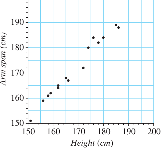
What the graph reveals:
Looking at the resulting scatterplot, we can observe that there is a clear relationship between these variables. As height increases, arm span also tends to increase, showing a positive connection between these two body measurements.
Reading and interpreting scatterplots
Being able to extract information from scatterplots is a crucial skill. Let's work through a detailed example to practice reading and interpreting these graphs.
Worked example: Internet use and numeracy scores
Worked Example: Reading and Interpreting a Scatterplot
The scatterplot below displays the average numeracy score for year students and their general rate of internet use (expressed as a percentage) across different countries.
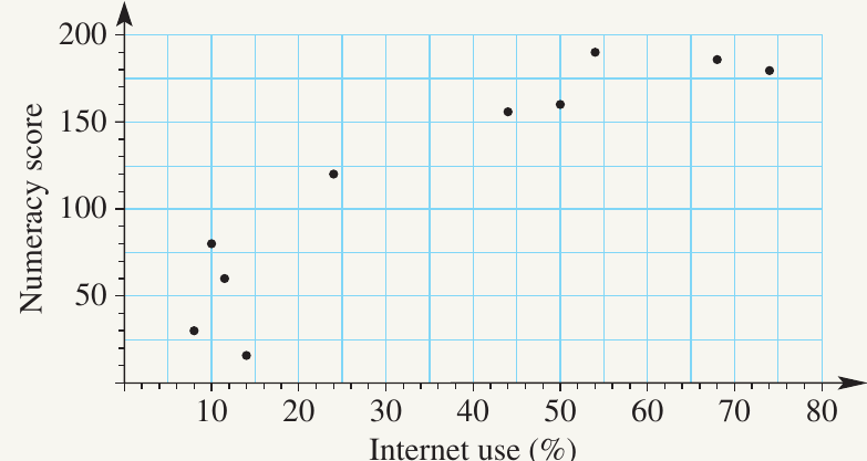
Let's examine how to answer various questions using this scatterplot:
Question a: What is the scale for the vertical axis?
To determine the scale, count the number of divisions between and . There are divisions, so each unit represents .
Answer: unit
Question b: What is the average numeracy score for the country with internet use?
Locate on the horizontal axis, then read vertically up to find the corresponding dot. From that dot, read horizontally across to the vertical axis.
Answer:
Question c: What is the internet use percentage for the country with an average numeracy score of ?
Find on the vertical axis, then read horizontally across to locate the corresponding dot. From that dot, read vertically down to the horizontal axis.
Answer:
Question d: How many countries have internet use less than ?
Count all the dots positioned to the left of the mark on the horizontal axis.
Answer: countries
Question e: How many countries have a numeracy score greater than ?
Count all the dots positioned above the mark on the vertical axis (in the top half of the graph).
Answer: countries
Question f: Is there a relationship between these two variables?
Examine the overall pattern of dots in the scatterplot. When internet use is greater than , there's a clear pattern where numeracy scores increase as internet use increases. Both variables move in the same direction, indicating a positive relationship. However, this pattern is less clear when internet use is below .
Answer: Yes, there is a relationship. When internet use exceeds , both variables increase together, showing a positive connection.
Exam tips
Critical Exam Success Strategies:
- Always check the scale carefully before reading values from a scatterplot. Don't assume each grid line represents one unit
- When describing relationships, look at the overall pattern rather than focusing on individual points
- Remember that each dot represents one complete set of measurements (one subject)
- Use a ruler to help you read values accurately by drawing light lines from the axes to the data points
- Label both axes clearly with variable names and units when constructing your own scatterplots
Remember!
Key Points to Remember:
-
Bivariate data involves measuring two different variables for each subject in your study
-
Scatterplots are graphs that help us visualise relationships between two numerical variables, with each data point represented as a dot
-
Construction follows four steps: draw a number plane, set up the horizontal axis with scale and title, set up the vertical axis with scale and title, then plot each ordered pair as a dot
-
When reading scatterplots, always determine the scale first by counting divisions and calculating what each unit represents
-
Relationships between variables are identified by looking for patterns in how the dots are distributed – do they trend upward together, downward together, or show no clear pattern?