Using a Bivariate Scatterplot (HSC SSCE Mathematics Standard): Revision Notes
Using a Bivariate Scatterplot
Introduction to scatterplots
A scatterplot is a visual tool that helps us understand the relationship between two variables. When examining a scatterplot, the key starting point is to look for patterns in how the data points are arranged. These patterns reveal whether a relationship exists between the variables and, if so, what type of relationship it is.
When data points are randomly scattered across the plot with no discernible pattern, this indicates there is no relationship or association between the variables. The variables are independent of each other, meaning changes in one variable do not correspond to predictable changes in the other.
However, when you can identify a clear pattern in the arrangement of points, this suggests an association exists between the variables. The nature of this pattern tells us important information about how the variables relate to each other.
To fully describe any association we find, we need to examine three key characteristics of the pattern: its form, direction, and strength. Understanding these three features allows us to communicate precisely what type of relationship exists between the variables.
Identifying relationships in scatterplots
No relationship
When data points are randomly scattered across the plot with no discernible pattern, this indicates there is no relationship (or no association) between the variables.
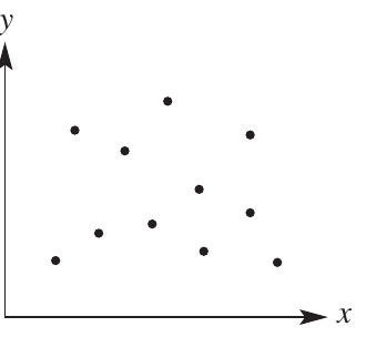
In the example above, the dots are spread randomly with no clear pattern, suggesting the two variables are not related.
Types of association
When a clear pattern exists in the scatterplot, we say there is an association between the variables. To describe this association fully, we need to consider three characteristics: form, direction, and strength.
The three scatterplots above all show clear patterns, but each pattern is different. We need specific vocabulary to describe these differences accurately. Always describe an association using all three characteristics: form, direction (if applicable), and strength.
Form of association
The form describes the shape of the pattern formed by the data points.
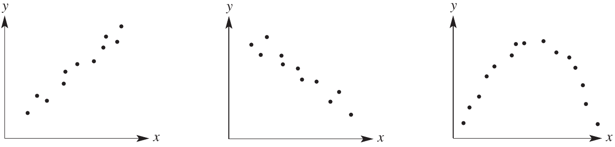
Linear form
When the points approximately follow a straight line, the association has a linear form.
The left scatterplot shows a linear pattern where points cluster around an imaginary straight line.
Non-linear form
When the points follow a curved pattern rather than a straight line, the association has a non-linear form.
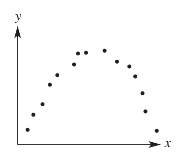
The example above shows points arranged in a curved arc, indicating a non-linear relationship. Non-linear patterns can take many forms including curves, exponential growth, or cyclical patterns.
Direction of association
For associations with linear form, we can describe the direction based on whether the line slopes upward or downward.
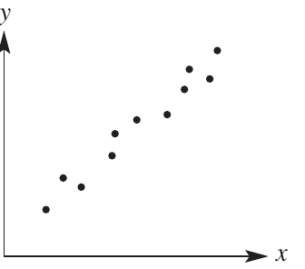
Positive association
A positive association exists when the imaginary line through the points has a positive gradient. In practical terms, this means as one variable increases, the other variable also tends to increase. The dots trend upward from left to right.
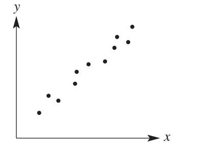
The scatterplot shows a positive association - both variables increase together.
Negative association
A negative association exists when the imaginary line through the points has a negative gradient. This means as one variable increases, the other variable tends to decrease. The dots trend downward from left to right.
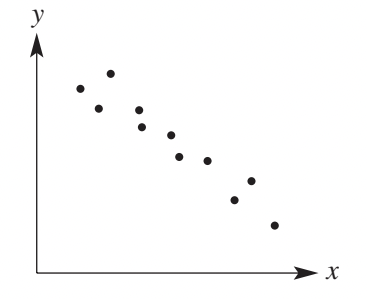
The scatterplot above demonstrates a negative association where one variable decreases as the other increases. This is also sometimes called an inverse relationship.
Strength of association
The strength of an association measures how closely the data points cluster around the pattern. It tells us how reliable the relationship is. Below you can see strong, moderate, and weak associations (in that order).
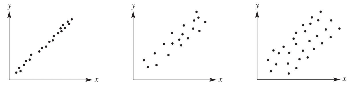
Strong association
In a strong association, the dots form a tight cluster following a single, clear stream. There is minimal scatter, and the pattern is very obvious.
The points lie very close to an imaginary line (for linear associations) or curve (for non-linear associations).
Moderate association
In a moderate association, there is more scatter in the data points. The pattern is still visible but less distinct than in a strong association. The points are more spread out around the line or curve.
Weak association
In a weak association, the scatter increases significantly. The pattern becomes much less clear, and the linear (or non-linear) form is less evident. Points are widely dispersed.
Exam tip: When describing an association in an exam, you should always mention the form (linear/non-linear), direction (positive/negative - if linear), and strength (strong/moderate/weak).
Worked example: Describing a bivariate dataset
Worked Example: Describing a bivariate dataset
The table below shows height (in cm) and mass (in kg) for nine people.

a) Construct a scatterplot using the data
Following our four-step process:
- Draw a number plane with (height) on the horizontal axis and (mass) on the vertical axis
- Use a scale where each unit represents cm for height
- Use a scale where each unit represents kg for mass
- Plot each ordered pair: , , , , , , , ,
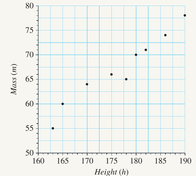
b) Describe the form of the association
The points approximately follow a straight line, so the association has a linear form.
c) Describe the direction of the association
The gradient of the imaginary line is positive - the dots trend upward from left to right. Therefore, this is a positive association.
d) Describe the strength of the association
There is only a small amount of scatter in the points. They cluster closely around the linear pattern. This is a strong association.
Complete description: Strong, positive, linear association.
e) Predict the mass of a person who is 173 cm tall
Draw an imaginary vertical line from cm on the horizontal axis. Where it meets the pattern of dots, read across to the vertical axis while maintaining the linear relationship. The predicted mass is approximately 65 kg.
f) Predict the height of a person who has a mass of 75 kg
Draw an imaginary horizontal line from kg on the vertical axis. Where it intersects the pattern, read down to the horizontal axis. The predicted height is approximately 187 cm.
Independent and dependent variables
In many bivariate datasets, one variable influences or affects the other. We classify these as independent and dependent variables.
Independent variable
The independent variable is the input variable. It is not affected by the other variable. Think of it as the variable you control or choose.
- Represented on the horizontal axis (x-axis)
- Usually comes first in ordered pairs
- Often represents time, distance, or a controlled factor
Dependent variable
The dependent variable is the output variable. Its value depends on or is influenced by the independent variable.
- Represented on the vertical axis (y-axis)
- Usually comes second in ordered pairs
- Often represents a response, result, or measurement
Worked Example: Identifying variables
The table below shows time taken (in hours) relative to distance travelled (in kilometres).

a) Draw a scatterplot
- Draw a number plane with (distance) on the horizontal axis and (time) on the vertical axis
- Use a scale of km per unit on the horizontal axis
- Use a scale of hours per unit on the vertical axis
- Plot the points: , , , , ,
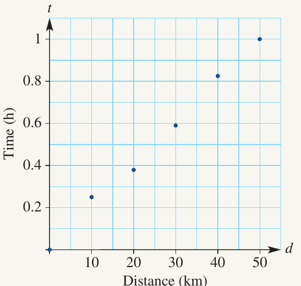
b) Identify the independent and dependent variables
The independent variable is distance because it is the input - we choose how far to travel. It appears on the horizontal axis.
The dependent variable is time because it depends on the distance travelled - the time taken is determined by how far we go. It appears on the vertical axis.
Exam tip: Think about cause and effect. The independent variable is the cause (what you change), and the dependent variable is the effect (what changes as a result).
Tips for identifying variables
When determining which variable is independent and which is dependent:
Tips for Identifying Variables:
- Ask: "Which variable influences the other?"
- Consider: "Which would I manipulate to see how it affects the other?"
- Think about cause and effect: "Which is the cause and which is the effect?"
- Remember: Time is almost always the independent variable when it's one of your variables
In some situations, the choice might not be immediately obvious, but thinking through the logical relationship between the variables will usually make it clear.
Remember!
Key Points to Remember:
-
A scatterplot shows the relationship between two variables by plotting data points on a coordinate plane. Look for clear patterns to identify whether an association exists.
-
Describe associations using three key features: Form (linear or non-linear), Direction (positive or negative for linear associations), and Strength (strong, moderate, or weak based on amount of scatter).
-
Strong associations have tightly clustered points following a clear pattern, while weak associations show widely scattered points with less obvious patterns.
-
The independent variable (input, not affected by the other variable) goes on the horizontal axis, while the dependent variable (output, depends on the independent variable) goes on the vertical axis.
-
Scatterplots can be used to make predictions by following the established pattern, though predictions are most reliable when the association is strong and within the range of the original data.