How to Interpret a Scatterplot - Further Exploration (VCE SSCE General Mathematics): Revision Notes
How to Interpret a Scatterplot - Further Exploration
Introduction to scatterplot interpretation
When examining a scatterplot, we look for specific features that reveal relationships between two variables. The first step is to check whether there is a clear pattern among the points. If the points are spread randomly with no discernible arrangement, we conclude there is no association between the variables.
However, when we do observe a distinct pattern in the data points, we can describe the association using three key characteristics:
- Direction - whether the relationship is positive or negative
- Form - whether the pattern is linear or non-linear
- Strength - how closely the points cluster around a trend line
We should also watch for outliers - unusual data points that don't fit the general pattern.
When analyzing any scatterplot, always examine all three characteristics (direction, form, and strength) to provide a complete description of the relationship between variables. This systematic approach ensures you don't miss important features of the data.
Direction and outliers
Identifying direction
The direction of an association describes how the two variables move in relation to each other.
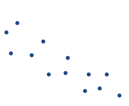
No association
When a scatterplot shows height plotted against age for a group of footballers, the points might be randomly scattered with no clear pattern. This suggests there is no relationship between these variables for this particular group. However, we might notice a possible outlier - for example, a footballer who is unusually tall at cm.
Positive association
When there is a clear pattern in the scatterplot where points trend upwards from left to right, we identify a positive association. This means that as one variable increases, the other variable also tends to increase.
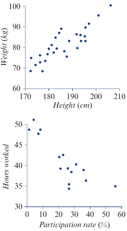
For example, in a plot of weight against height for footballers, we see this upward trend. The positive association tells us that taller players typically weigh more. In this type of scatterplot, we would also check for outliers, though there may be none present.
Negative association
When points in a scatterplot trend downwards from left to right, we identify a negative association. This means that as one variable increases, the other variable tends to decrease.
For instance, a scatterplot of working hours against university participation rates for different countries shows this downward pattern. The negative association indicates that countries with higher university participation rates tend to have people working fewer hours on average.
Formal definitions of direction
Two variables have a positive association when the value of the response variable tends to increase as the value of the explanatory variable increases.
Two variables have a negative association when the value of the response variable tends to decrease as the value of the explanatory variable increases.
Two variables have no association when there is no consistent change in the value of the response variable as the values of the explanatory variable increase.
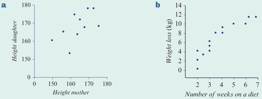
Worked example: Direction of association
Worked Example: Classifying Direction of Association
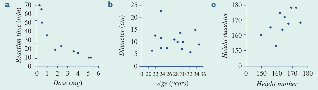
Let's classify each of the following scatterplots as showing positive, negative, or no association, and describe what this means in context.
Solution:
Part a: The scatterplot shows points trending downward from left to right. The direction of the association is negative. Reaction times tend to decrease as the drug dose increases.
Part b: There is no discernible pattern in the scatterplot of diameter against age. There is no association between diameter and age.
Part c: The scatterplot shows points trending upward from left to right. The direction of the association is positive. Taller mothers tend to have taller daughters.
Form
The form of an association describes the overall shape of the pattern. Does it follow a straight line or a curve?
Linear form
When the points in a scatterplot can be imagined as scattered around a straight line, we say the association has a linear form. The scatterplot may show points trending either upward or downward, but the overall pattern follows a linear path.
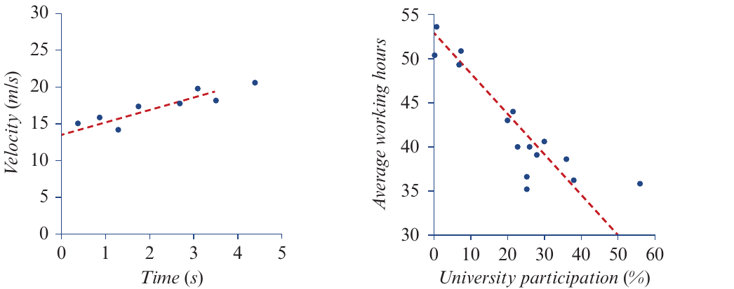
Both of the scatterplots shown above demonstrate linear form. The dotted lines have been added to help visualise how the points cluster around a straight line - one showing a positive linear association and one showing a negative linear association.
Non-linear form
When the points in a scatterplot follow a curved pattern rather than a straight line, we say the association has a non-linear form.
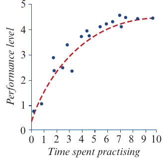
Consider the scatterplot showing performance level against time spent practising a task. There is clearly an association between these variables, but it is non-linear. The curve shows that whilst performance improves with practice, there comes a point when additional practice produces diminishing returns - the performance level no longer improves substantially with extra practice.
While non-linear relationships do exist in real data, many relationships we encounter are either linear or can be transformed to become linear. For now, we focus primarily on analysing scatterplots with linear forms.
Formal definition of form
A scatterplot has a linear form when the points tend to follow a straight line.
A scatterplot has a non-linear form when the points tend to follow a curved line.
Worked example: Form of an association
Worked Example: Identifying Form of Association
Let's classify the form of the association in each scatterplot as linear or non-linear.
Solution:
Part a: There is a clear pattern where the points can be imagined as scattered around a straight line. The association is linear.
Part b: There is a clear pattern, but the points can be imagined as scattered around a curved line rather than a straight line. The association is non-linear.
Strength
The strength of an association measures how much scatter exists in the scatterplot. It describes how closely the points cluster around a trend line.
Strong association
When there is a strong association between variables, the points show only a small amount of scatter and are tightly clustered about a trend line. The pattern is very clear and distinct.
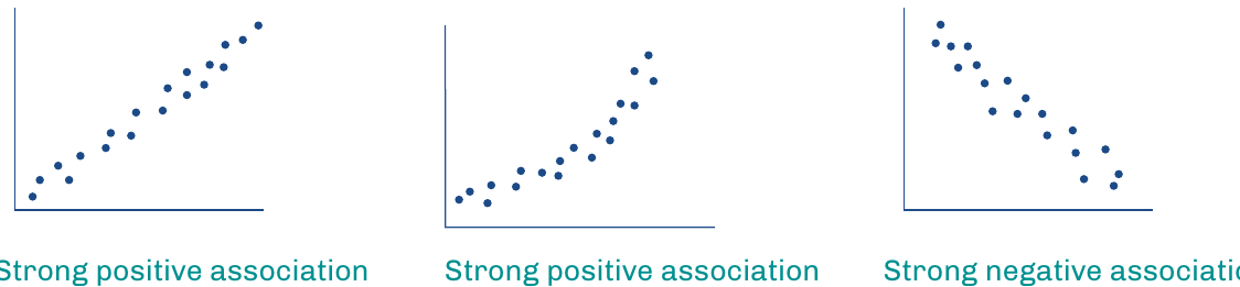
The three scatterplots above demonstrate strong associations. The first two show strong positive associations, whilst the third shows a strong negative association. In all cases, the points lie very close to where we would draw a trend line.
Moderate association
As the amount of scatter increases, the pattern becomes less clear. When points are broadly clustered about a trend line, we describe the association as moderate.
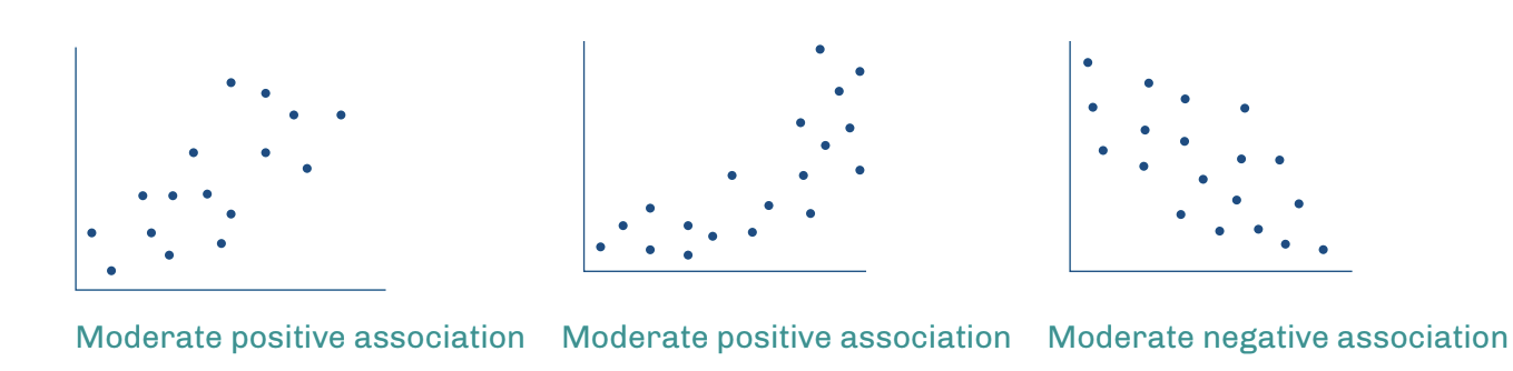
The scatterplots showing moderate associations have more scatter than strong associations, making the pattern less obvious but still identifiable.
Weak association
With even more scatter, the pattern becomes quite unclear. When points are loosely clustered about a trend line, we describe the association as weak.
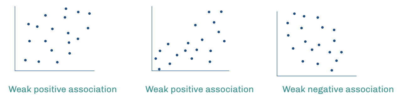
These scatterplots demonstrate weak associations. Whilst a general trend might still be visible, the large amount of scatter makes it difficult to identify a clear pattern.
Distinguishing between strength levels:
Think of strength as how confident you would be in predicting one variable from the other:
- Strong: You can predict with high confidence - points are packed tightly
- Moderate: You can make a reasonable prediction - points show clear trend but with some scatter
- Weak: Your prediction would be quite uncertain - points are loosely distributed
Remember: "Tight, Broad, Loose" corresponds to "Strong, Moderate, Weak"
Formal definitions of strength
An association is classified as:
Strong if the points on the scatterplot tend to be tightly clustered about a trend line.
Moderate if the points on the scatterplot tend to be broadly clustered about a trend line.
Weak if the points on the scatterplot tend to be loosely clustered about a trend line.
When no pattern can be seen, we say there is no association.
Worked example: Strength of an association
Worked Example: Classifying Strength of Association
Let's classify the strength of the association in each of the following scatterplots.
Solution:
Part a: The points are loosely clustered. The association is weak.
Part b: The points are tightly clustered. The association is strong.
Exam tips
Complete Scatterplot Descriptions in Exams
When describing an association in an exam, provide a complete description by addressing all three characteristics:
- State the direction (positive, negative, or none)
- Describe the form (linear or non-linear)
- Comment on the strength (strong, moderate, or weak)
For example: "There is a strong, positive, linear association between height and weight."
Always interpret your answer in context when variables are named. For instance: "Taller footballers tend to be heavier" is better than simply stating "positive association."
Key Points to Remember:
-
Pattern first: Check if there is a clear pattern in the scatterplot. No pattern means no association.
-
Direction: Positive association means both variables increase together. Negative association means one increases whilst the other decreases.
-
Form: Linear associations follow a straight-line pattern. Non-linear associations follow a curved pattern.
-
Strength: Strong associations have tightly clustered points, moderate associations have broadly clustered points, and weak associations have loosely clustered points.
-
Complete descriptions: Always describe all three characteristics (direction, form, and strength) when analysing a scatterplot with an association.