Recognising Relationships (VCE SSCE Mathematical Methods): Revision Notes
Recognising Relationships
Introduction
When studying mathematical relationships, we often need to understand how two variables are connected without necessarily finding an exact formula. This topic explores how we can examine and interpret relationships between variables using graphs.
In real-world situations, we frequently encounter relationships between quantities such as height and volume, distance and time, or temperature and pressure. By examining graphs of these relationships, we can gain valuable insights into how one variable changes in response to another.
This approach is particularly useful in practical situations where establishing an exact algebraic formula might be difficult or unnecessary. Instead, we focus on understanding the form and behaviour of the relationship by reading the graph.
This approach builds on your knowledge of polynomial, exponential, logarithmic, and circular functions, but focuses on understanding the form of relationships rather than establishing algebraic equations.
Interpreting graphical relationships
Understanding shape and relationship
The shape of a container or the nature of a physical situation directly affects the relationship between variables. Let's explore this through practical examples.
Worked Example: Water Vessels
Consider four different shaped vessels where water is being poured in at a constant rate. We need to determine how the height of water () relates to the volume poured in ().
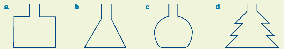
For each vessel, the relationship between height and volume depends on the container's shape:
Vessel a (rectangular container): The width remains constant throughout, so equal volumes of water always produce equal increases in height. This creates a linear relationship where increases steadily with .
Vessel b (conical flask): The container is narrow at the bottom and widens towards the top. Initially, small volumes produce large height increases, but as the container widens, the same volume produces smaller height increases. The graph starts steep and gradually becomes less steep.
Vessel c (round-bottom flask): This vessel is narrow at top and bottom but wide in the middle. Initially, the height rises quickly, then more slowly through the wide section, and finally quickly again as it reaches the narrow neck. The rate of height change varies significantly.
Vessel d (zigzag flask): Similar to the conical flask but with an irregular shape. The changing width creates a varying relationship between height and volume.
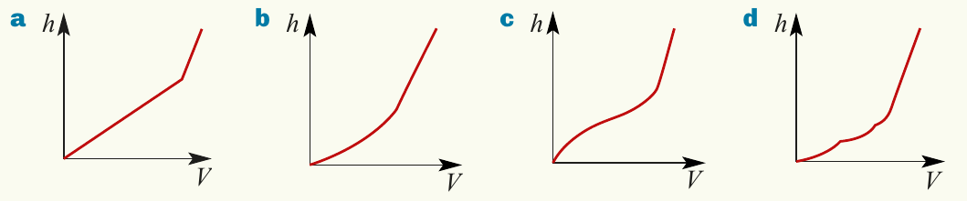
The graphs show these relationships visually, with all starting from the origin (no water, zero height) and curving upward as volume increases.
Worked Example: Particle Motion
Understanding motion from graphs is an essential skill. Let's analyse a distance-time graph to describe how a particle moves.
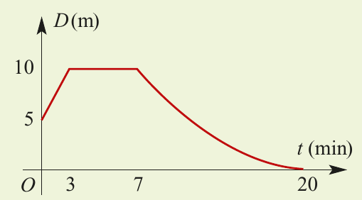
Reading the graph systematically, we can break down the particle's motion into distinct phases:
Phase 1 (0 to 3 minutes): The particle starts 5 metres from point O. It moves away from O in a straight line at constant speed. The distance increases from 5 m to 10 m over 3 minutes.
To find the speed: Distance travelled = metres, Time taken = minutes
Therefore, speed = metres per minute
Phase 2 (3 to 7 minutes): The graph shows a horizontal line segment, meaning the distance remains constant at 10 metres. The particle is stationary for 4 minutes.
Phase 3 (7 to 20 minutes): The particle returns toward O. The curved line indicates that the speed is not constant but gradually decreases. The particle decelerates throughout this phase, eventually coming to rest at O at exactly minutes. The curve becomes less steep as time progresses, showing the reducing speed.
Rate of change from graphs
Understanding rate of change is fundamental to interpreting graphs. The rate of change tells us how quickly one variable changes relative to another.
Positive rate of change
When a graph slopes upward (moving from left to right), we say the rate of change is positive. This means that as the -values increase, the -values also increase.
In this graph, grows as increases. The function is increasing over this interval, and the rate of change of y with respect to x is positive throughout.
Key characteristic: The graph appears to be climbing uphill as you move from left to right.
Negative rate of change
When a graph slopes downward (moving from left to right), the rate of change is negative. This indicates that as -values increase, -values decrease.
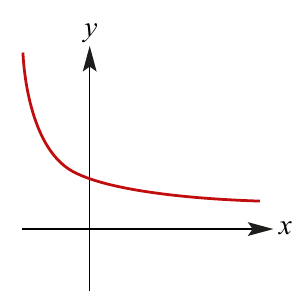
In this graph, decreases as increases. The function is decreasing, and the rate of change of y with respect to x is negative.
Key characteristic: The graph appears to be going downhill as you move from left to right.
Zero rate of change
When a graph is a horizontal line, the -value stays constant even as changes. The rate of change of y with respect to x is zero.
Key characteristic: A completely flat, horizontal line indicates no change in the dependent variable.
These concepts connect to the idea of gradient that you may have encountered when studying linear functions. The gradient represents the rate of change for straight lines.
Identifying intervals of change
Often, a function will have different rates of change over different intervals. We use interval notation to precisely describe where the rate of change is positive, negative, or zero.
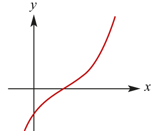
Worked Example: Using Interval Notation
For the graph shown, we need to identify where the rate of change is positive and where it is negative.
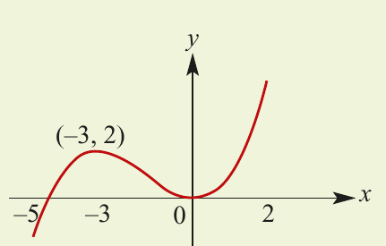
The graph shows a curve with a minimum point at .
Part a: Where is the rate of change negative?
Looking at the graph from left to right:
- From to , the graph slopes upward (positive rate of change)
- From to , the graph slopes downward (negative rate of change)
- From to , the graph slopes upward (positive rate of change)
Therefore, the rate of change of with respect to is negative for .
Note: We use a round bracket because at and , the graph has a turning point where the rate of change is momentarily zero.
Part b: Where is the rate of change positive?
The graph slopes upward in two separate sections:
- From to
- From to
Therefore, the rate of change of with respect to is positive for .
The union symbol () connects the two separate intervals where the rate is positive. We use square brackets at the endpoints and because these are included in the domain we're considering.
Summary of Key Concepts
For any function with rule , we can determine the rate of change by examining its graph:
-
Positive rate of change: If increases as increases over an interval, the rate of change is positive for that interval. The graph slopes upward.
-
Negative rate of change: If decreases as increases over an interval, the rate of change is negative for that interval. The graph slopes downward.
-
Zero rate of change: If remains constant as changes, the graph is a horizontal line and the rate of change is zero.
Remember!
- The shape of a graph reveals the relationship between variables without needing an algebraic formula
- Rate of change can be identified visually: upward slope = positive, downward slope = negative, horizontal = zero
- Different parts of a graph can have different rates of change - use interval notation to describe precisely where each type occurs
- Real-world situations (like water filling containers or particle motion) can be interpreted by carefully reading their graphs
- At turning points (peaks and troughs), the rate of change transitions from positive to negative or vice versa