Cartographic Skills (AQA A-Level Geography): Revision Notes
Cartographic Skills
Introduction to cartographic skills
Cartographic skills involve two fundamental areas of expertise:
- Reading and interpreting maps – understanding different map types such as atlas maps and weather charts
- Producing maps – creating sketch maps and other cartographic representations to display geographical information
These skills are essential for geographers as they enable us to visualise spatial patterns, identify relationships, and communicate geographical data effectively.
Geographical information systems (GIS)
Geographical information systems (GIS) are computer-based tools that allow geographers to collect, store, process, and display spatial data. GIS has become a vital component of modern geographical study.
Who Uses GIS Technology?
GIS is used extensively across multiple sectors:
- Environmental planners
- Government departments
- Public utility companies
- Commercial organisations
Key capabilities of GIS
GIS systems can perform several important functions:
- Help with questioning and understanding complex data sets
- Enable multiple sources of data to be combined and compared
- Present difficult abstract concepts in a visual, dynamic format
- Create three-dimensional representations of landscapes
- Provide opportunities for modelling different scenarios and making informed decisions
How GIS works
GIS software connects different types of geographical information. Digital maps, satellite images, and aerial photographs can all be linked together. The resulting maps are produced in two main formats:
Raster Maps
Raster maps are created from a series of coloured dots (pixels), similar to high-quality digital photographs. Digital versions of Ordnance Survey maps use this format.
Vector Maps
Vector maps record each feature (such as roads, buildings, or woodland) using XY coordinates. This allows information from spreadsheets and databases to be added to the maps. These layers can be added to a base map whenever needed. GoogleMaps is a well-known example of vector mapping.
Types of maps
Atlas maps
An atlas is a collection of maps organised around a single theme. Examples include road atlases or atlases focusing on specific topics (physical geography, political boundaries, population distribution, resources, etc.).
Academic atlases require you to:
- Use lines of latitude and longitude to identify and describe locations accurately
- Understand how colour schemes and symbols convey information
- Use the index to locate specific features
Data Currency Warning
When studying and comparing countries or regions using atlases, remember that information can become outdated quickly in our rapidly changing world. Always check that your atlas contains current data.
Weather maps
A synoptic weather chart (or weather map) provides a summary of current atmospheric conditions. These charts show:
- Pressure patterns
- Front locations (warm, cold, and occluded)
- Wind direction and speed
- How weather conditions will change over the coming days
Weather Maps for Fieldwork Planning
Weather maps are essential tools for planning fieldwork. They not only forecast what weather conditions to expect, but also explain why those conditions will occur. The Atlantic chart is the most frequently encountered detailed weather chart type in the UK.
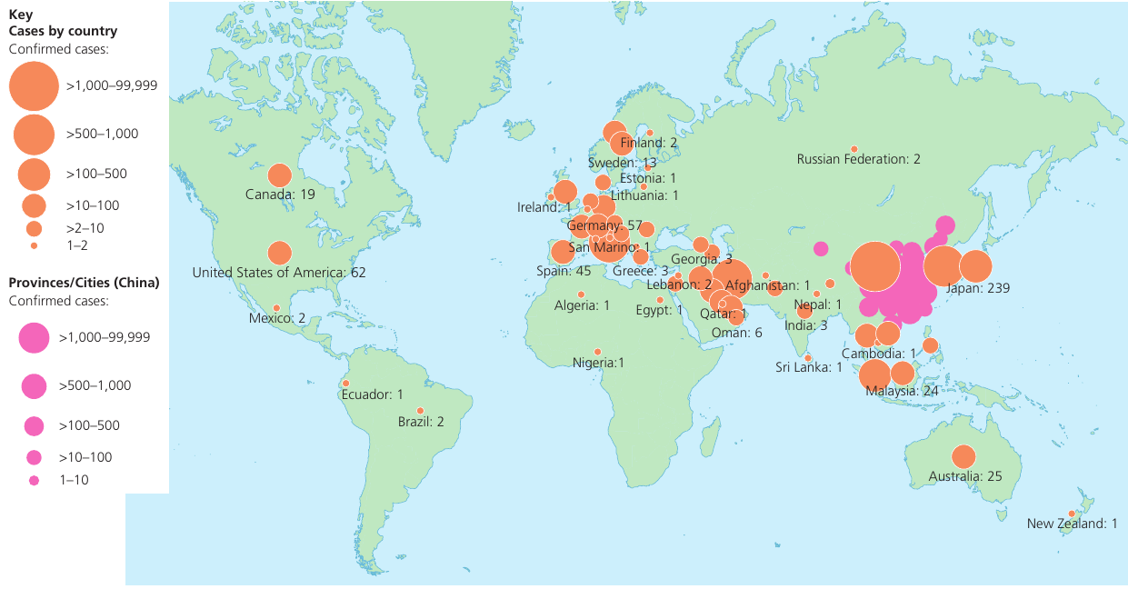
Maps with located proportional symbols
These maps include symbols whose size is proportional to the value they represent. Symbols can be:
- Circles
- Squares
- Bar graphs
- Pie charts
- Small pictographs
Proportional symbols are placed on a map to display spatial differences across regions.
Symbol Placement Considerations
When creating proportional symbol maps, you must take care with symbol placement. It is essential to avoid excessive overlapping, while ensuring it remains clear which area or place each symbol represents.
Maps showing movement – flow lines, desire lines and trip lines
Flow lines and desire lines both represent the volume of movement between locations. They are useful for showing:
- Traffic movements along specific routes (roads, railways, waterways)
- Migration of populations between regions
- Movement of goods or commodities
- Movements of shoppers between towns and retail centres
Key Visual Principle
The width of the line is proportional to the quantity of movement. This visual technique immediately highlights the most significant flows.
Flow lines represent the quantity of movement along an actual route, such as a train or bus route. They follow the physical path taken.
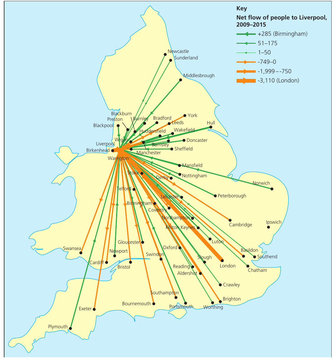
Desire lines are drawn directly from the point of origin to the destination. They do not follow a specific route – they simply connect the start and end points with a straight line.
Trip lines show regular trips, for example, where people travel to shop. Lines are drawn from a town to nearby villages to show shopping patterns.
Maps showing spatial patterns – choropleth, isoline and dot maps
Choropleth maps
A choropleth map displays data values through the density of shading within areas. Data are usually expressed as density per square kilometre (for example, population density).
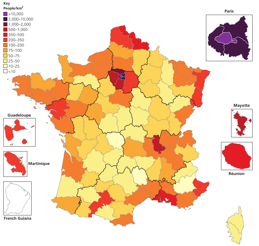
Choropleth maps are relatively easy to construct and visually effective. They allow readers to quickly identify general patterns in distribution. However, there are some limitations:
Limitations of Choropleth Maps
- The method assumes the entire area under one shade has uniform density, with no internal variations. For example, on UK maps, the whole of Scotland might be covered by one category, even though large variations clearly exist between central populated areas and the Highlands.
- The method implies abrupt changes at drawn boundaries, which will not be present in reality.
Constructing a choropleth map
To produce a choropleth map effectively, follow these stages:
-
Group the data into classes – Before you begin, decide on the appropriate number and range of classes needed to display your data clearly.
-
Devise a range of shadings – Create a shading scheme to cover the full range of your data. Darkest shades should represent the highest figures, and vice versa. Avoid using the two extremes of black and white because black suggests a maximum value whilst white implies nothing exists in that area.
-
Apply the shading carefully – Ensure each area is clearly shaded and that it is obvious which area or place the shading represents.
Isoline maps
Isolines (also called isopleths) are lines that join all points of the same value. This creates a visual pattern showing how a variable is distributed.
The best-known examples of isolines on Ordnance Survey maps are contour lines, which join places of equal height. This technique can be applied to numerous other factors:
- Isotherms – lines joining places of equal temperature
- Isohyets – lines joining places of equal rainfall
- Isobars – lines joining places of equal atmospheric pressure (seen on weather charts)
- Isochrones – lines joining places of equal travel time for commuters and shoppers
Rules for constructing isoline maps
When drawing isoline maps, you must follow these construction rules:
Essential Isoline Construction Rules
- Isolines connect points of equal value
- They represent continuous surfaces (like ground level) and do not suddenly disappear
- Isolines do not cross or touch each other (with the exception of vertical features, such as cliffs)
- Values on one side of an isoline are higher or lower than values on the other side
- The interval between isolines must be the same across the entire map (unless otherwise specified)
- Isoline maps of the environment almost always represent an overhead view, looking straight down
Dot maps
A dot map displays the spatial distribution of a geographical variable using numerous dots of equal size. Each dot has the same value and is plotted roughly where that variable occurs.
The dot value must be carefully chosen to avoid:
- Excessive overcrowding of dots in areas with high concentrations of the variable being mapped
- Areas with low concentrations having no dots at all, giving a false impression of emptiness
Limitations of Dot Maps
Dot maps have two main limitations:
- Large numbers of dots become difficult to count accurately. Although dot maps effectively show distribution patterns, they are less useful if you need a precise understanding of the values represented.
- Accompanying information about the distribution is necessary, otherwise the map could be misleading.
Graphical skills
Line graphs
Simple and compound line graphs
Line graphs are appropriate when you want to display absolute changes in data over time. For example, they effectively show:
- Changes in food production
- Population change
- Stream discharge patterns
When several lines are plotted on the same graph, it is important to identify whether it is a simple or compound line graph:
- On a simple line graph, the line represents the actual values of whatever is being measured on the vertical axis
- On a compound line graph, the differences between adjacent lines give the actual values. The areas between the lines are usually shaded or coloured, and there is an accompanying key
Key Points to Remember:
- Cartographic skills involve both reading maps and producing them to display geographical information effectively
- GIS is a powerful computer-based tool that allows geographers to store, process, and analyse spatial data in multiple layers
- Proportional symbol maps use symbols sized according to the values they represent, making spatial patterns immediately visible
- Flow lines and desire lines show movement between places, with line width proportional to the quantity of movement
- Choropleth maps use shading density to represent data values, but assume uniform density within each shaded area
- Isoline maps join points of equal value and never cross each other (except at vertical features like cliffs)
- Dot maps show distribution patterns effectively but can be difficult to count precisely when dots are numerous