Statistical Skills (AQA A-Level Geography): Revision Notes
Statistical skills
Statistical skills are essential tools in geography for analysing and interpreting data collected during fieldwork investigations. They help us understand patterns, identify trends and make meaningful comparisons between different datasets. In this section, we'll explore two main types of statistical measures: those that describe the centre of a dataset (central tendency) and those that describe how spread out the data is (dispersion).
Measures of central tendency
When analysing data, we often want to find a single value that represents the 'typical' or 'middle' value of our dataset. There are three main ways to do this: the arithmetic mean, mode and median. Each has its own strengths and is useful in different situations.
Each measure of central tendency gives you different insights into your data. The mean shows the mathematical average, the mode reveals the most common value, and the median identifies the middle point. Using all three together provides a more complete picture of your dataset.
Arithmetic mean
The arithmetic mean (commonly called the average) is found by adding all the values in your dataset together, then dividing by how many values you have.
Formula:
Where:
- (pronounced "x-bar") is the mean
- means the sum of all values
- is the number of values in the dataset
The mean on its own doesn't tell you much about your data. You should always use it alongside the standard deviation, which shows how spread out your values are from the mean. A mean without a measure of dispersion gives you an incomplete picture.
Worked Example: Corrie Orientation Data
The mean orientation for corries in the Glyders is . This indicates the corries face almost exactly north-east, pointing away from the sun towards cooling southerly breezes.
The mean orientation for corries on the Isle of Arran is . This shows a more easterly aspect, though still on the shady side of the mountain.
Mode
The mode is the value that appears most frequently in your dataset. It's the simplest measure of central tendency to understand.
To identify the mode, you need to know all the individual values in your dataset. You then find which value occurs most often.
A dataset can have:
- One mode (unimodal)
- Two modes (bimodal)
- More than two modes (multimodal)
- No mode (if all values occur with the same frequency)
Median
The median is the middle value when you arrange your data in order from smallest to largest.
How to find the median:
- Arrange all values in rank order (from lowest to highest)
- Find the position of the median using this formula:
- Position = where is the number of values
For odd-numbered datasets: If you have 15 values, the median will be the 8th value in the rank order.
For even-numbered datasets: If you have an even number of values, the median is the mean of the two middle values.
For example, if your dataset has 15 items, the median will be at position th value.
Distribution of the data set
It's quite possible for the mean, mode and median to give you the same result. However, this would only happen if your data follows a perfectly 'normal' distribution, which is extremely unlikely when working with real geographical data.
In reality, data distributions are usually skewed:
- Positive skew: The distribution is stretched towards the lower end, with a few high values pulling the mean up
- Negative skew: The distribution is stretched towards the upper end, with a few low values pulling the mean down
The more skewed your data is, the greater the variation between your three measures of central tendency. This is why you need to calculate all three measures and also look at measures of dispersion to get a complete picture of your dataset.
No single measure gives you a reliable picture of your data distribution. Two completely different datasets could have identical values for mean, mode and median. This is why we also need measures of dispersion to understand how the data is spread out.
Measures of dispersion
Measures of dispersion (also called measures of variability) tell us how spread out the data values are. They help us understand whether values are clustered closely together or scattered widely. There are three main measures: range, inter-quartile range and standard deviation.
Range
The range is the simplest measure of dispersion. It's calculated as:
Range = Highest value - Lowest value
The range gives you a quick indication of the total spread of your data.
Worked Example: Corrie Orientation Range
The Glyders corries:
The Arran corries:
This shows that the Arran corries have a much wider range of orientations than those in the Glyders.
Limitation of the range: The range only uses two values from your entire dataset (the highest and lowest), so it can be heavily influenced by extreme values (outliers). This means a single unusual value can make your data appear much more spread out than it really is.
Inter-quartile range
The inter-quartile range (IQR) is a more sophisticated measure that shows the spread of the middle 50 per cent of your data around the median value. This gives a better indication of how dispersed most of your data is, because it excludes extreme values at either end.
How to calculate the IQR:
- Arrange your data in rank order from smallest to largest
- Divide the data into four equal groups (quartiles)
- Find the upper quartile (UQ) and lower quartile (LQ)
- Calculate: IQR = UQ - LQ
Finding the upper quartile (UQ):
- The UQ is the value at position in your ranked data
- This is the boundary between the first and second quartiles
Finding the lower quartile (LQ):
- The LQ is the value at position in your ranked data
- This is the boundary between the third and fourth quartiles
The IQR formula:
Interpretation: The IQR indicates how spread out the middle 50 per cent of your data is around the median. A larger IQR means greater spread or dispersion; a smaller IQR means the data is more tightly clustered.
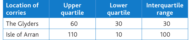
From the table above:
- The Glyders has an IQR of 30°, showing relatively consistent corrie orientations
- The Isle of Arran has an IQR of 100°, showing much greater variation in orientations
Standard deviation
The standard deviation is the most commonly used measure of dispersion. It measures how spread out values are from the mean value.
How it's calculated:
- Find the difference between each individual value and the mean
- Square each difference (this eliminates negative values)
- Add up all the squared differences
- Divide by the number of values (this gives you the variance)
- Take the square root of the variance
Standard deviation formula:
Where:
- SD is the standard deviation
- means "sum of"
- is each individual value
- is the mean
- is the number of values
What it tells you: A large standard deviation means the data values are widely spread from the mean. A small standard deviation means the values cluster closely around the mean. This makes it an excellent indicator of data consistency.
Displaying statistical data: dispersion diagrams
Dispersion diagrams are a useful way to visually display the main patterns in your data distribution. Each individual data point is plotted against a vertical scale, making it easy to see:
- The range of the data
- How individual values are distributed within that range
- The degree of clustering or bunching
- Comparisons between two or more datasets
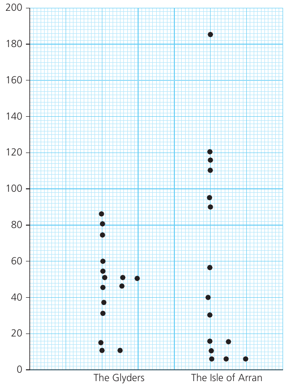
The diagram above shows the corrie lip orientation data for both the Glyders and the Isle of Arran. You can clearly see:
- The Glyders data is more tightly clustered, mainly between 30° and 60°
- The Arran data is much more spread out, ranging from about 5° to 185°
- Several Arran corries show clustering around 110-120°
- The different distributions support the statistical measures we calculated earlier
Dispersion diagrams provide an immediate visual comparison that makes patterns obvious at a glance. They're particularly valuable when comparing multiple datasets, as the differences in spread and clustering become immediately apparent.
Key Points to Remember:
-
Three measures of central tendency: Mean (calculated average), mode (most frequent value), and median (middle value when ranked). Each tells you something different about your data.
-
Mean needs support: The arithmetic mean has limited value on its own - always use it alongside the standard deviation to understand data spread.
-
IQR focuses on the middle: The inter-quartile range shows the spread of the middle 50% of your data around the median, making it less affected by extreme values than the range.
-
Standard deviation measures spread from mean: It's calculated using squared differences from the mean, giving you the variance, then taking the square root. Larger values indicate more dispersed data.
-
Visual display helps interpretation: Dispersion diagrams let you see the distribution patterns and compare datasets visually, making it easier to spot clustering, outliers and differences between groups.