Averages and range (AQA GCSE Maths): Revision Notes
Averages and range
Content Note: The material provided focuses on scatter graphs and correlation rather than traditional averages and range calculations.
What are scatter graphs?
Scatter graphs display the relationship between two different variables by plotting data points on a coordinate system. These graphs help us identify patterns and connections between variables that might not be obvious from looking at raw data alone.
Data points on scatter graphs don't always appear randomly scattered. When points form patterns close to a straight line, this indicates a correlation between the variables. The more closely the points follow a straight line pattern, the stronger the correlation becomes.
The key advantage of scatter graphs is their ability to reveal relationships that might be hidden in tables of raw data. They provide an immediate visual representation of how two variables interact with each other.
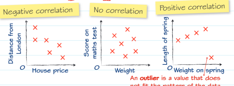
Types of correlation
Understanding correlation patterns is essential for interpreting scatter graphs effectively:
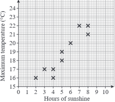
Positive correlation occurs when both variables increase together. As one variable gets larger, the other also tends to increase. The data points form an upward-sloping pattern from left to right.
Negative correlation happens when one variable increases while the other decreases. The data points create a downward-sloping pattern across the graph.
No correlation means there's no clear relationship between the variables. The points appear randomly scattered with no obvious pattern or trend.
Understanding outliers
An outlier represents a data point that doesn't follow the general pattern established by the rest of the data. These points stand out because they fall significantly away from the main trend.
Outliers can result from measurement errors, unusual circumstances, or genuinely exceptional cases. Identifying outliers helps improve the accuracy of your analysis and predictions.
When analysing scatter graphs, always look for outliers first. Ask yourself: "Does this point make sense?" or "Could this be a recording error?" Outliers can either reveal important exceptions or indicate problems with data collection.
Line of best fit
The line of best fit is a straight line drawn through the scatter graph that passes as close as possible to the maximum number of data points. This line helps reveal the overall trend in your data more clearly.
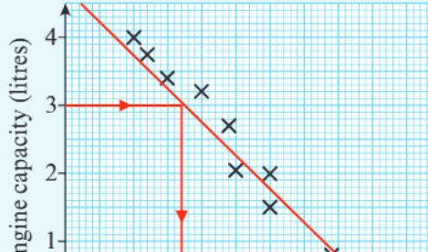
Drawing a Line of Best Fit:
Step 1: Look at the overall pattern of your data points Step 2: Draw a straight line that has roughly equal numbers of points above and below it Step 3: Ensure the line represents the general direction of the data pattern Step 4: Don't worry if the line doesn't pass through every point - it should show the overall trend
Making predictions from scatter graphs
Scatter graphs enable you to estimate values not directly shown in your data, but the reliability of predictions varies depending on their location relative to your existing data.
Interpolation
Interpolation involves predicting values that fall within the range of your existing data. These predictions tend to be more accurate and reliable because you're working within the boundaries of known information.
Extrapolation
Extrapolation means predicting values that fall outside the range of your existing data. These predictions are generally less reliable because they assume the same pattern continues beyond what you've actually observed.
When making predictions outside your data range, remember that real-world relationships might change or have limits that aren't apparent from your current data set. Always state that extrapolated predictions are less certain.
Cause and effect relationships
A crucial concept to remember is that correlation does not prove causation. Just because two variables show a relationship on a scatter graph doesn't automatically mean one variable causes changes in the other.
Critical Thinking Required: Variables might appear related because:
- Both are influenced by a third, unmeasured factor
- The relationship is purely coincidental
- There are complex underlying causes not captured in the data
Always consider whether a relationship makes logical sense before concluding that one variable directly causes changes in another.
Variables might appear related because both are influenced by a third, unmeasured factor, the relationship is purely coincidental, or there are complex underlying causes not captured in the data.
Always consider whether a relationship makes logical sense before concluding that one variable directly causes changes in another.
Key Points to Remember:
- Scatter graphs reveal relationships between two variables through plotted data points
- Strong correlation exists when points cluster closely around a straight line pattern
- Outliers are data points that don't match the general pattern of the remaining data
- Interpolation provides more reliable predictions than extrapolation
- Correlation doesn't equal causation- always think critically about what relationships actually mean