Bar charts (AQA GCSE Maths): Revision Notes
Bar charts
What are bar charts?
Bar charts provide a visual way to display data that has been collected and organised in tally charts or frequency tables. They make it easy to compare different categories of data at a glance and show patterns in your information clearly.
Bar charts are one of the most common ways to present categorical data because they make comparisons between different groups immediately obvious to the reader.
Bar charts are particularly useful when you want to show how frequently different items or categories appear in your data set. Each bar represents a different category, and the size of the bar shows how many times that category occurred.
Key features of bar charts
All bar charts must follow specific rules to display data correctly and clearly. Understanding these features is essential for both creating and interpreting bar charts accurately.
Essential features that every bar chart must have:
- Equal bar widths - All bars must be exactly the same width to avoid misleading comparisons
- Gaps between bars - There should always be spaces between individual bars to show they represent separate categories
- Labelled axes - Both the horizontal and vertical axes need clear labels explaining what they represent
- Consistent scale - The scale should increase in regular intervals (e.g., 2, 4, 6, 8 or 5, 10, 15, 20)
- Frequency representation - The height (vertical charts) or length (horizontal charts) of each bar shows the frequency or count for that category
Types of bar charts
Vertical and horizontal bar charts
Bar charts can be drawn in two orientations depending on what works best for your data and space available.
Vertical bar charts have categories along the bottom (horizontal axis) and frequencies up the side (vertical axis). The height of each bar represents the frequency.
Horizontal bar charts have categories listed down the side (vertical axis) and frequencies across the bottom (horizontal axis). The length of each bar represents the frequency.
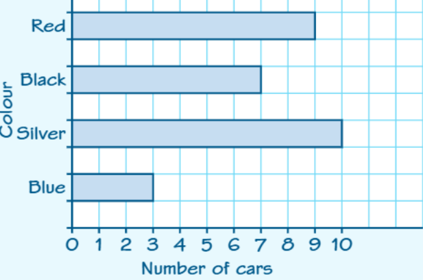
Choose vertical or horizontal orientation based on your category labels. If category names are long, horizontal charts often work better as they provide more space for labels.
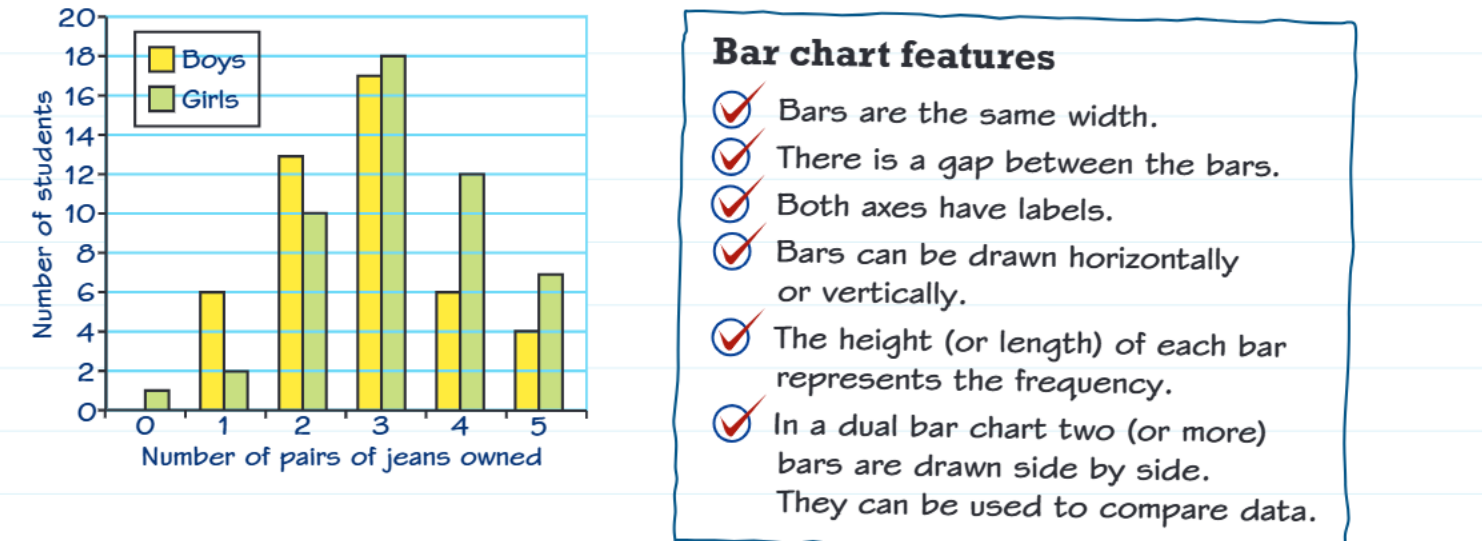
Dual bar charts
Dual bar charts allow you to compare two sets of related data side by side. They use different colours or patterns to distinguish between the two data sets being compared.
In dual bar charts, pairs of bars are positioned next to each other for easy comparison. This makes it simple to see differences and similarities between the two groups across all categories.
Creating bar charts from data
When converting data from a tally chart to a bar chart, follow a systematic approach to ensure accuracy and clarity.
Worked Example: Converting Tally Data to Bar Chart
Step 1: Count the tallies to find the frequency for each category
Step 2: Choose your scale - look at your highest frequency and choose appropriate intervals
Step 3: Draw and label your axes clearly
Step 4: Draw your bars ensuring they're all the same width with gaps between them
Step 5: Check your work by verifying each bar height matches the frequency
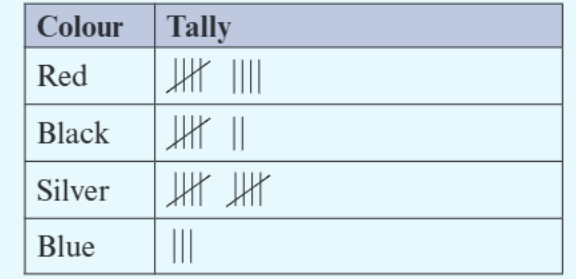
The tally chart shows the raw data collection, which then gets converted into the visual bar chart representation. This process transforms numerical data into visual form for easier interpretation.
Reading and interpreting bar charts
To extract information accurately from bar charts, follow these systematic steps:
Reading Bar Charts Step by Step:
- Find the category you're interested in along the appropriate axis
- Follow the bar to see where its end aligns with the frequency scale
- Read the frequency value from the scale
- Compare bars by looking at their relative heights or lengths
For exam questions, always show your working by clearly stating which bar you're reading and what value you've identified from the scale.
Exam tips
Key Exam Strategies:
- Check the scale carefully - it might not start at zero or might count in unusual intervals
- Use a ruler to help read values accurately from the chart
- Show your method when calculating totals or differences between categories
- Label your axes clearly when drawing bar charts
- Include a title if asked to draw a complete chart
- Double-check bar widths are equal and gaps are present
Common mistakes to avoid: Reading the wrong scale, forgetting gaps between bars, or using unequal bar widths.
Key Points to Remember:
- Bar charts display frequency data visually with equal-width bars and gaps between them
- The height or length of each bar represents the frequency for that category
- Both axes must be clearly labelled with appropriate scales
- Dual bar charts allow comparison between two related data sets
- Always check your scale carefully when reading values from bar charts