Histograms and Frequency Density (AQA GCSE Maths): Revision Notes
Histograms and frequency density
What is a histogram?
A histogram is a special type of bar chart where the bars can have different widths. This key feature sets histograms apart from regular bar charts and makes them particularly useful for displaying grouped data with unequal class intervals. When bars have different widths, we can't simply look at their heights to compare frequencies - we need to think more carefully about what the height actually represents.
The key difference between histograms and regular bar charts is that histogram bars can have different widths, while regular bar chart bars are always the same width. This seemingly small difference has major implications for how we interpret the data.
Understanding frequency density
The vertical axis of a histogram always shows frequency density, not frequency itself. This is crucial because when class intervals have different widths, simply plotting frequency would give a misleading picture of the data distribution.
Never confuse frequency with frequency density! The height of bars in a histogram represents frequency density, not the actual count of data points. This is essential for correct interpretation of histograms.
The frequency density formula
The fundamental relationship in histograms is captured by this formula:
This formula helps us understand why frequency density is necessary. If two classes have the same frequency but different widths, the narrower class will have a higher frequency density because the same number of data points are squeezed into a smaller range.
Remember that "frequency" is simply another way of saying "how much" or "how many" - it's the count of data points in each class.
Working backwards to find frequency
You can rearrange the formula to find frequency when you know the frequency density and class width:
This rearranged formula reveals something important: the frequency equals the area of the bar on the histogram. The width represents the class width, and the height represents the frequency density, so multiplying them gives the area, which corresponds to the frequency.
Key insight: In a histogram, the area of each bar represents the frequency. This is why we can compare different classes fairly, even when they have different widths - we're comparing areas, not just heights.
Worked example with beetle lengths
Let's examine a practical example using data about beetle lengths found in a garden:
| Length (mm) | Frequency |
|---|---|
| 0 < x ≤ 10 | 32 |
| 10 < x ≤ 15 | 36 |
| 15 < x ≤ 18 | 15 |
| 18 < x ≤ 22 | 28 |
| 22 < x ≤ 30 | 16 |
Worked Example: Calculating Frequency Density for Beetle Lengths
To create the histogram, we need to calculate the frequency density for each class. Here's how we work through the calculations:
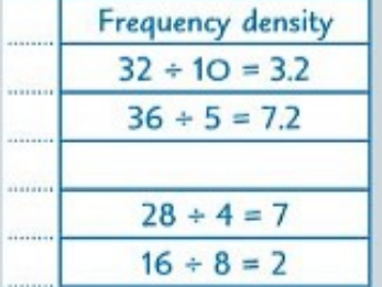
For each class interval, we divide the frequency by the class width:
- Class 0 < x ≤ 10: Frequency density =
- Class 10 < x ≤ 15: Frequency density =
- Class 18 < x ≤ 22: Frequency density =
- Class 22 < x ≤ 30: Frequency density =
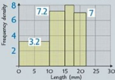
Notice how the resulting histogram shows these calculated frequency densities as the heights of the bars. The tallest bar corresponds to the 10-15mm class, not because it has the highest frequency, but because it has the highest frequency density due to its narrow class width.
Finding missing values
Sometimes you'll encounter problems where you need to find missing information. The beauty of histograms is that they provide all the visual information needed to complete frequency tables, even when some values are missing.
Worked Example: Finding Missing Frequency
If you can see from a histogram that the frequency density for the 15 < x ≤ 18 class is 8, and you know the class width is 3, you can calculate:
This demonstrates how histograms provide all the information needed to complete frequency tables.
Estimating values within specific ranges
Histograms also enable you to estimate how many data points fall within ranges that don't align with the original class boundaries. This is a powerful technique for making predictions or gaining deeper insights into data distribution patterns.
Estimation technique: To estimate the number of beetles between 7.5mm and 12.5mm in length:
- Identify which classes these ranges overlap
- Calculate what proportion of each class you're interested in
- Apply the frequency density × class width formula for each portion
- Sum the results
This technique is particularly valuable for making predictions or gaining deeper insights into data distribution patterns.
Key Points to Remember:
- Core formula:
- Reverse calculation: (this equals the area of the bar)
- Histogram bars have different widths - this distinguishes them from regular bar charts
- The vertical axis always shows frequency density, never raw frequency
- Frequency density indicates data concentration within each class interval
- You can estimate values for any range by using proportions and frequency densities