Other Graphs and Charts (AQA GCSE Maths): Revision Notes
Other graphs and charts
When working with different types of data, your choice of chart depends on your data type and what you want to demonstrate. Each graph type has specific strengths that make it suitable for particular situations.
Line graphs for time series data
Line graphs are the perfect choice when you're dealing with data that changes over time. This type of information is called time series data, and it often reveals interesting patterns that help us understand trends and make predictions.
Time series data is any data collected over regular time intervals - like daily temperatures, monthly sales figures, or yearly population counts. The key feature is that the order of the data points matters because they represent a sequence through time.
Understanding seasonality and patterns
Time series data commonly shows recurring patterns, and this repetition is known as seasonality. Don't worry - seasonality doesn't always have to match actual seasons! It simply means that the data follows a regular repeating cycle.
Seasonality can occur over any regular time period - daily patterns (like rush hour traffic), weekly patterns (like weekend shopping), monthly patterns (like utility bills), or yearly patterns (like ice cream sales). The term "seasonality" is used regardless of the actual time period involved.
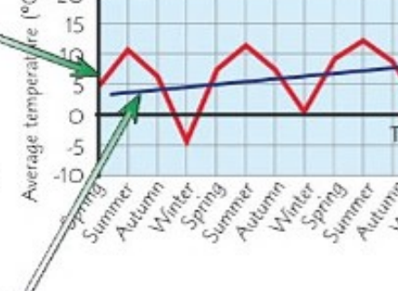
The time duration between pattern repetitions (from one peak to the next peak, or from one low point to the next low point) is called the period. For example, if a pattern repeats every four data points, then the period is four.
Worked Example: Identifying Period
Looking at ice cream sales data:
- Week 1: 200 units
- Week 2: 350 units
- Week 3: 500 units
- Week 4: 300 units
- Week 5: 200 units (pattern starts repeating)
The period is 4 weeks because the pattern repeats every 4 data points.
Spotting overall trends
While looking at the repeating patterns, you should also examine the overall trend. This means determining whether the values are generally increasing, decreasing, or staying roughly the same over time, ignoring the regular ups and downs of the pattern. You can often draw a trend line to make this overall direction clearer.
When identifying trends, focus on the general direction of the peaks and troughs rather than the individual fluctuations. A trend line helps smooth out the seasonal variations to reveal the underlying long-term pattern.
The peaks and troughs (highest and lowest points) in your data might show a slight upward or downward movement over time, which reveals the underlying trend beneath the seasonal variations.
Frequency polygons for grouped data
When you have grouped data from a frequency table, a frequency polygon provides an excellent way to visualise the information. This type of graph looks quite similar to a line graph, but it serves a different purpose.
To create a frequency polygon, you plot the frequency of each group against its mid-interval value (the middle value of each group). Then you connect these points using straight lines to form the polygon shape.
Frequency polygons are particularly useful when comparing multiple data sets or when you want to show the shape of a distribution clearly. They're easier to interpret than histograms when dealing with several groups of data.
This method is particularly useful when you want to show how data is distributed across different groups or ranges, making it easy to spot where most of your data falls.
Pie charts for proportions
Pie charts excel at showing proportions - they help you see how different parts make up the whole. There's one crucial rule to remember when working with pie charts, and it's called the golden rule.
The golden rule for pie charts
The Golden Rule for Pie Charts
The total of everything in a pie chart must equal 360°. This is because a complete circle contains 360 degrees, so all the slices must add up to this total.
When solving pie chart problems, you can use this rule to find missing values. For example, if you know three sectors are 90°, 70°, and 100°, you can calculate the fourth sector: 360° - 90° - 70° - 100° = 100°.
Working with pie chart calculations
You can convert between fractions and degrees using the relationship that the whole circle (360°) represents the total quantity. If a sector represents 5 out of 18 items, then its angle would be (5/18) × 360°.
Worked Example: Pie Chart Calculations
A survey of 24 students' favourite subjects shows:
- Maths: 8 students
- Science: 6 students
- English: 4 students
- Art: 6 students
Step 1: Convert to angles
- Maths:
- Science:
- English:
- Art:
Step 2: Check the total 120° + 90° + 60° + 90° = 360° ✓
These calculations work both ways - if you know the angle, you can find the quantity, and if you know the quantity, you can find the angle.
Stem and leaf diagrams for data spread
Stem and leaf diagrams provide an excellent way to show the spread and distribution of your data while keeping all the original values visible. They're particularly useful for finding statistical measures like the range and median.
Constructing stem and leaf diagrams
In these diagrams, each number is split into two parts: the 'stem' (usually the tens digit) and the 'leaf' (usually the units digit). For example, if your data includes ages like 23, 25, 27, the stem would be 2 and the leaves would be 3, 5, 7.
Always include a key to explain what your notation means. For instance: "Key: 1 | 2 = 12 years old" shows that a stem of 1 with a leaf of 2 represents the value 12.
Worked Example: Constructing a Stem and Leaf Diagram
Data set: 23, 25, 27, 31, 34, 38, 41, 43, 47, 52
Step 1: Identify stems and leaves
- 23 → stem: 2, leaf: 3
- 25 → stem: 2, leaf: 5
- 27 → stem: 2, leaf: 7
- And so on...
Step 2: Organise the diagram
2 | 3 5 7
3 | 1 4 8
4 | 1 3 7
5 | 2
Step 3: Add the key Key: 2 | 3 = 23
Finding range and median
The range is straightforward to calculate from a stem and leaf diagram - it's simply the highest value minus the lowest value.
For the median, you need to count the total number of values and find the middle position. If you have 19 values, the median is the 10th value when arranged in order (since (19 + 1) ÷ 2 = 10). The stem and leaf format makes it easy to count to this position.
Worked Example: Finding Range and Median
Using the diagram from above:
2 | 3 5 7
3 | 1 4 8
4 | 1 3 7
5 | 2
Range: 52 - 23 = 29
Median: 10 values total, so median is the average of 5th and 6th values Counting: 23, 25, 27, 31, 34, 38, 41, 43, 47, 52 5th value = 34, 6th value = 38 Median = (34 + 38) ÷ 2 = 36
| Quarter | Climbing | |
|---|---|---|
| 1 | 2 | |
| 2 | 4 | |
| 3 | 10 | |
| 4 | 6 | |
| 1 | 1 | |
| 2 | 4 | |
| 3 | 11 | |
| 4 | 7 |
Key Points to Remember:
-
Choose your graph type based on your data: line graphs for time series, frequency polygons for grouped data, pie charts for proportions, and stem and leaf diagrams for data spread
-
Time series data often shows seasonality: look for repeating patterns and measure the period between repetitions
-
The golden rule for pie charts: all sectors must total 360° because that's the number of degrees in a complete circle
-
Stem and leaf diagrams preserve original data: they show distribution while keeping all individual values visible for calculating statistics
-
Always look for overall trends: even when data has regular patterns, there might be an underlying upward or downward trend over time