Scatter Graphs (AQA GCSE Maths): Revision Notes
Scatter graphs
A scatter graph is a type of graph used to show the relationship between two variables. Each data point is plotted as a cross (X) on the graph, with one variable on the horizontal axis and another on the vertical axis.
Scatter graphs are particularly useful in statistics and data analysis because they allow us to visually examine how two different measurements might be connected. For instance, we might plot a student's hours of study against their exam scores, or the outside temperature against ice cream sales.
Types of correlation
When we look at scatter graphs, we can identify three main types of relationships between the variables:
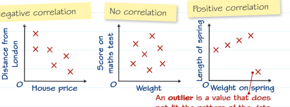
Positive correlation
Positive correlation occurs when both variables increase together. As one variable gets larger, the other also tends to get larger. The points on the scatter graph form a pattern that slopes upward from left to right.
Negative correlation
Negative correlation happens when one variable increases while the other decreases. As one variable gets larger, the other tends to get smaller. The points form a pattern that slopes downward from left to right.
No correlation
No correlation means there is no clear relationship between the two variables. The points appear randomly scattered across the graph with no obvious pattern.
The strength of correlation can vary even within these categories. A strong positive correlation will show points very close to a straight upward line, while a weak positive correlation will show more scattered points that still generally trend upward.
Understanding outliers
An outlier is a data point that does not fit the general pattern of the other data points. Outliers stand apart from the main cluster of points and can significantly affect the overall relationship shown in the graph.
Outliers can occur for various reasons - they might represent measurement errors, unusual circumstances, or genuinely exceptional cases that don't follow the typical pattern. When analysing scatter graphs, it's important to identify outliers and consider whether they should be included in your analysis or investigated further.
Outliers can dramatically affect the line of best fit and any conclusions you draw from the data. Always identify and consider the impact of outliers in your analysis.
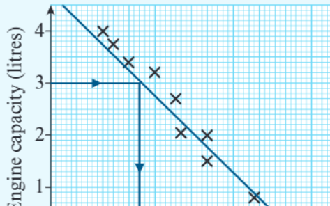
Line of best fit
A line of best fit is a straight line drawn through the data points that comes as close as possible to most of the points. This line helps us:
- See the general trend in the data
- Make estimates and predictions
- Understand the strength of the correlation
The closer the points are to the line of best fit, the stronger the correlation between the variables.
Drawing a Line of Best Fit:
Step 1: Plot all your data points on the scatter graph Step 2: Look for the general direction of the data points Step 3: Draw a straight line that passes through or near as many points as possible Step 4: Ensure roughly equal numbers of points above and below your line Step 5: The line should represent the overall trend, not necessarily pass through every point
Cause and effect versus correlation
Understanding the difference between correlation and causation is crucial for proper data interpretation. Just because two variables show a correlation doesn't mean that one causes the other.
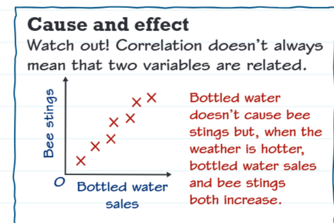
Sometimes both variables are affected by a third factor. For example, bottled water sales and bee stings might both increase in hot weather, but bottled water doesn't cause bee stings - the hot weather affects both variables.
Correlation does not always mean causation. This is one of the most important principles in statistics. Always consider alternative explanations and potential third variables that might influence both measurements.
Making predictions
We can use scatter graphs and lines of best fit to estimate values and make predictions. However, the reliability of these predictions depends on where they fall relative to our existing data.
Interpolation
Interpolation means predicting a value that falls within the range of the existing data. These predictions are generally more reliable because we're estimating between known data points.
Extrapolation
Extrapolation means predicting a value that falls outside the range of the existing data. These predictions are less reliable because we're going beyond what we know from the data.
Making Predictions:
If your scatter graph shows the relationship between hours studied (0-10 hours) and exam scores:
Interpolation example: Predicting the exam score for 7 hours of study (within our data range) - this is reliable
Extrapolation example: Predicting the exam score for 15 hours of study (outside our data range) - this is less reliable as we don't know if the same relationship continues
The further you extrapolate from your known data, the less reliable your predictions become. The relationship between variables might change outside the range of your observations.
Exam tips
When working with scatter graphs in your exam, keep these key strategies in mind:
Exam Strategy Tips:
- Always check what type of correlation is shown first
- Identify any outliers that don't fit the pattern
- Use the line of best fit for making estimates
- Remember that predictions within the data range (interpolation) are more reliable than those outside it (extrapolation)
- Be careful not to assume correlation means causation
- Show your working when reading values from graphs
- Check the scales on both axes carefully
Key Points to Remember:
- Scatter graphs show relationships between two variables using plotted points
- Positive correlation: both variables increase together
- Negative correlation: one increases as the other decreases
- No correlation: no clear relationship between variables
- Outliers are points that don't fit the general pattern
- Correlation doesn't equal causation - always consider other factors that might influence both variables
- Interpolation (within data range) is more reliable than extrapolation (outside data range)
- The line of best fit helps identify trends and make predictions