Charts (Grade 11 NSC Matric Computer Application Technology): Revision Notes
Charts
Charts are incredibly useful tools when you need to present data clearly in reports and presentations. In Excel, we use the term charts to refer to what you might have called graphs in Mathematics. This unit will teach you how to create professional-looking charts, format them effectively, and edit them when needed.
Visual data representation is one of the most powerful ways to communicate complex information quickly and effectively. Learning to create professional charts is an essential skill for academic and professional success.
Why use charts?
Visual representations of data help people understand information much more quickly than looking at rows and columns of numbers. A well-designed chart can instantly show trends, comparisons, and patterns that might be hidden in a spreadsheet.
Charts transform raw data into meaningful insights that your audience can grasp at a glance, making your presentations and reports far more engaging and persuasive.
Creating charts in Excel
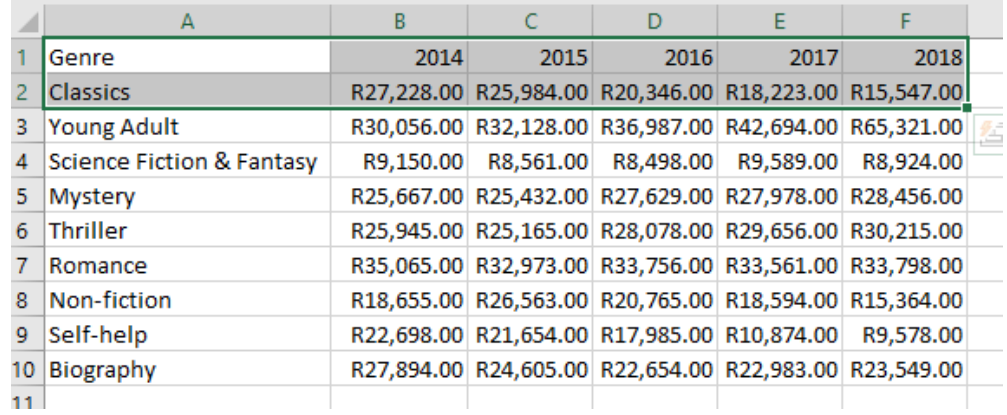
Before you can create any chart, your data must be properly organised in your spreadsheet. Excel works best when your data is arranged in a logical structure with clear headings and consistent formatting.
Data Organisation is Critical
Poor data organisation is the most common cause of chart creation problems. Always ensure your data has clear headers and is arranged in a consistent format before attempting to create any chart.
The step-by-step process
Worked Example: Creating Your First Chart
Step 1: Select your data Choose the range of cells that contains the information you want to display in your chart. Make sure to include any column or row headers as these will become your chart labels.
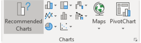
Step 2: Access the Insert tab Click on the Insert tab in the Excel ribbon to access all the chart creation tools.
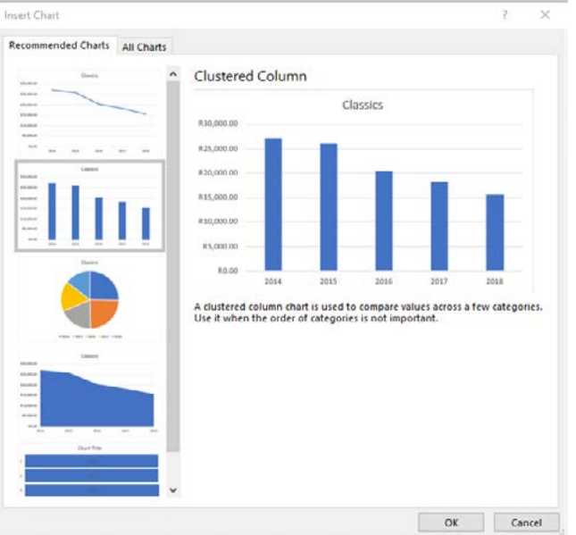
Step 3: Choose Recommended Charts Excel's Recommended Charts feature analyses your selected data and suggests the most appropriate chart types. This is particularly helpful when you're unsure which chart style will work best for your data.
Step 4: Preview and select your chart type Excel will show you a preview of how your chart will look with different styles. Take time to consider which format best represents your data and makes it easy to understand.
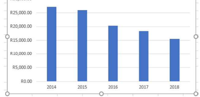
Step 5: Insert the chart Once you've chosen your preferred chart style, click OK to insert it into your spreadsheet. The chart will appear as an object that you can move, resize, and modify.
The beauty of Excel's chart creation process is that it provides intelligent suggestions based on your data structure, making it easier for beginners to create professional-looking visualisations.
Formatting and editing charts
Excel provides two main approaches for customising your charts to make them look professional and convey your message effectively. Understanding when to use each method will make you much more efficient at chart formatting.
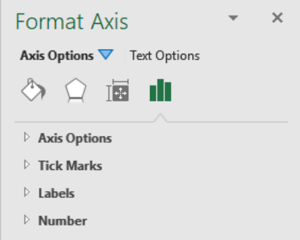
Method 1: The Format pane
The Format pane gives you detailed control over individual chart elements. You can access this by right-clicking on any part of your chart and selecting the appropriate formatting option. This method is ideal when you need precise control over specific elements like axes, data series, or chart titles.
The Format pane is your go-to tool when you need to make specific, detailed adjustments to chart appearance. It provides the most comprehensive formatting options but requires more time to navigate.
The Format pane allows you to modify:
- Data display elements (axes, gridlines, data series)
- Visual appearance (colours, fonts, borders)
- Size and positioning properties
Method 2: Chart Tools ribbon
When you select a chart, Excel automatically displays the Chart Tools contextual ribbon, which contains two important tabs:
Design tab: This focuses on the overall appearance and structure of your chart. You can:
- Add or remove chart elements
- Change the layout quickly using pre-designed templates
- Modify colours and visual styles
- Switch between different chart types
- Rearrange or change your data range
Format tab: This provides tools for detailed formatting of individual elements. You can:
- Format specific chart components you've selected
- Add shapes and visual enhancements
- Apply WordArt effects to text elements
- Adjust the chart's position within your spreadsheet
- Resize the chart precisely
Choosing the Right Method
Use the Chart Tools ribbon for quick, common changes and overall styling. Use the Format pane when you need to make specific, detailed adjustments to individual chart elements.

Working with chart elements
Chart elements are the individual components that make up your chart, such as titles, legends, gridlines, and data labels. Managing these elements effectively is crucial for creating clear, professional charts.
Understanding how to control each element gives you the power to create charts that communicate exactly what you want your audience to understand.
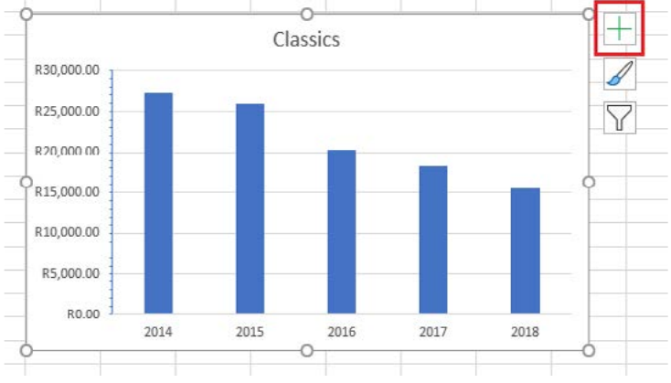
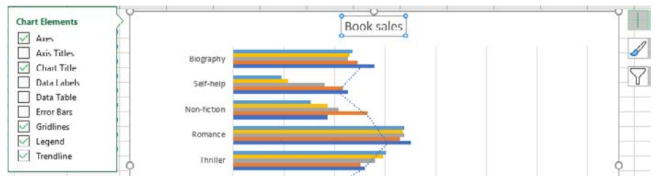
The Chart Elements button
Excel provides a convenient Chart Elements button (the plus sign icon) that appears when you select a chart. This tool allows you to quickly add or remove common chart components.
The Chart Elements button is one of the most efficient ways to modify your chart's appearance. It appears as a small plus sign (+) icon when you click on any chart, providing instant access to the most commonly used chart components.
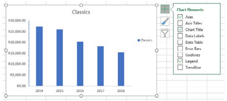
Common chart elements you can control
- Axes: The horizontal and vertical lines that provide the scale for your data
- Chart Title: The main heading that describes what your chart shows
- Data Labels: Numbers or text that appear on or near data points
- Error Bars: Indicators of uncertainty or variation in your data
- Gridlines: Horizontal and vertical lines that help readers interpret values
- Legend: A key that explains what different colours or patterns represent
- Trendlines: Lines that show the general pattern or direction of your data
Customising chart elements
You can easily add or remove elements by ticking or unticking boxes in the Chart Elements panel. For more advanced formatting, click the arrow next to each element to access additional positioning and styling options.
Adding meaningful titles and labels
One of the most important aspects of creating effective charts is ensuring they communicate clearly with your audience. Your chart should provide all the information someone needs to understand your data without requiring additional explanation.
The Power of Clear Communication
A chart without proper titles and labels is like a book without a title page - your audience will struggle to understand what they're looking at. Always prioritise clarity over creativity when naming your chart elements.
Why meaningful titles matter
A good chart title should immediately tell the reader what they're looking at. Instead of generic labels like "Data" or "Chart 1", use descriptive titles that explain the specific information being presented. For example, "Term 3 English Marks" is much more helpful than simply "Marks".
Naming your axes
Both the horizontal (x-axis) and vertical (y-axis) should have clear, descriptive labels. If your horizontal axis shows dates, label it appropriately (such as "Event dates"). If your vertical axis shows quantities, specify what's being measured (like "Number of attendees").
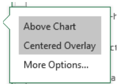
Two methods for adding titles
Worked Example: Adding Chart Titles
Method 1: Direct entry
- Select your chart
- Click in the Chart Title box that appears
- Type your desired title directly
Method 2: Linking to a cell
- Select the Chart Title box in your chart
- Type an equals sign (=) followed by the cell reference containing your title text
- Press Enter
This second method is particularly useful because if you change the text in the linked cell, your chart title will automatically update.
Editing charts and data
One of the powerful features of Excel charts is their dynamic nature. When you modify the underlying data in your spreadsheet, your chart automatically updates to reflect those changes. However, there are also specific editing tools for when you need to make direct changes to your chart.
This dynamic updating feature means your charts always stay current with your data, making them incredibly valuable for reports that need regular updates.
Three main areas you can edit
1. The data itself: Changes to the values in your spreadsheet cells will immediately appear in your chart
2. The data series: You can modify which data is included in your chart, add new data series, or remove existing ones
3. Chart titles and labels: All text elements in your chart can be edited for clarity and formatting
Making quick edits
Quick Editing Process
To edit titles or labels directly:
- Click once to select the chart element
- Click again to enter editing mode
- Type your new text
- Click outside the text box when finished
Modifying chart data
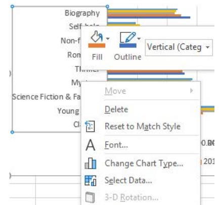
Right-click on your chart and select "Select Data" to access more comprehensive editing options. This opens a dialogue box where you can:
- Add or remove data series
- Change the data range your chart uses
- Modify category labels
- Switch rows and columns in your data presentation
Understanding these editing capabilities ensures you can maintain and update your charts as your data changes or as you refine your presentation needs.
Key Points to Remember:
- Charts in Excel are powerful tools for making data easy to understand and visually appealing
- Always start with properly organised data before creating any chart
- Use Excel's "Recommended Charts" feature to find the best chart type for your data
- The Format pane and Chart Tools ribbon provide different approaches to customising your charts
- Chart Elements can be easily added or removed using the plus sign button when a chart is selected
- Meaningful titles and axis labels are essential for effective communication
- Charts automatically update when you change the underlying spreadsheet data, making them dynamic and responsive to your work