The Hertzsprung-Russell Diagram (HSC SSCE Physics): Revision Notes
The Hertzsprung-Russell diagram
What is the Hertzsprung-Russell diagram?
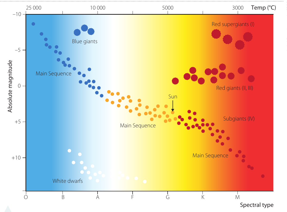
The Hertzsprung-Russell diagram (often called the H-R diagram) is one of the most important tools in astronomy for understanding stars and their evolution. It reveals fundamental relationships between a star's brightness, temperature, and stage of life.
The diagram is named after two astronomers who independently made the same discovery. In 1911, Danish astronomer Ejnar Hertzsprung plotted the actual brightness of stars against their colour. Two years later in 1913, American astronomer Henry Russell created a similar plot showing absolute magnitude against spectral class. Both scientists discovered something remarkable: stars don't scatter randomly across the diagram, but instead cluster in distinct regions. This pattern tells us that certain combinations of brightness and temperature are common, whilst others are rare or don't exist at all.
Magnitude and luminosity are two different ways of describing how bright stars are. Apparent magnitude describes how bright a star appears from Earth, whilst absolute magnitude tells us how bright the star truly is. The H-R diagram uses absolute magnitude, which allows us to compare stars fairly regardless of their distance from us.
Understanding the axes of the H-R diagram
The H-R diagram has two axes that contain crucial information about stars.
Vertical axis: absolute magnitude
The vertical axis shows absolute magnitude, which measures a star's true brightness. This scale might seem backwards at first: lower numbers (including negative values) represent brighter stars, whilst higher positive numbers represent dimmer stars. This historical scale originated when ancient astronomers called the brightest stars "magnitude 1" and fainter stars "magnitude 2, 3" and so on. When more precise measurements became possible, brighter stars were assigned negative magnitudes.
The magnitude scale is counterintuitive: lower and negative values mean brighter stars! A star with magnitude is much brighter than a star with magnitude . Think of it as a ranking system where first place (brightest) gets the lowest number.
On the H-R diagram, absolute magnitude ranges from about (extremely bright) at the top to (very dim) at the bottom.
Horizontal axis: spectral type and temperature
The horizontal axis shows spectral type, which classifies stars by their surface temperature and colour. The spectral types are designated by letters: O B A F G K M, running from hottest to coolest (left to right on the diagram). A useful mnemonic to remember this sequence is: "Oh Be A Fine Guy/Girl Kiss Me".
The diagram also shows temperature along the top, ranging from approximately on the left to on the right. Each spectral type is further divided into ten subtypes (for example, A0, A1, A2... A9) for more precise classification.
The colour of stars follows this temperature sequence:
- O and B stars (hottest): blue-white
- A and F stars: white
- G stars: yellow (like our Sun)
- K stars: orange
- M stars (coolest): red
Remember: blue stars are hot, red stars are cool - opposite to what we might expect from everyday experience with water taps!
Star groups on the H-R diagram
When thousands of stars are plotted on an H-R diagram, they form distinct regions that correspond to different types of stars at different stages of their lives.
Main sequence
The main sequence is the most prominent feature of the H-R diagram - a diagonal band stretching from the upper left (hot and luminous) to the lower right (cool and dim). Most stars, including our Sun, belong to this group. What defines a main sequence star is what's happening in its core: these stars are actively fusing hydrogen into helium through nuclear reactions.
The main sequence exists because there's a direct relationship between a star's mass and its temperature. More massive stars have stronger gravity, which compresses their cores to higher densities and temperatures. This causes fusion reactions to proceed more rapidly, making the star both hotter at its surface and more luminous overall. Conversely, less massive stars have cooler surfaces and lower luminosity.
Our Sun sits about halfway along the main sequence with a spectral type of G2 and surface temperature of approximately . Stars with about ten times the Sun's mass are found in the upper left as very hot blue-white stars with temperatures around or more. The smallest main sequence stars, with only solar masses, are found in the lower right as cool red stars.
Red giants and red supergiants
Red giants occupy the upper right region of the H-R diagram. These stars present an interesting puzzle: they have relatively cool surface temperatures (hence their red colour and M or K spectral types), yet they're extremely luminous. The only way a cool star can be very bright is if it has an enormous surface area - these stars are truly gigantic in size.
This large size is confirmed by examining the width of absorption lines in their spectra, which indicates lower atmospheric pressure. Despite having greater mass than smaller stars, the surface of a red giant is so far from the centre that gravity is weaker there, resulting in lower atmospheric density and pressure.
Red supergiants are even larger and more luminous than red giants, and are classified as luminosity class I. These are among the largest stars in the universe.
White dwarfs
White dwarfs are found in the lower left region of the H-R diagram. These stars are hot (giving them white or blue-white colours), yet they're very dim. This combination tells us they must be extremely small - typically about the same size as Earth.
White dwarfs are not actively fusing elements in their cores. Instead, they're the collapsed remnants of stars like our Sun that have exhausted their nuclear fuel. They shine only from residual heat, gradually cooling over billions of years. Their high surface gravity creates dense atmospheres, which can be detected through narrow spectral lines.
Blue giants
Blue giants are rare, short-lived stars found in the upper left region of the H-R diagram. They're both very hot and very luminous. Importantly, blue giants are not main sequence stars despite being massive. The key difference is that they're fusing heavier elements (not just hydrogen) in their cores, indicating they're in a more advanced stage of stellar evolution.
Subgiants
Subgiants (luminosity class IV) occupy a region between the main sequence and the red giant region. These stars are transitioning from main sequence stars to giants, having exhausted the hydrogen in their cores but not yet fully expanded into red giants.
Stellar evolution and the H-R diagram
The H-R diagram isn't just a snapshot of different types of stars - it's also a map of stellar evolution. As stars age, they move through different regions of the diagram.
The life cycle of a star
Stars begin their lives and evolve through distinct stages, with the path they follow depending primarily on their mass.
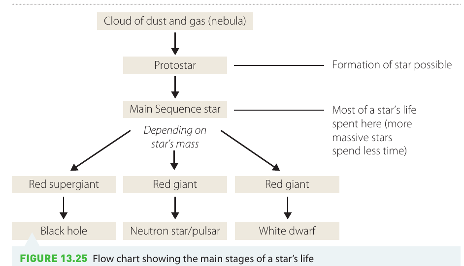
Protostar stage
Before a star is born, it exists as a protostar - a hot ball of gas collapsing under its own gravity. During this stage, no nuclear reactions are occurring yet. The energy that makes the protostar glow comes from gravitational potential energy: as material falls inward, gravitational energy converts to heat.
This process continues until the core becomes dense and hot enough for nuclear fusion to begin. A star is truly "born" when hydrogen fusion ignites in its core.
Main sequence stage
Once hydrogen fusion begins, the star enters the main sequence stage, where it will spend most of its life. During this stage, the star remains stable because there's a balance between two opposing forces:
- The outward pressure from radiation and hot gas
- The inward pull of gravity
This equilibrium keeps the star's size relatively constant. The greater a star's mass, the stronger its gravity, which allows higher core density and temperature. This causes fusion reactions to proceed more rapidly, resulting in higher surface temperatures.
Stars of different masses spend vastly different amounts of time on the main sequence:
- Stars with the Sun's mass remain on the main sequence for about billion years
- Massive stars (about solar masses) consume their fuel rapidly and may last only tens of millions of years
- Low-mass stars ( solar masses) burn their fuel so slowly they could theoretically last as long as the current age of the Universe
Post-main sequence evolution
When the hydrogen fuel in a star's core becomes depleted, gravity takes over and the core collapses. This collapse increases the core's density and temperature dramatically. The layer of helium that has accumulated around the core gets compressed so much that helium fusion can begin - an event called the "helium flash".
What happens next depends critically on the star's mass:
Example: Mass-Dependent Evolution Pathways
Low to medium mass stars (like our Sun):
- Expand into red giants as their outer layers swell
- Eventually shed their outer layers
- Leave behind a white dwarf that gradually cools
High mass stars:
- Expand into red supergiants
- Undergo further stages of fusion, creating heavier elements
- End their lives in massive supernova explosions
- Leave behind either a neutron star (or pulsar) or, if massive enough, a black hole
Key principle: More massive stars spend less time on the main sequence because they burn through their fuel much more rapidly. Mass determines a star's destiny!
Using the H-R diagram to classify stars
The H-R diagram is a powerful tool for analysing different populations of stars. An interesting comparison can be made between the brightest stars we see in the night sky versus the closest stars to Earth.
When we plot the brightest stars visible from Earth on an H-R diagram, we get a very different pattern compared to plotting the closest stars. The brightest stars include many red giants, supergiants, and blue giants - all extremely luminous objects that can be seen from great distances. In contrast, the closest stars are predominantly small, dim main sequence stars and white dwarfs.
This demonstrates an important observational bias: when we look at the night sky with our eyes or telescopes, we see luminous stars preferentially, not nearby stars. The closest stars would be a more representative random sample of the stellar population, whilst the brightest stars tell us more about which types of stars are easiest to observe.
Investigation 13.2: Plotting stars on an H-R diagram
Aim: To compare the results of plotting the brightest and the closest stars on an H-R diagram
Materials:
- Data tables provided below
- Pen, paper, ruler (or graphing software)
Data:
The brightest stars in the night sky:
| Star | Apparent magnitude, | Absolute magnitude, | Spectral type |
|---|---|---|---|
| Sirius | 1.45 | +1.41 | A1 |
| Canopus | 0.73 | +0.16 | F0 |
| Rigil Kentaurus (Alpha Centauri A) | 0.10 | +4.3 | G2 |
| Arcturus | 0.06 | −0.2 | K2 |
| Vega | 0.04 | +0.5 | A0 |
| Capella | 0.08 | −0.6 | G8 |
| Rigel | 0.11 | −7.0 | B8 |
| Procyon | 0.35 | +2.65 | F5 |
| Achernar | 0.48 | −2.2 | B5 |
| Hadar | 0.60 | −5.0 | B1 |
| Altair | 0.77 | +2.3 | A7 |
| Betelgeuse | 0.80 | −6.0 | M2 |
| Aldebaran | 0.85 | −0.7 | K5 |
| Acrux | 0.9 | −3.50 | B2 |
| Spica | 0.96 | −3.4 | B1 |
| Antares | 1.0 | −4.7 | M1 |
| Pollux | 1.15 | +0.95 | K0 |
| Fomalhaut | 1.16 | +0.08 | A3 |
| Deneb | 1.25 | −7.3 | A2 |
| Mimosa | 1.26 | −4.7 | B0 |
The closest stars to Earth:
| Star | Distance (ly) | Apparent magnitude | Absolute magnitude | Spectral type |
|---|---|---|---|---|
| Proxima Centauri | 4.2 | 11.1 | 15.5 | M5 |
| Rigil Kentaurus | 4.3 | −0.01 | 4.4 | G2 |
| Alpha Centauri B | 4.3 | 1.33 | 5.7 | K1 |
| Barnard's Star | 6.0 | 9.54 | 13.2 | M4 |
| Wolf 359 | 7.7 | 13.5 | 16.7 | M6 |
| BD +362147 | 8.2 | 7.5 | 10.5 | M2 |
| Luyten 726-8A | 8.4 | 12.5 | 15.5 | M6 |
| Luyten 726-8B | 8.4 | 13.0 | 16.0 | M6 |
| Sirius A | 8.6 | −1.46 | 1.4 | A1 |
| Sirius B | 8.6 | 8.3 | 11.2 | A |
| Ross 154 | 9.4 | 10.45 | 13.1 | M4 |
| Ross 248 | 10.4 | 12.29 | 14.8 | M5 |
| Epsilon Eridani | 10.8 | 3.73 | 6.1 | K2 |
| Ross 128 | 10.9 | 11.1 | 13.5 | M4 |
| 61 Cygnus A | 11.1 | 5.2 | 7.6 | K4 |
| 61 Cygnus B | 11.1 | 6.0 | 8.4 | K5 |
| Epsilon Indi | 11.2 | 4.7 | 7.0 | K3 |
| BD +4344A | 11.2 | 8.1 | 10.4 | M1 |
| BD +4344B | 11.2 | 11.1 | 13.4 | M4 |
| Procyon A | 11.4 | 0.4 | 2.6 | F5 |
Method:
- Draw axes for your H-R diagram using about half an A4 page. The vertical axis should show absolute magnitude () ranging from at the top to at the bottom. The horizontal axis should show spectral type from O on the left through B, A, F, G, K to M on the right.
- Using the brightest stars data table, plot each star's position using its absolute magnitude and spectral type. Note that each spectral type is divided into ten subtypes (for example, A0, A1, A2... A9).
- On the same axes but using a different colour, plot the closest stars data.
Results:
- Keep your completed diagram for your notes.
- Identify and draw lines around the main sequence, red giant, and white dwarf regions on your diagram.
Discussion questions:
- Compare and contrast the plots from the two data sets. The brightest stars show a much wider spread across the H-R diagram, including many giants and supergiants in the upper right, and some blue giants in the upper left. The closest stars cluster predominantly on the lower main sequence, with mostly M-type red dwarfs, plus a few white dwarfs.
- Which data set provides a more valid random sample of stars in our night sky? The closest stars represent a better random sample because they include all types of stars within a certain distance, regardless of how bright they appear. The brightest stars data is biased toward intrinsically luminous stars (giants and supergiants) because these can be seen from great distances, even if they're actually quite rare.
- Why does the brightest stars data contain many very luminous stars but few small main sequence stars? Luminous stars (giants, supergiants, blue giants) can be seen from enormous distances across the galaxy, so even though they're rare, many appear in our night sky. Small main sequence stars are actually very common, but they're so dim that we can only see them if they're very close to Earth. Therefore they're under-represented in the "brightest stars" list but dominate the "closest stars" list.
Conclusion:
When comparing the H-R diagrams of the brightest versus closest stars, clear differences emerge. The brightest stars include a disproportionate number of giants and supergiants because these extremely luminous objects can be seen from great distances. The closest stars predominantly consist of dim main sequence stars (especially red dwarfs) and white dwarfs, which reflects the true distribution of stellar types in our galaxy. This demonstrates that what we observe in the night sky is biased toward intrinsically bright objects, not representative of the actual stellar population.
Key Points to Remember:
-
The Hertzsprung-Russell diagram plots absolute magnitude (true brightness) against spectral type (temperature and colour), revealing distinct regions where different types of stars cluster.
-
The main sequence is the diagonal band containing most stars, including our Sun. These stars are actively fusing hydrogen into helium in their cores. Position on the main sequence depends on mass: more massive stars are hotter and brighter.
-
Red giants (cool but luminous) occupy the upper right, white dwarfs (hot but dim) occupy the lower left, and blue giants (hot and luminous) occupy the upper left of the diagram.
-
Stars evolve through the H-R diagram during their lifetimes. They spend most of their lives on the main sequence, then move to different regions depending on their mass. Low-mass stars become red giants then white dwarfs; high-mass stars become supergiants then end as neutron stars or black holes.
-
The pattern of stars on an H-R diagram depends on the sample: brightest stars (biased toward luminous giants and supergiants) show a different distribution than closest stars (dominated by dim main sequence stars and white dwarfs), which better represents the true stellar population.