Investigating Associations Between Categorical Variables (VCE SSCE General Mathematics): Revision Notes
Investigating Associations Between Categorical Variables
What is an association?
When two variables are related or connected in some way, we say they are associated. For example, a person's attitude to a particular issue might be associated with where they live, or a student's future plans might be associated with their gender.
To investigate whether an association exists between two categorical variables, we use a two-way frequency table (also called a contingency table). This special table summarises data from two variables simultaneously, allowing us to examine whether changes in one variable correspond to changes in the other.
A two-way frequency table is a powerful tool that displays the relationship between two categorical variables in a single, organized format. Unlike separate frequency tables that show each variable in isolation, a two-way table reveals patterns and connections between the variables.
Constructing a two-way frequency table
Understanding the data structure
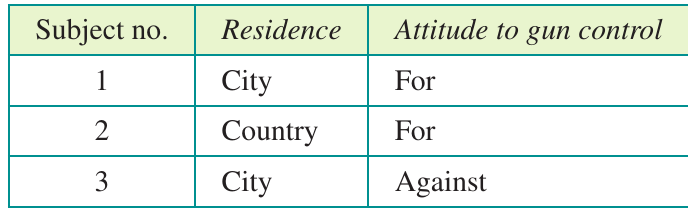
Imagine we want to investigate whether people's attitudes to gun control depend on where they live (city or country). We could collect data from a sample of people, recording two pieces of information about each person:
- Their residence (city or country)
- Their attitude to gun control (for or against)
Both of these are categorical variables, as they sort people into distinct categories rather than measuring quantities.
From separate tables to a two-way table
We could present each variable separately in simple frequency tables. For example, from a sample of 100 people:
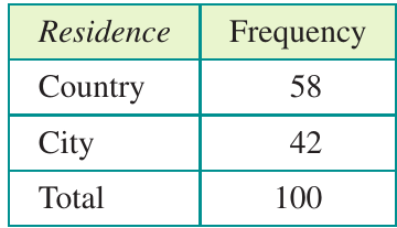
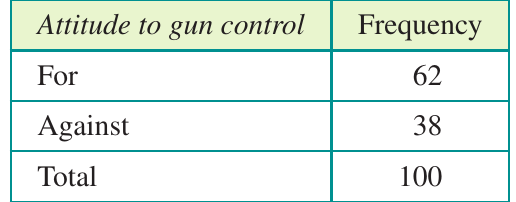
These separate tables tell us about each variable individually, but they don't reveal the relationship between them. To investigate the connection between residence and attitude, we need to combine this information into a single two-way frequency table.
Identifying explanatory and response variables
Before constructing our two-way table, we must identify which variable is which:
- The explanatory variable (EV) is the variable that might explain or influence the other variable
- The response variable (RV) is the variable that might depend on or be influenced by the explanatory variable
In our gun control example, we think a person's attitude might depend on where they live, but where someone lives doesn't depend on their attitude. Therefore:
- Residence is the explanatory variable
- Attitude to gun control is the response variable
Critical Convention for Table Construction
In two-way frequency tables, the response variable categories label the rows, and the explanatory variable categories label the columns. This convention is essential for correctly calculating percentages and interpreting associations.
Building the table
Following this convention, we create a table where:
- Columns represent residence (country and city)
- Rows represent attitude to gun control (for and against)
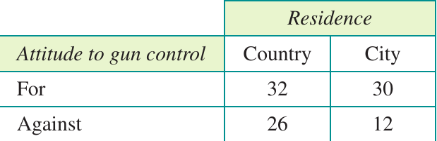
We then complete the table by adding row and column totals:
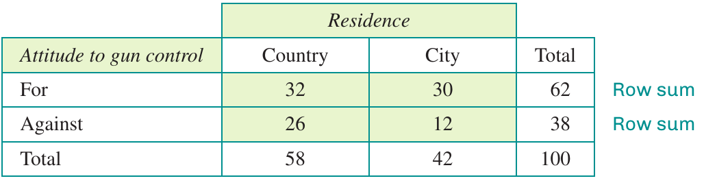
The shaded cells in the table contain the core data. The row sums show how many people overall had each attitude, while the column sums show how many people lived in each type of area.
Worked example: constructing a table from raw data
Worked Example: Building a Two-Way Table from Survey Data
Let's work through an example step by step. Suppose we ask ten Year 9 students whether they intend to go to university, and also record their gender.
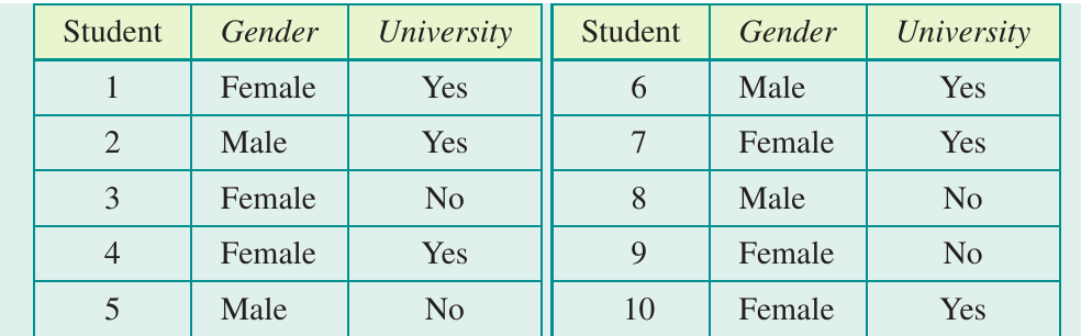
Step 1: Identify the explanatory and response variables.
Gender is the explanatory variable (a student's plans might depend on gender, but gender doesn't depend on plans). University intention is the response variable.
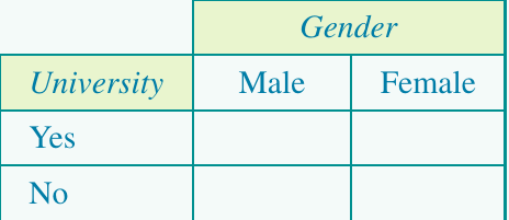
Step 2: Create the table structure with gender labelling columns and university intention labelling rows.
Step 3: Work through the data one person at a time, placing a tally mark in the appropriate cell.
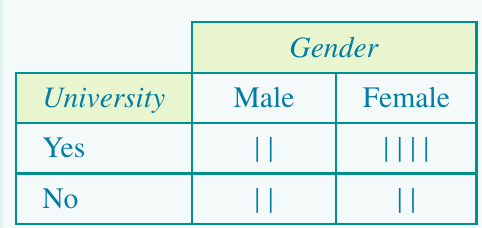
Step 4: Count the tally marks and add row and column totals.
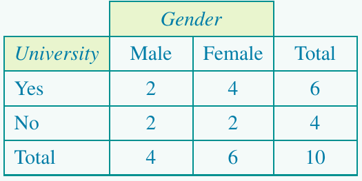
Check: The grand total (10) should equal the number of students in the sample.
Converting to percentaged two-way frequency tables
Why use percentages?
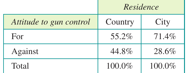
Looking at the gun control table, we see that more country people (32) favour gun control than city people (30). But does this really mean country people are more supportive? Not necessarily - there were more country people in the sample overall (58 versus 42). To make a fair comparison, we need to express the data as percentages.
Raw frequencies can be misleading when comparing groups of different sizes. Percentages allow us to compare proportions on an equal basis, regardless of the total number of people in each category.
Calculating column percentages
When the explanatory variable labels the columns (as it should), we calculate column percentages by dividing each cell frequency by its column sum, then multiplying by 100.
For the gun control example:
- Percentage of country people for gun control:
- Percentage of country people against gun control:
- Percentage of city people for gun control:
- Percentage of city people against gun control:
Round percentages to one decimal place unless dealing with very small percentages. This provides sufficient precision while maintaining readability.
The percentaged table now looks like this:
Using percentages to identify associations
Evidence of association
The percentaged table reveals something the frequencies concealed: city people are actually more supportive of gun control than country people (71.4% versus 55.2%). The difference between these percentages indicates that attitude to gun control is associated with residence.
Key Principle for Identifying Associations
If the percentages across a row differ substantially between columns, this indicates an association between the variables. If the percentages are similar, there is no evidence of association.
Writing a report
When reporting findings, quote relevant percentages and state your conclusion clearly:
In this sample of 100 people, a higher percentage of city people were for gun control than country people: 71.4% to 55.2%. This indicates that a person's attitude to gun control is associated with their place of residence.
Example of no association
Consider this table about whether mobile phones should be banned in cinemas, comparing Year 10 and Year 12 students:
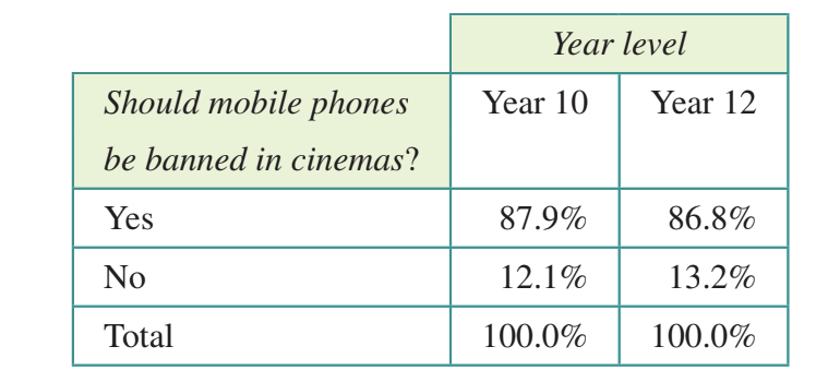
The percentages in favour are very similar (87.9% versus 86.8%). We would report:
In this sample of 100 students, the percentage of Year 10 and Year 12 students supporting a ban on mobile phones in cinemas is similar: 87.9% to 86.8%. This indicates that support for banning mobile phones in cinemas is not associated with year level.
Worked example: identifying association from a percentaged table
Worked Example: Identifying Association Using Column Percentages
Here's a table showing university intentions by gender for 200 Year 9 students:
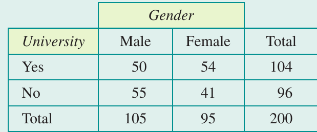
Step 1: Calculate column percentages.
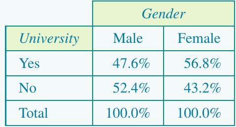
Step 2: Compare percentages across a row (choosing "Yes" to university).
A greater proportion of females (56.8%) than males (47.6%) intend to go to university.
Step 3: Write a report.
In this sample of 200 Year 9 students, a greater proportion of females than males (56.8% compared with 47.6%) were intending to go to university. There is an association between gender and intention to go to university.
Working with larger tables
The same principles apply when variables have more than two categories. For example, this table shows smoking status by education level:
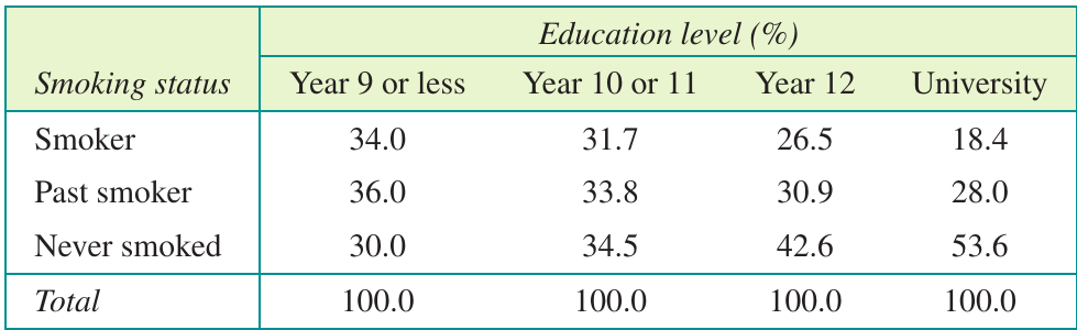
To identify an association, compare percentages across any row. Looking at the "Smoker" row:
The percentage of smokers steadily decreases with education level, from 34.0% for Year 9 or below to 18.4% for university graduates. This indicates that smoking is associated with level of education.
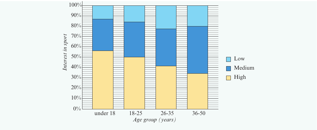
Here's another example showing interest in sport by age group:
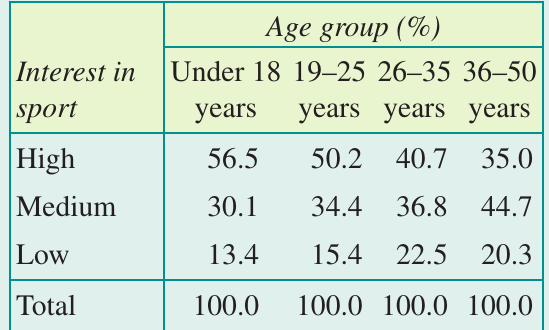
Identifying the explanatory variable: Age could explain interest in sport, but interest in sport cannot explain age. Therefore, age group is the explanatory variable.
Finding the association: Looking at the "High" interest row, we see high interest decreases with age (from 56.5% for under 18s to 35.0% for 36-50 year olds). This indicates an association between age and interest in sport.
Segmented bar charts
What is a segmented bar chart?
A segmented bar chart provides a visual way to display the information from a percentaged two-way frequency table. It consists of:
- One bar for each category of the explanatory variable
- Each bar divided into coloured segments representing the response variable categories
- Each bar reaching 100% in height
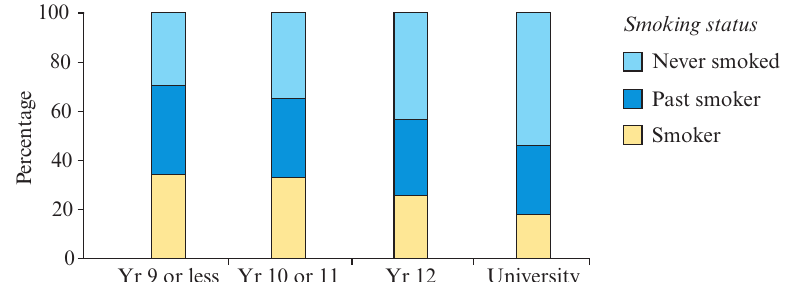
Segmented bar charts are particularly useful when presenting findings to audiences who may find tables difficult to interpret. The visual representation makes patterns and differences immediately apparent.
Constructing a segmented bar chart
To create a segmented bar chart for interest in sport by age group:
- Label the horizontal axis with the explanatory variable (age group)
- Scale the vertical axis from 0% to 100%
- Draw one bar for each age category
- Divide each bar into segments based on the percentages in the table
- Colour each segment consistently and add a legend
Interpreting segmented bar charts
Segmented bar charts make it easier to spot associations visually. Look for differences in the heights of corresponding segments across bars.
For example, this chart shows preferred holiday type by age:
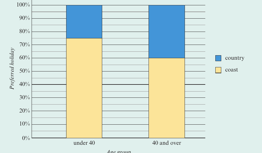
The coastal holiday segment (yellow) is noticeably larger for the under 40 group than for the 40 and over group. We can conclude:
There is an association between holiday preference and age. Those aged under forty are more likely to choose a coastal holiday (75%) than those aged forty or over (60%).
Exam tips
Essential Exam Tips
- Always identify which variable is explanatory and which is response before constructing a table
- Remember: response variable in rows, explanatory variable in columns
- Calculate column percentages when the explanatory variable is in columns
- Each column should add to 100% in a percentaged table
- Look for differences in percentages across rows to identify associations
- Quote specific percentages when writing reports
- If percentages are similar (within a few percentage points), conclude there is no association
- Check your work: all frequencies in a table should add up to the total sample size
Remember!
Key Points to Remember
- Association means two variables are related or linked in some way
- Two-way frequency tables summarise data from two categorical variables simultaneously
- The explanatory variable potentially influences the response variable
- Column percentages allow fair comparison when column totals differ
- An association exists when percentages differ substantially across columns for any row
- Segmented bar charts provide a visual alternative to percentaged tables
- Always quote relevant percentages and sample sizes when reporting findings
- Similar percentages indicate no association between variables