Investigating Associations Between Two Numerical Variables (VCE SSCE General Mathematics): Revision Notes
Investigating Associations Between Two Numerical Variables
Introduction to bivariate numerical data
When we investigate relationships between variables in statistics, sometimes we need to examine how two numerical variables relate to each other. For example, we might want to know whether there is a connection between the university participation rate in a country and the average hours worked by employees in that country. Both of these variables are numerical (they can be measured with numbers), so we need a special type of graph to display and analyse this relationship.
The first step in investigating an association between two numerical variables is to create a visual display of the data. This visual display is called a scatterplot.
Understanding the relationship between two numerical variables is fundamental to statistical analysis. Scatterplots provide a powerful visual tool that allows us to identify patterns and associations that might not be obvious from looking at raw data alone.
What is a scatterplot?
A scatterplot is a type of graph that allows us to display bivariate data when both variables are numerical. The term "bivariate" means we are working with two variables at once.
Key features of scatterplots:
- Each point on the scatterplot represents a single case (for example, one country, one person, or one observation)
- The scatterplot uses a coordinate system with two axes
- Standard practice is to place the response variable (RV) on the vertical axis (the -axis)
- The explanatory variable (EV) goes on the horizontal axis (the -axis)
Critical Convention to Remember:
Always place the explanatory variable on the horizontal (-axis) and the response variable on the vertical (-axis). This convention helps us understand which variable we think might be influencing the other. The explanatory variable is the one we believe might cause or explain changes in the response variable.
Worked example: University participation and hours worked
Worked Example: Creating a Scatterplot from Data
Let's investigate whether there is an association between university participation rate (the EV) and average hours worked (the RV) in nine different countries.
The Data:
| Participation rate (%) | 26 | 20 | 36 | 1 | 25 | 9 | 30 | 3 | 55 |
|---|---|---|---|---|---|---|---|---|---|
| Hours worked | 35 | 43 | 38 | 50 | 40 | 50 | 40 | 53 | 35 |
Building the scatterplot step by step
To create a scatterplot from this data, we plot each country as a single point using its two values. For example, the first country has a participation rate of 26% and workers average 35 hours per week. This gives us the point on our graph.
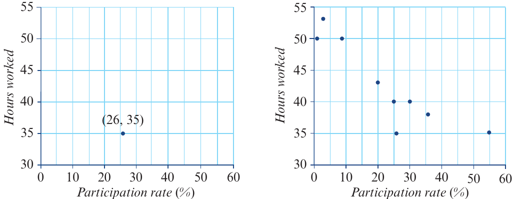
The image above shows two stages. On the left, we have plotted just one point for the country with 26% participation rate and 35 hours worked. On the right, we have plotted all nine countries, giving us a complete scatterplot.
What the scatterplot reveals:
Looking at the completed scatterplot, we can begin to see a pattern. As the university participation rate increases, the average hours worked tends to decrease. This suggests there may be a negative association between these two variables.
Using technology to create scatterplots
While we can draw scatterplots by hand, it is often more efficient and accurate to use a CAS calculator. Here we will look at how to create scatterplots using two different types of calculator.
Example data: Test scores
For this example, we'll use test score data from nine students who took two different tests:
| Test 1 | 10 | 18 | 13 | 6 | 8 | 5 | 12 | 15 | 15 |
|---|---|---|---|---|---|---|---|---|---|
| Test 2 | 12 | 20 | 11 | 9 | 6 | 6 | 12 | 13 | 17 |
We will treat Test 1 as the explanatory variable (it goes on the -axis) and Test 2 as the response variable (it goes on the -axis).
Creating a scatterplot on the TI-Nspire CAS
Step 1: Start a new document
- Press ctrl + N to create a new document
Step 2: Enter the data
- Select Add Lists & Spreadsheet
- Enter the Test 1 data into a column named test1
- Enter the Test 2 data into a column named test2
Step 3: Add a statistics graph
- Press ctrl + I and select Add Data & Statistics
Step 4: Create the scatterplot
- Click on Click to add variable on the -axis and select test1 (the explanatory variable)
- Click on Click to add variable on the -axis and select test2 (the response variable)
- The calculator will automatically create and scale the scatterplot
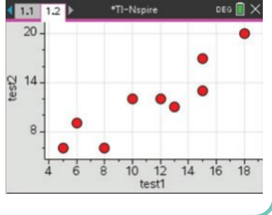
The resulting scatterplot shows a positive association between the two test scores. Students who scored higher on Test 1 generally also scored higher on Test 2. This is what we might expect—students who perform well in one test often perform well in another.
Creating a scatterplot on the ClassPad
Step 1: Open the Statistics application
- Enter the Test 1 data into a column named test1
- Enter the Test 2 data into a column named test2
Step 2: Configure the graph settings
- Tap the settings icon to open the Set StatGraphs dialogue box
- Set Draw to On
- Set Type to Scatter
- Set XList to main\test1
- Set YList to main\test2
- Leave Freq as 1 and Mark as square
- Tap Set to confirm
Step 3: Display the scatterplot
- Tap the graph icon in the toolbar to plot the scatterplot
Step 4: View full screen (optional)
- Tap the expand icon to see the scatterplot in full screen mode
If you have multiple graphs displayed, tap the data screen, select StatGraph, and turn off any unwanted graphs to avoid confusion. Having multiple graphs active simultaneously can make it difficult to interpret your results correctly.
Interpreting scatterplots
Once we have created a scatterplot, we need to be able to read and interpret the information it contains. Let's practice with an example.
Worked Example: Reading and Interpreting a Scatterplot
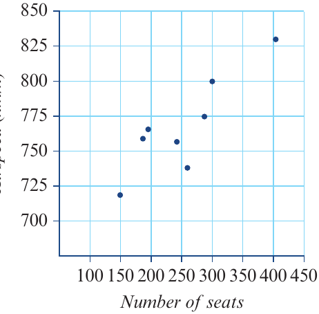
Consider this scatterplot showing the relationship between the number of passenger seats in commercial aircraft and their airspeed:
From this scatterplot, we can determine:
a) Which is the explanatory variable?
The explanatory variable is the number of seats. This is plotted on the horizontal (-axis). We might expect that the size of the aircraft (indicated by number of seats) could influence its airspeed.
b) What type of variable is airspeed?
Airspeed is a numerical variable because it is measured in km/h and can take any value within a range.
c) How many aircraft were investigated?
We count the number of points on the scatterplot. There are 9 points, so 9 aircraft were investigated.
d) What was the airspeed of the aircraft that has 300 seats?
We locate 300 on the horizontal axis and find the corresponding point. Reading across to the vertical axis, the airspeed is approximately 775 km/h.
Key Points to Remember:
- A scatterplot is used to display the relationship between two numerical variables
- Each point on a scatterplot represents one case or observation
- The explanatory variable (EV) is plotted on the horizontal axis (-axis)
- The response variable (RV) is plotted on the vertical axis (-axis)
- Scatterplots help us identify patterns and associations between variables
- Technology tools like CAS calculators make it quick and accurate to create scatterplots from data sets
- Always check which axis represents which variable when interpreting scatterplots