Investigating the Association Between a Numerical and a Categorical Variable (VCE SSCE General Mathematics): Revision Notes
Investigating the Association Between a Numerical and a Categorical Variable
Introduction
When investigating relationships between variables, we often need to examine how a numerical variable relates to a categorical variable. Understanding this relationship helps us identify patterns and make informed conclusions about our data.
A numerical variable is one that takes numerical values that can be measured or counted (such as height, test scores, or age). A categorical variable is one that takes values that are categories or labels (such as gender, yes/no responses, or age groups).
Example Context:
Suppose we want to investigate whether attending a revision class affects test scores. Here we have:
- Test score: a numerical variable (the number of marks achieved)
- Attended revision class: a categorical variable (with values 'yes' or 'no')
When investigating these associations, we identify:
- The response variable: the numerical variable we are measuring (e.g., test score)
- The explanatory variable: the categorical variable that may explain differences in the response (e.g., attended revision class)
Comparing distributions
To determine whether an association exists between our variables, we compare the distribution of the numerical variable across different categories. We look for differences in:
- Shape: Is the distribution symmetric, positively skewed, or negatively skewed?
- Centre: What is the typical value? (measured by the median)
- Spread: How variable are the values? (measured by the IQR)
- Outliers: Are there any unusual values?
If we notice meaningful differences in any of these characteristics across the categories, we can conclude that an association exists between the two variables.
For small datasets (when using dot plots or stem plots), we typically focus on comparing centre and spread, as it's often difficult to identify shape clearly with limited data.
Graphical displays for investigating associations
Parallel dot plots
Parallel dot plots are useful for displaying and comparing distributions for small datasets. Each category of the categorical variable has its own dot plot, positioned one above the other using the same horizontal scale.
This allows for easy visual comparison between the groups.
When to use parallel dot plots:
- Small datasets (typically fewer than observations per group)
- When you want to see individual data points
- When comparing two categories
How to interpret parallel dot plots:
- Calculate the median for each group
- Determine the IQR for each group
- Compare the medians to identify differences in centre
- Compare the IQRs to identify differences in spread
- Write a conclusion about whether an association exists
Worked Example: Using a parallel dot plot
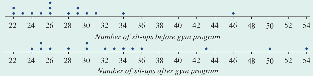
The parallel dot plots shown above display the number of sit-ups performed by people before and after completing a gym program.
Here, the numerical variable number of sit-ups is the response variable, and the categorical variable gym program (with values 'before' and 'after') is the explanatory variable.
Step 1: Locate the median number of sit-ups performed before and after the gym program.
Before: sit-ups
After: sit-ups
Step 2: Determine the IQR of sit-ups performed before and after the gym program.
Before: sit-ups
After: sit-ups
Step 3: Compare the values and draw a conclusion.
There are reasonable differences in both the median and IQR of the number of sit-ups performed before and after the gym program. This provides evidence that the number of sit-ups performed is associated with completing the gym program.
Report:
The median number of sit-ups performed after attending the gym program () is higher than the median number performed before attending (). The variability in the number of sit-ups has also increased from to . Thus we can conclude that the number of sit-ups performed is associated with completing the gym program.
Back-to-back stem plots
Back-to-back stem plots display two distributions side by side, sharing a common stem in the middle. The leaves for one category extend to the left, while the leaves for the other category extend to the right.
When to use back-to-back stem plots:
- Small datasets
- When comparing exactly two categories
- When you want to preserve the actual data values
How to interpret back-to-back stem plots:
- Determine the median for each group
- Calculate the quartiles and IQR for each group
- Compare the medians to identify differences in centre
- Compare the IQRs to identify differences in spread
- Write a conclusion about whether an association exists
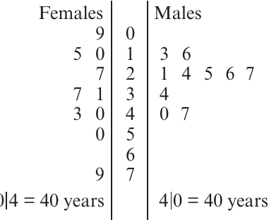
Worked Example: Using a back-to-back stem plot
Consider a back-to-back stem plot displaying the distribution of life expectancy (in years) for the same countries in and .
Here, the numerical variable life expectancy is the response variable, and year is the explanatory variable. Although year is numerical, because it only takes two values ( and ), we treat it as a categorical variable.
Step 1: Determine the median life expectancies for and .
: years
: years
Step 2: Determine the quartiles and IQR for each year.
: years
: years
Step 3: Compare the values and draw a conclusion.
The differences in median and IQR between and are sufficient to conclude that the distribution of life expectancy has changed over this time period.
Report:
There is an association between year and life expectancy. The median life expectancy has increased between and , from years to years. Over the same period, life expectancy has also become less variable ( in years; in years).
Parallel boxplots
Parallel boxplots are the most commonly used tool for investigating associations between a numerical and a categorical variable. They display one boxplot for each category of the categorical variable, positioned one above the other (or side by side) using the same scale.
When to use parallel boxplots:
- Larger datasets
- When comparing two or more categories
- When you want a clear visual summary including outliers
How to interpret parallel boxplots:
When using boxplots, we can compare all four aspects of the distributions: shape, centre, spread, and outliers.
- Compare the medians (centre)
- Compare the IQRs (spread)
- Compare the shapes (symmetric or skewed)
- Identify any outliers
- Write a conclusion about whether an association exists
Comparing distributions across two groups
Worked Example: Comparing pulse rates by gender
The parallel boxplots below compare resting pulse rates (in beats per minute) for a group of male students and female students.
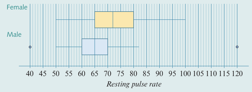
Here, the numerical variable resting pulse rate is the response variable, and the categorical variable gender is the explanatory variable.
Step 1: Compare the medians.
Female median: approximately beats per minute
Male median: approximately beats per minute
The median for females is higher than that for males.
Step 2: Compare the spread.
Female IQR: approximately beats per minute
Male IQR: approximately beats per minute
The IQR for females is greater than that for males.
Step 3: Compare the shape.
Both distributions are approximately symmetric.
Step 4: Locate any outliers.
There are two outliers for males: one at beats per minute and one at beats per minute.
Step 5: Write the report.
Report:
There is an association between resting pulse rate and gender. On average, the resting pulse rate for males is lower (median: male , female ) and less variable than that for females (IQR: male , female ). The distributions of resting pulse rates for both male and female students were approximately symmetric. One male was found to have an extremely low pulse rate of , while another had an extremely high pulse rate of .
Comparing distributions across more than two groups
Parallel boxplots are particularly useful when comparing more than two categories, as they allow for easy comparison across multiple groups.
Worked Example: Comparing salaries across age groups
The parallel boxplots below compare salary distributions for workers in a certain industry across four different age groups: – years, – years, – years, and – years.
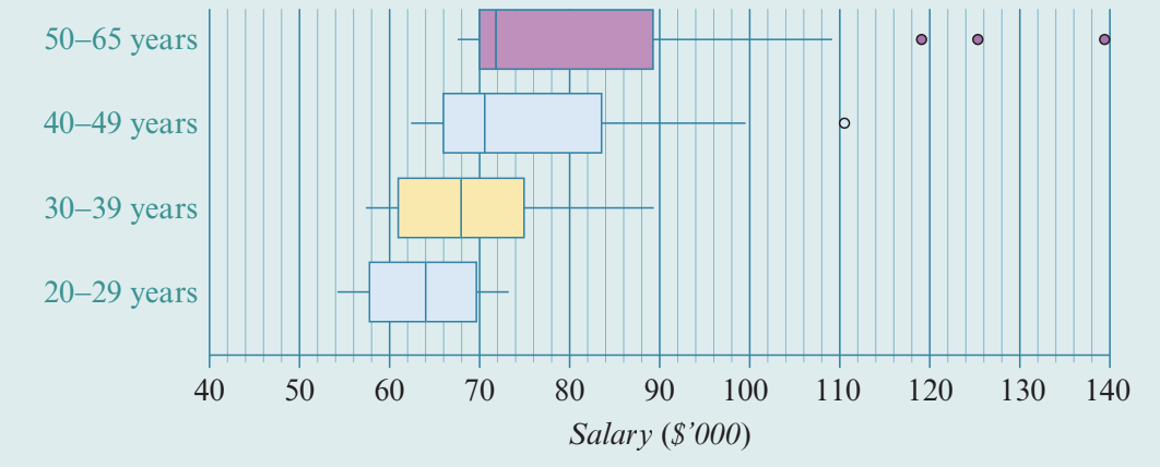
Here, the numerical variable salary is the response variable, and the categorical variable age group is the explanatory variable.
Step 1: Compare the medians.
The median salary increases with age:
- – years: $64,000
- – years: approximately $66,000
- – years: approximately $68,000
- – years: $72,000
Step 2: Compare the IQRs.
The IQR also increases with age:
- – years: approximately $12,000
- – years: approximately $20,000
Step 3: Compare the shapes.
The shape of the distribution changes with age group:
- – years: symmetric
- Progressively more positively skewed as age increases
Step 4: Locate the outliers.
- – years: no outliers
- – years: no outliers
- – years: one outlier at $110,000
- – years: three outliers at $119,000, $126,000, and $140,000
Step 5: Write the report.
Report:
In this industry there is an association between salary and age group. The median salaries increase across the age groups, from $64,000 for – year-olds to $72,000 for – year-olds. The salaries also become more variable, with the IQR increasing from around $12,000 for –-year-olds to around $20,000 for –-year-olds. The shape of the distribution of salaries changes with age group, from symmetric for –-year-olds to progressively more positively skewed as age increases. There are no outliers in the – and – age groups. Outliers begin to appear at $110,000 for the – age group, and at $119,000, $126,000, and $140,000 for the – age group.
Writing reports about associations
When writing a report about the association between a numerical and a categorical variable, include:
- A clear statement about whether an association exists
- Comparison of centre (medians) with specific values
- Comparison of spread (IQRs) with specific values
- Description of shape differences (if using boxplots)
- Mention of any outliers (if using boxplots)
- A conclusion that ties back to the context of the problem
Structure your report like this:
"There is [or is not] an association between [categorical variable] and [numerical variable]. [Compare centre with values]. [Compare spread with values]. [Describe shape if applicable]. [Mention outliers if applicable]."
Exam tip: Always support your conclusion with numerical evidence from the data. Don't just say "the median is higher" – state the actual values!
Key Points to Remember:
- To investigate associations between a numerical and categorical variable, compare the distribution of the numerical variable across different categories
- Use parallel dot plots or back-to-back stem plots for small datasets – compare median and IQR
- Use parallel boxplots for larger datasets or multiple categories – compare shape, centre, spread, and outliers
- An association exists if there are noticeable differences in the distributions across categories
- Always write a report that includes specific numerical values and relates back to the context
- The response variable is the numerical variable; the explanatory variable is the categorical variable