Pearson’s Correlation Coefficient (r) (VCE SSCE General Mathematics): Revision Notes
Pearson's Correlation Coefficient (r)
Introduction
When examining relationships between two numerical variables, we often want to measure not just whether an association exists, but how strong that association is. Pearson's correlation coefficient, denoted by , provides exactly this measurement for linear associations.
This coefficient gives us a numerical measure that tells us how closely the points in a scatterplot cluster around a straight line. The tighter the clustering, the stronger the relationship, and the higher the value of .
Key assumptions
Before using Pearson's correlation coefficient, two important conditions must be met:
- Both variables must be numerical – We need actual numerical data, not categories or labels.
- The association must be linear – The relationship between the variables should follow a straight-line pattern. If the relationship is curved or follows some other pattern, Pearson's is not appropriate.
Always create a scatterplot first to confirm that the association appears linear before calculating .
Properties of Pearson's correlation coefficient
Understanding the properties of helps us interpret its value correctly.
Range and interpretation
Pearson's correlation coefficient has several important properties:
- has a value between -1 and +1 – These are the minimum and maximum possible values.
- Larger values indicate stronger associations – The closer is to or , the stronger the linear relationship.
- The sign indicates direction:
- Positive means a positive linear association (as one variable increases, the other tends to increase)
- Negative means a negative linear association (as one variable increases, the other tends to decrease)
- close to zero indicates no linear association – The variables don't have a linear relationship.
Understanding Sign vs. Magnitude
The sign of (positive or negative) tells you the direction of the relationship, while the magnitude (absolute value) tells you the strength. For example, and both indicate very strong relationships – the negative sign simply means the relationship slopes downward instead of upward.
Extreme values
Understanding the extreme values helps us recognise different patterns:
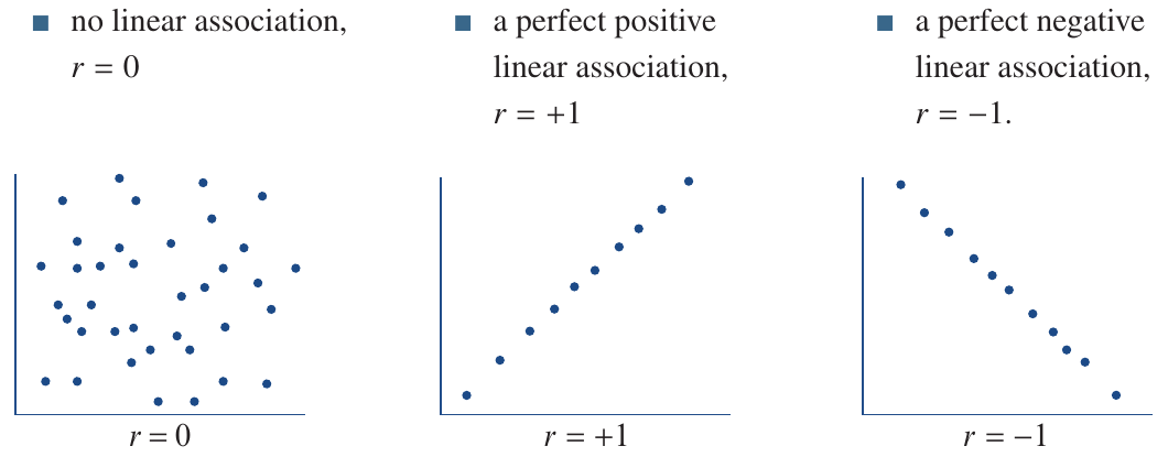
- : No linear association – points are scattered randomly with no clear linear pattern
- : Perfect positive linear association – all points lie exactly on an upward-sloping straight line
- : Perfect negative linear association – all points lie exactly on a downward-sloping straight line
These extreme values (, , ) are theoretical reference points. In real-world data, you'll almost never see exactly these values, but they help us understand what different correlation values mean.
Real-world values
In practice, we rarely see values of exactly , , or . Most real data gives us values somewhere in between. Here are some examples:
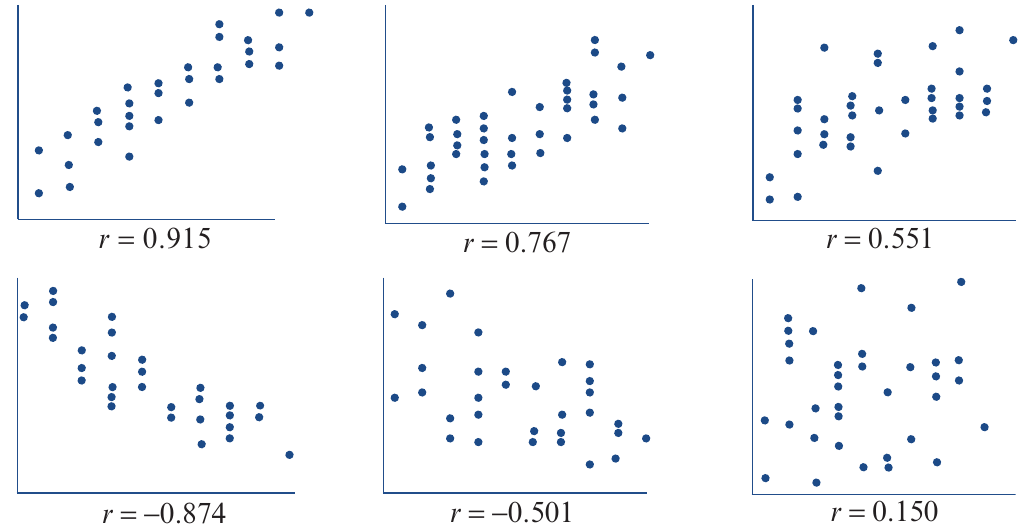
These scatterplots illustrate an important point: the stronger the association, the larger the magnitude of Pearson's correlation coefficient. Notice how:
- Strong correlations (like or ) show points tightly clustered around a line
- Moderate correlations (like or ) show more scatter but still a clear trend
- Weak correlations (like or ) show considerable scatter with less obvious patterns
Summary of properties
Key Properties of Pearson's Correlation Coefficient ():
- Measures the strength of a linear association, with larger values indicating stronger relationships
- Has a value between and
- Is positive if the direction of the linear association is positive
- Is negative if the direction of the linear association is negative
- Is close to zero if there is no association
Estimating correlation from scatterplots
Before calculating precisely using technology, it's useful to estimate its value by examining a scatterplot. This helps us check whether our calculated value makes sense and catch any potential errors.
Worked example: estimating values
Worked Example: Estimating Correlation Coefficients from Scatterplots
Let's estimate the correlation coefficient for these scatterplots:
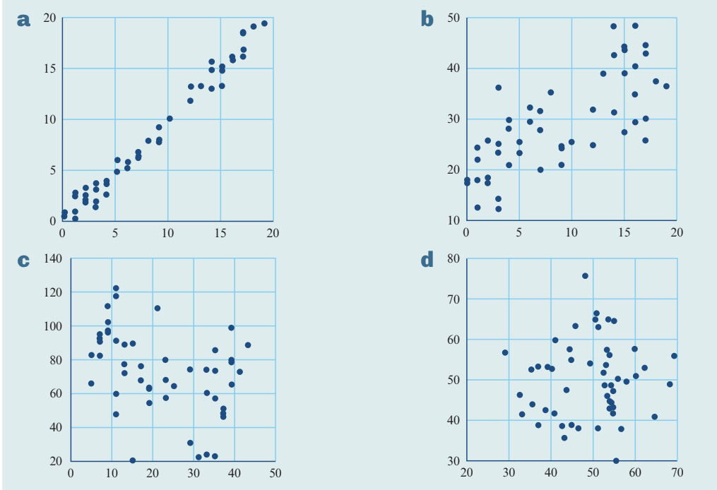
Plot a:
- The points are tightly clustered around an upward-sloping line
- The direction is positive
- Comparing to our reference plots, this looks similar to a strong positive correlation
- Estimate: r ≈ 0.9
Plot b:
- The points show an upward trend but are more loosely clustered
- The direction is positive
- The scatter is greater than plot a but not as loose as very weak correlations
- Estimate: r ≈ 0.7
Plot c:
- The points show a downward trend
- The direction is negative
- The clustering appears moderately loose
- Estimate: r ≈ -0.4
Plot d:
- The points appear randomly scattered with no clear pattern
- There's no obvious linear trend
- Estimate: r ≈ 0
Tips for estimation
Three-Step Approach to Estimating :
- First, determine the direction: Is the trend upward (positive) or downward (negative)?
- Then, assess the clustering: How tightly do the points cluster around an imaginary line?
- Compare to reference plots: Use known examples to guide your estimate
Calculating Pearson's correlation coefficient
The formula
The formula for calculating is:
Where:
- is the number of data pairs
- and are the mean and standard deviation of the values
- and are the mean and standard deviation of the values
This formula is quite tedious to calculate by hand, so we typically use technology instead. However, understanding the formula helps us appreciate that depends on how the variables vary together relative to their individual variations.
Important notes about calculation
Critical Considerations When Calculating :
Like the mean and standard deviation, Pearson's correlation coefficient:
- Is one of the most frequently computed descriptive statistics
- Should only be calculated after confirming a linear association exists (using a scatterplot)
- Can be very sensitive to outliers, particularly for small data sets
Always visually inspect your data before calculating !
Using technology to calculate
We'll use an example to demonstrate the calculation process.
Example data:
| Income ($'000) | 8.9 | 23.0 | 7.5 | 8.0 | 18.0 | 16.7 | 5.2 | 12.8 | 19.1 | 16.4 | 21.7 |
|---|---|---|---|---|---|---|---|---|---|---|---|
| CO₂ (tonnes) | 7.5 | 12.0 | 6.0 | 1.8 | 7.7 | 5.7 | 3.8 | 5.7 | 11.0 | 9.7 | 9.9 |
This data shows the per capita income and carbon dioxide emissions for 11 countries.
TI-Nspire CAS calculator
TI-Nspire CAS Steps:
- Start a new document and select Add Lists & Spreadsheet
- Enter the data into lists:
- Name the first list income
- Name the second list co2
- Open the Calculator application
- Access the statistics menu: Statistics > Stat Calculations > Linear Regression (a + bx)
- In the dialog box:
- Set X List to income
- Set Y List to co2
- Press OK to generate results
The output will show: r = 0.818344...
Rounded to three decimal places: r = 0.818
ClassPad calculator
ClassPad Steps:
- Open the Statistics application
- Enter the data:
- Income in List1
- CO₂ in List2
- Select Calc > Regression > Linear Reg from the menu
- In the Set Calculation dialog box, confirm your selections
- Tap OK
The output will show: r = 0.818344...
Rounded to three decimal places: r = 0.818
Worked example: test scores
Worked Example: Calculating Correlation Between Test Scores
Scores in two tests for a group of ten students are given below. Determine the value of the correlation coefficient, rounded to four decimal places.
| Score test 1 (30) | 14 | 17 | 26 | 17 | 15 | 13 | 29 | 25 | 17 | 30 |
|---|---|---|---|---|---|---|---|---|---|---|
| Score test 2 (20) | 9 | 11 | 15 | 13 | 10 | 9 | 16 | 14 | 12 | 19 |
Solution:
- Enter the data into lists named test1 and test2
- Follow the calculator instructions for your device
- Result: r = 0.9499
Interpretation: This strong positive correlation suggests students who performed well on test 1 also tended to perform well on test 2.
Classifying the strength of linear associations
Once we've calculated , we need to interpret what the value means. We use standard guidelines to classify the strength of the association.
Classification guidelines
Here's the complete classification system:
| Value of | Strength of association |
|---|---|
| strong positive association | |
| moderate positive association | |
| weak positive association | |
| no association | |
| weak negative association | |
| moderate negative association | |
| strong negative association |
Important Points About Classification:
- The sign of tells you the direction (positive or negative)
- The magnitude (absolute value) tells you the strength
- Values close to zero indicate no linear association
Worked example: classification
Worked Example: Classifying Correlation Strength
Classify the strength of each of these linear associations:
a)
The value falls in the range
Classification: weak, positive
b)
The value falls in the range
Classification: moderate, negative
c)
The value falls in the range
Classification: strong, positive
d)
The value falls in the range
Classification: no association
Practice classifications
Here are some additional examples:
- → strong, positive (between 0.75 and 1)
- → strong, negative (between -1 and -0.75)
- → no association (between -0.25 and 0.25)
- → moderate, negative (between -0.75 and -0.5)
Correlation and causation
Critical Concept: Correlation Does NOT Imply Causation
This is one of the most important concepts in statistics: correlation does not imply causation.
Even a strong correlation between two variables does NOT prove that changing one variable will cause a change in the other. It only suggests that this might be a possible explanation.
Understanding the difference
A strong correlation between two variables means they vary together:
- If the correlation is positive, both variables tend to increase together
- If the correlation is negative, one tends to decrease as the other increases
However, even a strong correlation is not sufficient evidence that changing one variable will cause a change in the other. It only suggests that this might be a possible explanation.
Example: smoking and heart disease
Suppose we find a high correlation between smoking rates and incidence of heart disease across different countries. Can we conclude that smoking causes heart disease based solely on this correlation?
No, we cannot. Here's why:
Alternative explanations might exist. For example:
- People who smoke might also neglect other lifestyle factors like exercise and diet
- It could be lack of exercise that actually causes heart disease
- Smoking and heart disease might both be related to a third factor we haven't measured
Correct vs incorrect interpretations
Distinguishing Correlation from Causation:
Correct interpretation:
"Those countries which have higher rates of smoking also tend to have higher incidence of heart disease."
This statement describes the association without claiming causation.
Incorrect interpretations:
- "As the smoking rate increases, the incidence of heart disease will also increase."
- "Reducing the smoking rate would also reduce the incidence of heart disease."
These statements incorrectly imply that changing one variable will cause a change in the other.
Worked example: income and emissions
Worked Example: Interpreting Correlation Correctly
The correlation coefficient between per capita income and carbon dioxide emissions for 11 countries is . Does this mean that reducing per capita income would result in decreased carbon dioxide emissions?
Answer:
No, we cannot infer causation, even when there is a strong correlation.
Correct interpretation:
"We can only conclude that those countries with higher per capita income also tend to have higher carbon dioxide emissions."
This describes the observed association without claiming that changing income would cause a change in emissions. Other factors might explain both variables, or the relationship might work in the opposite direction.
Why this matters
Being careful about the distinction between correlation and causation is essential because:
- Incorrect causal interpretations can lead to poor decisions
- Many factors can create correlations without causal relationships
- Establishing causation requires more than just observing correlation (such as controlled experiments)
Remember: Correlation shows that variables are associated, but not that one causes the other.
Remember!
Key Points to Remember:
- Pearson's correlation coefficient () measures the strength of a linear association between two numerical variables
- ranges from to , with values closer to these extremes indicating stronger relationships
- The sign tells you direction (positive or negative), while the magnitude tells you strength
- Always check assumptions: both variables must be numerical, and the association must be linear (check with a scatterplot first)
- Use technology to calculate – the formula is tedious by hand, and calculators give accurate results quickly
- Classify strength using standard ranges: weak ( to ), moderate ( to ), or strong ( to )
- Correlation does NOT imply causation – a strong correlation shows variables are associated but doesn't prove one causes the other