Scatterplots (VCE SSCE General Mathematics): Revision Notes
Scatterplots
Introduction to bivariate data analysis
When working with bivariate data (data involving two variables), we often want to explore whether there's a relationship between them. The key question we ask is: "Does knowing the value of one variable give us information about the value of the other variable?"
For example, imagine looking at the relationship between the time a student spends studying and their exam mark. It makes sense that more study time might lead to better marks. In this case, study time helps predict or explain the exam mark.
The fundamental question in bivariate data analysis is: Can one variable help us understand or predict the other? This question guides how we organize and display our data.
Response and explanatory variables
When exploring relationships between two numerical variables, we need to identify which variable does the explaining and which variable responds.
Explanatory variable (EV): This is the variable we use to explain or predict the value of the other variable. It's the one we think might have an effect.
Response variable (RV): This is the variable that may change in response to the explanatory variable. It's the outcome we're interested in predicting or understanding.
Study Time and Exam Marks
In the study time example:
- Study time is the explanatory variable (it helps explain the mark)
- Exam mark is the response variable (it responds to the amount of study time)
This is because we expect that changes in study time will affect exam marks, not the other way around.
Alternative terminology: You may also see these called independent variable (IV) and dependent variable (DV) respectively. These terms mean the same thing:
- EV = IV (the variable that stands alone)
- RV = DV (the variable that depends on the other)
Identifying response and explanatory variables
To identify which variable is which, ask yourself: "Which variable am I using to predict or explain the other?" Let's look at some examples.
Example 1: Age and sleep
Question: Do older people sleep less?
Variables: Age and time spent sleeping
Solution:
We want to see if age explains how long people sleep.
- EV: Age
- RV: Time spent sleeping
Example 2: Kilojoule consumption and weight loss
Question: Is there an association between kilojoule consumption and weight loss?
Variables: Kilojoule consumption and weight loss
Solution:
We're investigating whether the amount people eat (kilojoules) explains their weight loss.
- EV: Kilojoule consumption
- RV: Weight loss
Example 3: Height and wrist circumference
Question: Can we predict a person's height from their wrist circumference?
Variables: Height and wrist circumference
Solution:
Since we want to predict height from wrist circumference, wrist circumference is the predictor.
- EV: Wrist circumference
- RV: Height
The question matters! We could reverse this question and ask "Can we predict wrist circumference from height?" In that case, height would be the EV and wrist circumference would be the RV.
The way you phrase your research question determines which variable is explanatory and which is response, especially when there's no obvious cause-and-effect relationship.
Constructing a scatterplot manually
Once you've identified your variables, the next step is to create a visual display of your data. This display is called a scatterplot.
What is a scatterplot?
A scatterplot is a graph that helps us visualize bivariate data when both variables are numerical.
Key features:
- Each point on the plot represents one case (e.g., one person, one car, one day)
- The horizontal (x) axis shows the explanatory variable (EV)
- The vertical (y) axis shows the response variable (RV)
Axis convention: When constructing a scatterplot, always remember:
- EV goes on the x-axis (horizontal)
- RV goes on the y-axis (vertical)
Think: "X for eXplanatory, Y for Yielded result"
Constructing a scatterplot step by step
Let's create a scatterplot showing the relationship between study time and exam marks for 10 students.
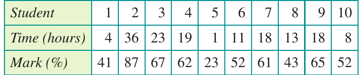
For each student:
- The x-coordinate represents time spent studying (in hours)
- The y-coordinate represents the mark obtained (as a percentage)
Worked Example: Plotting Student 1
Student 1 studied for hours and obtained a mark of . This is plotted as the point .
Coordinates:
where:
- (study time on horizontal axis)
- (mark on vertical axis)
The left plot shows just Student 1's data point. The right plot shows all 10 students, with one point for each student. Notice how the points suggest a pattern: generally, more study time is associated with higher marks.
Understanding a scatterplot
Scatterplots don't just display data—they reveal patterns and relationships. Let's practice reading and interpreting information from a scatterplot.
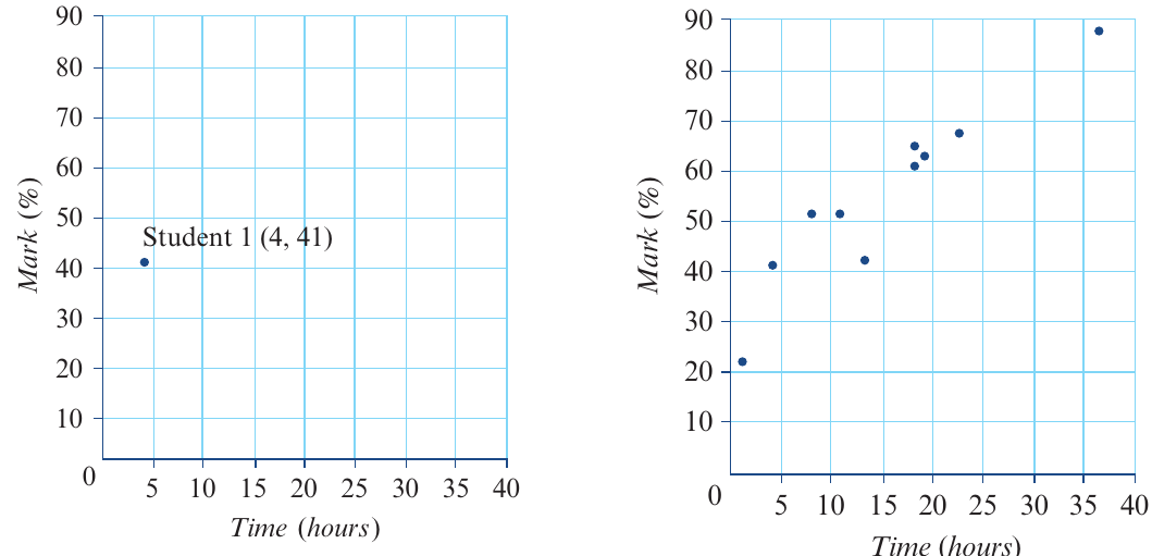
Example 4: Car age and price
The scatterplot below shows data about second-hand cars, investigating the relationship between a car's age and its price.
Worked Example: Interpreting a Scatterplot
Question 1: Which is the explanatory variable and which is the response variable?
The explanatory variable appears on the horizontal axis and the response variable on the vertical axis.
- EV: Age
- RV: Price
Question 2: How many cars are in the data set?
Count the number of points on the scatterplot.
Answer: cars
Question 3: How old is the circled car? What is its price?
Look at the coordinates of the circled point:
- The x-coordinate gives the age
- The y-coordinate gives the price
Answer: The car is years old and costs $12,000
When reading coordinates from a scatterplot, always check which axis represents which variable. The position along the horizontal axis tells you the EV value, and the position along the vertical axis tells you the RV value.
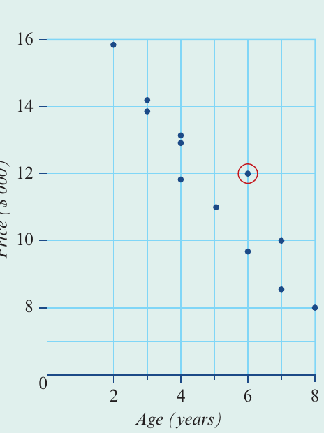
Using a CAS calculator to construct a scatterplot
While understanding how to construct scatterplots manually is important, you'll typically use a CAS calculator for this task in practice. Both the TI-Nspire CAS and ClassPad can create scatterplots efficiently.
General process (both calculators)
Steps for creating a scatterplot on a CAS calculator:
- Enter your data into lists (one list for each variable)
- Open the statistics or graphing application
- Select scatterplot as your graph type
- Assign the EV to the x-axis and the RV to the y-axis
- The calculator will automatically scale and display the plot
Exam tip: Make sure you can:
- Enter data correctly into your calculator
- Identify which variable goes on which axis
- Read coordinates from points on the scatterplot
The images above show the process on a CAS calculator, from entering data to viewing the completed scatterplot.
Common CAS mistakes to avoid:
- Swapping the EV and RV when setting up your plot
- Entering data incorrectly into lists
- Forgetting to clear old data before entering new data
- Not checking your axis labels match your variables
Always double-check your variable assignment before creating the plot!
Remember!
Key Points to Remember:
- Explanatory variable (EV) predicts or explains the response variable (RV)
- The EV goes on the horizontal (x) axis, the RV goes on the vertical (y) axis
- Each point on a scatterplot represents one case from your data set
- Scatterplots are used when both variables are numerical
- The way you phrase your research question helps determine which variable is the EV and which is the RV
- While you should understand manual construction, use your CAS calculator for efficiency in exams
- Remember: "EV Explains, RV Responds" and "Horizontal helps (EV), Vertical varies (RV)"