Production Possibility Diagrams (AQA A-Level Economics): Revision Notes
Production Possibility Diagrams
What is a production possibility diagram?
A production possibility diagram is one of the most important tools in economics. It helps us understand how economies deal with the fundamental problem of scarcity and the need to make choices about what to produce.
A production possibility frontier (PPF) is a curve that shows all the different possible combinations of two goods or types of goods that can be produced when all resources in the economy are being used to their maximum capacity with no waste. The PPF is sometimes also called a production possibility curve.
The key assumptions behind a PPF are:
- All available resources are being fully employed (nothing is left unused)
- Resources are being used efficiently (no waste)
- The level of technology and technical progress is fixed
Technical progress refers to new and improved methods of producing goods, as well as new techniques that allow us to produce more output from the same amount of scarce resources.
Understanding the basic PPF diagram
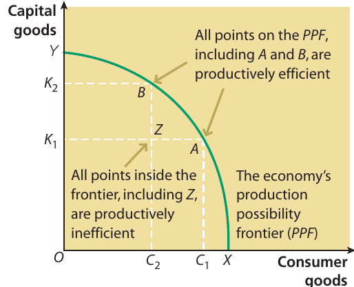
Let's look at a typical PPF diagram showing the trade-off between producing capital goods and consumer goods for an entire economy:
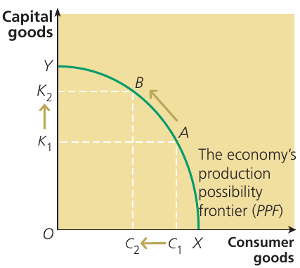
This diagram illustrates several important features:
The PPF curve connects points Y, B, and A. Each point on the curve represents a different combination of capital goods and consumer goods that the economy can produce. For example:
- Point Y shows the maximum output of capital goods when no consumer goods are produced
- Point X (on the horizontal axis) shows the maximum output of consumer goods when no capital goods are produced
- Points A and B show different combinations where both types of goods are produced
The shape of the curve is important. Most PPFs are concave (bowed outward from the origin). This shape reflects the fact that resources are not perfectly adaptable between different uses. As you produce more of one good, you have to sacrifice increasingly larger amounts of the other good.
The choice between capital goods and consumer goods is particularly significant for an economy. Capital goods (like machinery and factories) help produce other goods in the future, while consumer goods (like food and clothing) satisfy immediate wants and needs. The combination chosen reflects society's decisions about allocating scarce resources between competing uses.
Macroeconomic applications of PPF diagrams
Production possibility frontiers can be used to illustrate several important macroeconomic concepts. Let's explore two key applications.
Using a PPF to show economic growth
Economic growth is defined as the increase in the potential level of real output that the economy can produce over a period of time. It's important to note this refers to potential output, not actual output at any given moment.
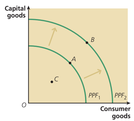
This diagram shows two forms of economic growth:
Short-run economic growth occurs when the economy moves from a point inside the PPF (like point C) to a point on the frontier (like point A). This happens when previously unused or underutilised resources are brought into production. The economy is taking up slack and making use of spare capacity. The PPF itself hasn't moved - the economy is simply moving towards its existing productive potential.
Short-run growth: Movement from inside the PPF to the frontier
- Uses previously idle resources
- Takes up spare capacity
- The frontier itself doesn't shift
- Economy moves toward existing potential
Long-run economic growth is shown by an outward movement of the entire frontier from PPF₁ to PPF₂. The shift from point A to point B represents this type of growth. Long-run economic growth increases the total productive capacity of the economy. This can happen through:
- Investment in new capital goods
- Improvements in technology
- Increases in the workforce
- Better education and training (improving human capital)
- Discovery of new natural resources
Key distinction: Short-run growth = movement TO the frontier. Long-run growth = outward SHIFT of the frontier itself. Many students confuse these two concepts!
Using a PPF to show full employment and unemployment
Production possibility diagrams are also useful for illustrating the difference between full employment and unemployment in an economy.
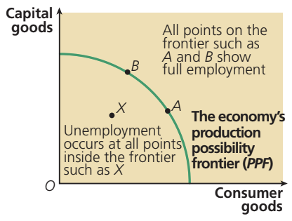
All points on the production possibility frontier (such as points A and B) represent situations where the economy is achieving full employment. This means that all who are able and willing to work are employed, and all available resources are being utilised to their maximum potential.
Full employment occurs when everyone who is able and willing to work has a job. It's important to understand that full employment doesn't mean zero unemployment - there will always be some people between jobs or temporarily out of work.
By contrast, a point inside the PPF (such as point X) represents unemployment. When the economy operates at a point inside the frontier, some resources (including labour) are not being employed. There is unused capacity in the economy. If long-run economic growth were to move the PPF outwards, points A and B on the old frontier would then be inside the new frontier and would represent unemployment relative to the new productive potential.
"ON is efficient, IN is not" - A helpful memory aid:
- Points ON the frontier = full employment and efficiency
- Points INSIDE the frontier = unemployment and inefficiency
Unemployment means that not all of those who are able and willing to work are employed. This represents wasted potential in the economy and is associated with productive inefficiency.
Microeconomic applications of PPF diagrams
While the examples above focused on the whole economy (macroeconomic applications), PPF diagrams can also be used at the microeconomic level to illustrate decisions made by individual firms or industries.
Scarcity, resource allocation and choice
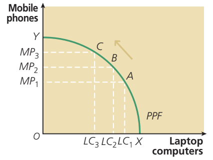
This diagram shows a microeconomic PPF for a firm that can produce mobile phones and laptop computers. We can identify this as a microeconomic diagram because it focuses on the production choices of a single firm rather than the entire economy.
Resource allocation is the process through which available factors of production are assigned to produce different goods and services. In a modern economy, resources must be allocated among many competing uses such as food, cars, healthcare, defence, and countless other goods and services.
The PPF in the diagram shows the different possible ways scarce resources can be allocated between mobile phone and laptop computer production:
- Point Y shows maximum mobile phone production (zero laptop computers)
- Point X shows maximum laptop computer production (zero mobile phones)
- Points between these extremes show various combinations of both products
Point C shows one particular allocation of resources. At this point, the firm produces MP₂ mobile phones and LC₂ laptop computers. Compared to the resource allocation at point A, point B shows the effect of shifting more resources into mobile phone production, which means fewer resources are allocated to laptop computer production.

Large companies like Apple must constantly make resource allocation decisions. They must decide how to divide their resources between different product lines, research and development, marketing, and other activities. These decisions involve trade-offs and opportunity costs.
Opportunity cost revisited
Production possibility diagrams provide an excellent way to illustrate the concept of opportunity cost. Remember that opportunity cost is the value of the next best alternative foregone when a choice is made.
Let's work through an example using the microeconomic PPF for mobile phones and laptop computers:
Suppose the firm initially produces MP₁ mobile phones and LC₁ laptop computers (point A). If the manufacturer decides to increase mobile phone production from MP₁ to MP₂, then laptop computer production must fall from LC₁ to LC₂. Moving from point A to point B on the curve, the fall in computer production is the opportunity cost of increasing mobile phone production.
The slope of the PPF shows opportunity cost - what must be sacrificed to produce more of another good. The steeper the slope, the higher the opportunity cost.
The shape of the PPF tells us something important about opportunity costs. The curve slopes downward and is concave (bowed outward). This shape shows that opportunity costs increase as more of a good is produced.
Here's why: When mobile phone production increases from MP₁ to MP₂, laptop computer production falls by LC₁ - LC₂. But suppose mobile phone production increases again by the same amount (MP₃ - MP₂ is the same as MP₂ - MP₁). In this situation, shown at point C on the curve, more laptop computers must be sacrificed than before: LC₃ - LC₂ is larger than LC₂ - LC₁.
The slope of the PPF shows the opportunity cost of producing more mobile phones in terms of the laptop computers that must be sacrificed. As we move up the curve from point A to point B to point C, the slope becomes steeper. This means the opportunity cost of producing mobile phones increases as more mobile phones are produced. Each additional mobile phone requires sacrificing a greater number of laptop computers than the previous increase.
This pattern of increasing opportunity costs occurs because resources are not perfectly adaptable between different uses. Some resources are better suited for making mobile phones, while others are better for making laptop computers. As production of one good increases, the economy must start using resources that are less and less well-suited to that task.
Worked example: calculating opportunity cost
Worked Example: Calculating Opportunity Cost with Apples and Pears
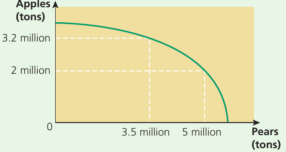
A country is currently producing 3.2 million tons of apples and 3.5 million tons of pears. The country wants to calculate the opportunity cost of increasing pear production to 5 million tons.
Step 1: Identify the initial and final positions
- Initial: 3.2 million tons apples, 3.5 million tons pears
- Final: ? million tons apples, 5 million tons pears
Step 2: Determine the change in pear production
- Increase in pears = 5 - 3.5 = 1.5 million tons
Step 3: Find the corresponding change in apple production
- Looking at the diagram, when pears increase to 5 million tons, apples fall to 2 million tons
- Decrease in apples = 3.2 - 2 = 1.2 million tons
Step 4: State the opportunity cost
- The opportunity cost of increasing pear production by 1.5 million tons is the sacrifice of 1.2 million tons of apples
This example demonstrates how to use a PPF to calculate opportunity costs by identifying the trade-off between two goods.
Productive efficiency and production possibility diagrams
The concept of productive efficiency is closely linked to production possibility frontiers.
Productive efficiency for the economy as a whole occurs when it is impossible to produce more of one good without producing less of another. For an individual firm, productive efficiency occurs when the average total cost of production is minimised.
Understanding productive efficiency using the PPF
All points on the production possibility frontier (including points A and B in the diagram) are productively efficient. At these points:
- All available resources are fully employed
- Resources are being used in the most efficient way possible
- Output is maximised from available inputs
- It's impossible to produce more of one good without producing less of the other
By contrast, all points inside the frontier (including point Z) are productively inefficient. At these points:
- Some resources are not being employed
- Resources are not being used efficiently
- The economy could produce more of both goods (or more of one without sacrificing the other)
- Output is not maximised from available inputs
Critical distinction:
- ON the frontier = Productively efficient (maximum output achieved)
- Inside the frontier = Productively inefficient (wasted resources and potential)
Productive inefficiency is often associated with unemployment. When resources (especially labour) are unemployed, the economy operates inside its PPF.
Movement along the PPF
Consider a movement along the PPF from point A to point B. The diagram shows that when moving along the frontier, more capital goods can be produced, but only by reducing production of consumer goods. This represents another way of understanding productive efficiency: when the economy is productively efficient, producing more of one good requires giving up some production of other goods.
By contrast, when the economy is productively inefficient at point Z, more capital goods and consumer goods can both be produced by taking up the slack in the economy and making better use of idle resources. Moving from point Z to a point on the frontier increases output without requiring trade-offs between different goods.
Drawing a PPF from given data
Sometimes you'll need to draw a production possibility frontier from data provided in a table. Let's work through an example:
Worked Example: Drawing a PPF from Production Data
| Tanks | Military aircraft |
|---|---|
| 100 | 0 |
| 90 | 10 |
| 80 | 20 |
| 70 | 30 |
| 60 | 40 |
| 50 | 50 |
| 40 | 60 |
| 30 | 70 |
| 20 | 80 |
| 10 | 90 |
| 0 | 100 |
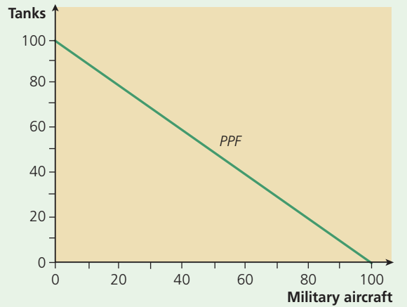
Step 1: Identify the axes
- Horizontal axis: Military aircraft (0 to 100)
- Vertical axis: Tanks (0 to 100)
Step 2: Plot the points from the table
- Each row gives a combination that can be produced
- Plot all 11 points on the graph
Step 3: Connect the points
- The PPF connects all the plotted points
- In this case, the result is a straight line
Key observation: Unlike most PPFs shown earlier, this one shows constant opportunity cost. Each time 10 extra tanks are produced, exactly 10 military aircraft must be sacrificed. This is why the PPF is a straight line rather than a curve.
The straight line PPF is positioned between the two production possibility extremes, showing all the possible combinations of tanks and military aircraft that can be produced with available resources.
While most real-world PPFs are curved (showing increasing opportunity costs), the straight-line case is sometimes used in economic analysis to simplify the model or when opportunity costs genuinely are constant.
Exam tips for PPF diagrams
Exam Success Tips for PPF Diagrams
When working with production possibility diagrams in your economics studies, keep these points in mind:
-
You must be able to both draw and interpret PPF diagrams. They appear in both microeconomics and macroeconomics questions.
-
At the micro level, PPFs illustrate scarcity, choice, opportunity cost, and productive efficiency for individual firms or industries.
-
At the macro level, PPFs can illustrate economic growth, full employment, and unemployment for the whole economy.
-
Always label your axes clearly and mark specific points referred to in the question.
-
Remember that points on the frontier are productively efficient, while points inside are productively inefficient.
-
An outward shift of the entire frontier represents long-run economic growth.
-
The shape of the PPF (usually concave/bowed outward) reflects increasing opportunity costs.
-
Be prepared to calculate opportunity costs by identifying what must be sacrificed when moving from one point on the PPF to another.
Summary
Key Points to Remember:
-
A production possibility frontier shows all the different combinations of goods that can be produced when all resources are fully and efficiently employed.
-
Points on the PPF are productively efficient; points inside are productively inefficient and indicate unemployment or waste.
-
Long-run economic growth is shown by an outward shift of the entire PPF, representing an increase in the economy's productive capacity.
-
The slope of the PPF shows opportunity cost - what must be sacrificed to produce more of another good.
-
PPFs can be used in both macroeconomic contexts (showing choices for the whole economy) and microeconomic contexts (showing choices for individual firms).
-
Memory aid: "OUT means growth" - an OUTward shift represents economic growth.