Inequality and Poverty (Edexcel A-Level Economics A): Revision Notes
Inequality and Poverty
Introduction to the global challenge
One of the most pressing economic challenges facing the world today is the significant inequality in how resources are distributed globally. As of November 2020, the world population reached approximately 8 billion people. The majority of these people live in what are termed 'developing countries'. Current estimates suggest that around 8.3% of the world's population (approximately 641.4 million people) live in absolute poverty, with more than half of these individuals residing in sub-Saharan Africa.
The impact of recent global events has exacerbated this situation. The World Bank estimates that between 75 and 95 million additional people will be forced into absolute poverty due to the combined effects of the COVID-19 pandemic and the war in Ukraine.
Beyond this global inequality between nations, there is also considerable inequality in the distribution of income and wealth within individual societies. The extent of this inequality varies significantly between countries.
Understanding inequality and poverty requires examining both developed and developing countries, exploring how inequality is measured, investigating its causes, and considering the policies that can be implemented to address these issues.
Developed and developing countries
Understanding development
Development is a concept that extends far beyond simple economic growth. When we talk about economic growth, we refer to a society's ability to expand its productive capacity. However, true development encompasses much more than this single dimension.
Economic growth represents an essential component of development because it increases the resources available to society. Without additional resources, meaningful development becomes extremely difficult. However, growth alone is not sufficient for development to occur. The additional resources generated through growth must be used wisely, and the resulting changes must represent the 'right' sort of growth that genuinely improves people's lives.
Development also involves addressing poverty alleviation. A country cannot truly be considered 'developed' if a substantial portion of its population lives in absolute poverty. Furthermore, development requires structural change within the economy and, in some cases, significant changes in institutions, cultural attitudes, and political systems.
Key characteristics of development:
- Expansion of productive capacity through economic growth
- Wise use of additional resources to meet genuine development objectives
- Reduction in absolute poverty levels
- Structural changes in the economy
- Institutional improvements
- Social and cultural advancement
Identifying developing countries
Defining what constitutes a developing country proves challenging because development encompasses multiple dimensions rather than a single measurable factor. A country cannot be classified solely based on average incomes because the concept of development includes various aspects. For example, a country might have relatively high average incomes but still be characterised by high poverty rates, significant inequality, or weak provision of education and healthcare services.
The countries referred to as developing are primarily concentrated in four major regions:
- Sub-Saharan Africa
- Latin America
- South Asia
- South East Asia
It's important to note that this classification excludes some countries within the 'developing' range but relatively few. China sometimes requires separate consideration rather than being grouped with South East Asia, partly due to its enormous size and partly because it has followed a distinctly different development path.
When discussing economic development, it's crucial to remember the wide diversity between countries classified as developing. Although it may be tempting to generalise, each country possesses different characteristics and faces different configurations of problems and opportunities. Therefore, a policy that proves effective in one country may fail completely in a different part of the world.
Inequality between countries
Measuring living standards with GNI per capita
One important measure for assessing development levels is Gross National Income (GNI) per capita, which represents the average level of income per person in the population. Although this indicator has limitations (which we'll explore later), it helps illustrate the inequality that exists between countries around the world.
The measure used to compare countries is GNI per capita measured in purchasing power parity dollars (PPP$). This measurement approach is crucial because using official exchange rates to convert from local currency into US dollars can be highly misleading. The US dollar measure understates the real purchasing power of income in developing countries. What matters most is not the nominal value but the actual command over resources that people in different countries have.
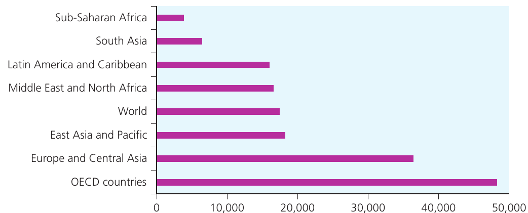
The figure above shows the relative size of GNI per capita in PPP$ for regional groupings of countries around the world in 2019. This data includes developing countries compared with developed countries (represented by OECD members). The gap in income levels between developing countries and OECD countries is extremely clear. Equally apparent is the gap between countries in sub-Saharan Africa and South Asia compared to those in East Asia and Latin America. Remember that 2019 captures the state of economies before the impact of COVID-19 was felt.
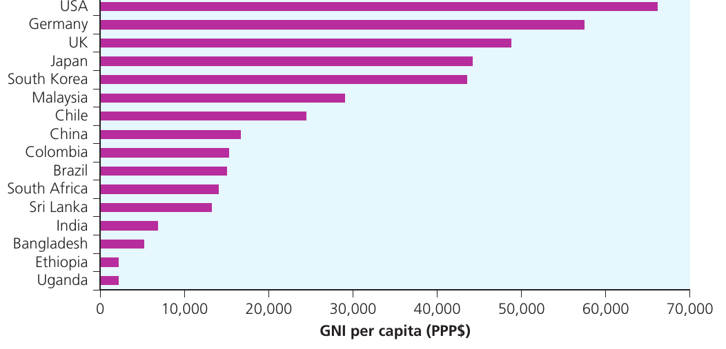
When examining individual countries rather than regional groupings, the disparities become even more striking. The data shows GNI per capita (PPP$) levels in 2019 for a selected group of countries, with three countries from each of the four major regional groupings, plus four developed economies. Because of the diversity of countries in each region, such selections must be treated with some caution. Countries like Malaysia, South Korea, and China have been chosen to represent East Asia and the Pacific to highlight three countries that have been successful in achieving economic growth over a sustained period.
Limitations of GNI per capita
GNI has several important limitations as a measure of living standards, even when measured in PPP$. One particularly significant limitation when considering low-income countries is that many developing countries have substantial informal economic activity, which may not be captured by a measure like GNI based on monetary transactions.
The informal economy includes:
- Subsistence agriculture, which remains important in many countries, especially in sub-Saharan Africa
- Petty traders and shoe-shiners operating in both rural and urban areas
- Wayside barbers and small-scale enterprises operating across a wide range of activities
The International Labour Organization (ILO) estimates that the informal economy comprises more than half of the global labour force. This highlights the need for caution when using GNI per capita data as a measure of the gap in living standards between countries.
Inequality within a country
Some degree of inequality in income and wealth will always exist within any society. However, the extent of inequality varies considerably from one country to another. Before exploring the causes of inequality and the policies that might influence how income and wealth are distributed within society, we need methods to characterise and measure inequality. This enables us to judge relative standards of living in different countries or different time periods.
Income distribution and deciles
GNI per capita is an average measure that does not reveal information about how income is distributed among different groups in society. One way of presenting data on income distribution is to rank households according to their incomes, then calculate the share of total household income that goes to different segments of the population.
Deciles and quintiles
When groups are divided into tenths, they are referred to as deciles. Thus:
- The poorest 10% is the first decile
- The next 10% is the second decile
- And so on
Similarly, the poorest 20% is the first quintile. This approach proves useful for exploring the pattern of income distribution because it quantifies the difference between income going to low-income and high-income households.
According to World Bank data, extreme examples of income inequality exist:
- In Brazil, the top decile (richest 10%) of households receive 42 times higher income than the lowest decile (poorest 10%)
- In Czechia (formerly the Czech Republic), the ratio is only 5.1
These extreme examples demonstrate the degree of inequality in income distribution within countries. The degree of inequality is important for international comparisons of living standards across countries.
| Income group | UK, 2017 | USA, 2018 | Norway, 2018 |
|---|---|---|---|
| First decile | 2.6 | 1.7 | 3.4 |
| First quintile | 6.8 | 5.2 | 8.9 |
| Second quintile | 11.8 | 10.3 | 14.1 |
| Third quintile | 16.5 | 15.3 | 17.8 |
| Fourth quintile | 22.8 | 22.3 | 22.6 |
| Top quintile | 42.1 | 46.9 | 36.6 |
| Top decile | 26.7 | 30.8 | 22.2 |
| Ratio top quintile/first quintile | 6.2 | 9.0 | 4.1 |
The table above presents income distribution data for three developed countries. Notice that the unit of measurement is normally the household rather than the individual, based on the assumption that members of a household tend to share their resources. For example, a millionaire's life-partner may not earn any income but is not usually poor.
Interpreting Income Distribution Data
Looking at the UK data in the table:
- The poorest 20% (first quintile) receive 6.8% of total income
- The richest 20% (top quintile) receive 42.1% of total income
- The ratio is 42.1 ÷ 6.8 = 6.2
This means households in the top quintile receive 6.2 times more income than those in the poorest quintile. On this basis, inequality in the UK is lower than in the USA but higher than in Norway.
Different inequality measures
Several statistical measures can be used to summarise income inequality:
P90/P10 ratio: This measure, used by the Office for National Statistics, compares the ratio of top and bottom deciles (the richest 10% to the poorest 10%).
S80/S20 ratio: This measures the ratio of the highest quintile to the lowest quintile.
Palma ratio: This calculates the ratio of the richest 10% to the poorest 40% of households.
| Country | P90/P10 | S80/S20 | Palma ratio |
|---|---|---|---|
| Slovenia | 5.0 | 3.5 | 0.9 |
| Norway | 6.5 | 4.1 | 1.0 |
| Poland | 7.5 | 4.7 | 1.1 |
| France | 8.3 | 5.1 | 1.3 |
| Germany | 8.5 | 5.2 | 1.2 |
| Japan | 9.1 | 5.3 | 1.3 |
| Greece | 9.2 | 5.6 | 1.3 |
| UK | 10.3 | 6.2 | 1.4 |
| Italy | 14.1 | 7.0 | 1.5 |
| USA | 18.1 | 9.0 | 2.0 |
These three measures show fairly consistent results, with Slovenia appearing to be the least unequal society and the USA the most unequal. However, remember that these represent just a few selected countries.
The Lorenz curve
The structure of income distribution information differs considerably from the sorts of data that economists normally encounter. It is helpful to find an appropriate type of diagram to allow the data to be presented visually. The Lorenz curve provides one such method for depicting the distribution of income graphically.
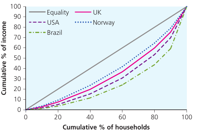
The figure above shows Lorenz curves for the UK, USA, Norway, and Brazil. These curves are constructed by plotting cumulative percentages. The process works as follows:
Constructing a Lorenz Curve: UK Example
Taking the UK as an example, the data show that:
- The poorest 20% receive 6.8% of total household income
- The poorest 40% receive 6.8% + 11.8% = 18.6%
- The poorest 60% receive 18.6% + 16.5% = 35.1%
- And so on
It is these cumulative percentages that are plotted to produce the Lorenz curve.
Interpreting Lorenz curves:
If income were perfectly equally distributed between households, the poorest 10% of households would receive exactly 10% of income, the poorest 20% would receive 20%, and so on. The Lorenz curve would then be a straight line going diagonally across the figure (the equality line).
To interpret country curves, the closer a country's Lorenz curve is to the diagonal equality line, the more equal is the distribution. You can see from the figure that:
- Norway comes closest to the equality line, confirming the earlier conclusion that income is more equally distributed in that country
- The UK and US curves are closer together, but there seems to be slightly more inequality in the USA, as its Lorenz curve is further from the equality line
- Brazil has been included as an example of a society with substantial inequality
The Gini coefficient
The Lorenz curve is excellent for comparing income distribution in just a few countries. However, it is also helpful to have an index that can summarise the relationship numerically. The Gini coefficient serves this purpose. It is a way of quantifying the equality of income distribution in a country.
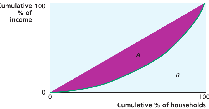
The Gini coefficient is obtained by calculating the ratio of the area between the equality line and the country's Lorenz curve (area A in the figure) to the whole area under the equality line (area A + B).
In published data, the Gini coefficient is often expressed as a percentage (i.e. multiplied by 100). The closer the Gini coefficient is to 100, the further the Lorenz curve is from equality, and thus the more unequal is the income distribution.
| Country | Gini coefficient (%) |
|---|---|
| USA | 41.4 |
| UK | 35.1 |
| Norway | 27.6 |
| Brazil | 53.4 |
| Czechia | 25.0 |
| South Africa | 63.0 |
The table above shows Gini coefficient values for the countries in the Lorenz curve figure (and those from an earlier exercise). The data confirms the patterns observed in the Lorenz curves, with South Africa showing the highest inequality (63.0%) and Czechia the lowest (25.0%).
In data published by the World Bank and the United Nations (and sometimes the ONS), the Gini coefficient is known as the Gini index.
Measurement issues in income inequality
When measuring income inequality, several important measurement issues need to be considered:
Household size and composition: Absolute income levels per household may be misleading because households are of different sizes and compositions. When examining income distribution in the UK, it is important to make adjustments for this.
The adjustment is made using equivalence scales. These allow a household to be judged relative to a 'reference household' made up of a childless couple. For example, a household with a husband, wife and two young children might rate as 1.18 relative to the childless couple with a rating of 1. So if the couple with two children had an income of £40,000 per year, this would be the equivalent of 40,000/1.18 = £33,898 for comparison purposes. These equivalised incomes need to be considered when examining inequality.
Consumption versus income: People tend to smooth their consumption over their lifetimes. It has been argued that it is more important to look at consumption (expenditure) than income when considering inequality.
Housing costs: In the short run, households have no control over their spending on housing. Some measures of inequality choose to exclude housing costs from calculations in order to focus on the income that households have at their disposal for other expenditures. As housing tends to constitute a higher proportion of the budgets of poor households, measures of inequality that exclude housing costs tend to show greater levels of inequality.
Government-provided services: The standard of living that households can achieve depends partly on government-provided services, such as health and education. Remember that both rich and poor households may benefit from these.
Wealth distribution: In considering inequality in a society, it may be important to examine inequalities in the distribution of wealth as well as income. Wealth can be regarded as the accumulated stock of assets that households own. In the UK, wealth is more unequally distributed than income.
An interesting observation
Many people remain unaware of where they fit into the income distribution of their country. A survey in the USA found that 19% of Americans believed that they were in the top 1% of earners.
Measuring poverty
One important aspect of inequality is poverty. If there is a wide gap between the richest and poorest households, it is important to evaluate just how poor those poorest households are, and whether they should be regarded as being 'in poverty'. This requires a clear definition of poverty.
Absolute poverty
One way of defining poverty is to specify a basket of goods and services that is regarded as the minimum required to support human life. Households that are seen to have too low an income to allow them to purchase everything in that basic bundle of goods would be regarded as being in absolute poverty.
A common way of measuring the poverty rate in a country is to estimate the percentage of the population living below a poverty line, known as a headcount ratio. The poverty line in this context is an estimate of the income needed to ensure basic human survival. People living below this level are perceived to be in absolute poverty.
To enable international comparisons of poverty levels, the World Bank has defined an International Poverty Line. From September 2022, this was set at $2.15 based on 2017 PPP prices. The line has to be reset every few years in line with changing prices over time.
The World Bank estimated that more than 648 million people worldwide were living beneath this level in 2019. This represents a decline from the 700 million who were estimated to be living below the poverty line in 2015. However, the number of people living in absolute poverty is expected to rise steeply as a result of the COVID-19 pandemic and the war in Ukraine.
Notice that some individual countries set their own national poverty line to reflect local conditions.
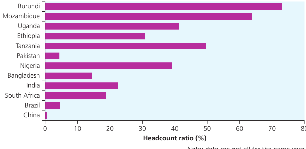
The figure above shows the percentage headcount ratio for a range of countries. Notice that countries in the figure are ranked from top to bottom in ascending order of GNI per capita in PPP$. This allows us to observe the relationship between poverty levels and income per capita, although the relationship is not perfect (for example, Pakistan shows a relatively low headcount ratio relative to some countries with higher GNI per capita, such as Nigeria).
Exam tip: When interpreting graphs that rank countries by different variables, you can learn about the relationships between variables by observing the pattern of the bars. If there had been a perfect correlation between relative poverty levels and GNI per capita, the pattern would be smooth. However, this is not the case, which indicates that other factors beyond average income affect poverty rates.
Relative poverty
For a country like the UK, the absolute poverty line is not particularly helpful, as very few people fall below it. Thus poverty is defined in relative terms. If a household has insufficient income for its members to participate in the normal social life of the country, it is said to be in relative poverty.
This too is defined in terms of a threshold poverty line, set at 60% of the median adjusted household disposable income. (The median is the income level of the middle-ranked household.)
In Europe, estimates of poverty are based on a regular survey of households conducted in EU member states and some other selected countries. Households with income below 60% of median adjusted income are described as being in relative poverty (or being 'at risk of poverty'). Households experiencing this in the current year and at least two of the three preceding years are said to be in persistent poverty.
Important distinction: Absolute poverty is almost entirely confined to developing countries, but relative poverty can exist in any society, even the most advanced nations, because some individuals may be excluded from normal society.
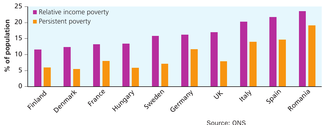
The figure above presents data for a range of European countries in 2017 (pre-Brexit). The proportion of people below the relative poverty line varies substantially across these countries, from 11.5% in Finland to 23.6% in Romania. The UK shows relative income poverty that is below, but close to, the EU average. Indeed, the UK's persistent poverty rate was the fifth-lowest among the EU member states.
Understanding the income gap: The percentage falling below the poverty line is not a totally reliable measure on its own. It is also important to know how far below the poverty line households are falling. The income gap (the distance between household income and the poverty line) is a useful measure of the intensity of poverty as well as of its incidence.
Changes in inequality and poverty over time
Although the distribution of income does not change rapidly from one year to the next, there have been changes over time.
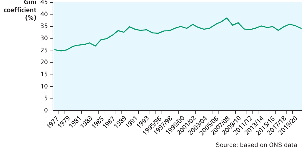
The figure above graphs the Gini coefficient, calculated for equivalised disposable income in the UK since 1977. Because people can be expected to smooth their consumption through time, expenditure inequality has been a little steadier than income inequality. However, both show a noticeable increase in inequality during the 1980s, since when there seems to have been no discernible trend.
Key observations about UK inequality trends:
- Significant rise in inequality from approximately 25% (1977) to around 35% (late 1980s)
- Relatively stable fluctuation between 32-38% from the 1990s onwards
- Peak around 2007/08 at approximately 38%
- Ends around 34-35% in 2019/20
It is worth noting that this has been a common feature for developed countries overall. A study by the OECD found no generalised trend in the distribution of household incomes since the mid-1970s, although about half of the countries studied did show an increase between the mid-1980s and mid-1990s.
Another study, undertaken by the Institute for Fiscal Studies, analysed trends and noted that there were very different trends identifiable over some 'periods of political interest'. In particular, between 1979 and 1990, with Margaret Thatcher as prime minister, income growth was higher for each successive quintile.
However, you should not read too much into these differences. The causes of change in income distribution reflect not only the political stance of the government in power but other changes occurring in society and in the pattern of employment over time.
Causes of inequality and poverty
Inequality arises from a variety of factors, some reflecting patterns in wealth (through the ownership of assets), some relating to the operation of the labour market, and some arising from the actions of governments. Changes in the demographic structure of the population can also be important.
Wealth inequality
One significant source of income inequality stems from the unequal distribution of wealth. Wealth represents the accumulated stock of assets that households own, including property, savings, investments, and other valuable possessions. Those who own substantial wealth can generate income from:
- Rental income from property
- Dividends from shares
- Interest from savings
- Capital gains from asset appreciation
This creates a self-reinforcing cycle where those with wealth can generate more income, which can then be used to accumulate more wealth. In the UK and many other countries, wealth is distributed far more unequally than income.
Labour market factors
The operation of the labour market plays a crucial role in determining income distribution. Several factors contribute to wage inequality:
Skills and education: Workers with higher levels of education and specialised skills typically command higher wages in the labour market. This reflects their higher productivity and the demand for their services.
Occupational differences: Different occupations offer vastly different levels of remuneration. Professional and managerial occupations typically pay much more than low-skilled manual work.
Labour market power: Some workers have greater bargaining power than others, whether through trade unions, professional associations, or simply through being in high demand.
Discrimination: Unfortunately, discrimination based on gender, ethnicity, age, or other characteristics can lead to pay differences that are not justified by productivity differences.
Government policy
Government actions significantly affect the distribution of income through:
Taxation: Progressive tax systems, where higher earners pay a larger proportion of their income in tax, can help reduce inequality. However, the design of the tax system matters enormously.
Transfer payments: Benefits, pensions, and other welfare payments redistribute income from taxpayers to recipients, typically reducing inequality.
Public services: Government provision of services like healthcare and education affects living standards and can help reduce inequality by ensuring everyone has access to essential services.
Minimum wage legislation: Setting a minimum wage can help protect the lowest-paid workers and reduce poverty.
Demographic factors
Changes in population structure can affect inequality:
Ageing population: As populations age, there may be more pensioners with lower incomes relative to working-age adults.
Household composition: Changes in household formation patterns, such as increases in single-parent families, can affect income distribution.
Migration: Immigration patterns can affect the labour market and income distribution, though the effects are complex and contested.
Key Points to Remember:
-
Development encompasses more than just economic growth - it requires wise use of resources, poverty reduction, and structural changes in the economy and society.
-
The Lorenz curve and Gini coefficient are the key tools for measuring inequality - the closer the Lorenz curve to the equality line (and the lower the Gini coefficient), the more equal the income distribution.
-
Absolute and relative poverty are fundamentally different concepts - absolute poverty measures whether people can afford basic survival needs (International Poverty Line: $2.15), while relative poverty measures whether people can participate in normal society (set at 60% of median income).
-
Income inequality varies enormously both between and within countries - developing countries often face greater challenges, but inequality exists even in the wealthiest nations.
-
Multiple factors drive inequality - including wealth distribution, labour market factors, government policies, and demographic changes. No single policy can address all aspects of inequality.