Other Graphs and Charts (Edexcel GCSE Maths): Revision Notes
Other graphs and charts
When studying statistics, you'll encounter several different types of graphs and charts beyond the basic ones. Two important types you need to master are frequency polygons and two-way tables. These tools help you visualise and organise data in different ways, making patterns and relationships easier to spot.
Frequency polygons
A frequency polygon is a special type of graph that displays information from a frequency table. Think of it as a way to show how frequently different values occur in your data set, but instead of using bars like in a histogram, you use connected straight lines.
Frequency polygons are particularly useful for comparing multiple data sets on the same graph, as the lines don't overlap like bars would in a histogram.
How to construct a frequency polygon
The process of creating a frequency polygon involves several important steps. First, you need to calculate the mid-interval values for each class interval in your frequency table. The mid-interval value is found by adding the lower and upper bounds of each class and dividing by 2.
Worked Example: Calculating Mid-Interval Values
For a class interval 20-30: Mid-interval value =
For a class interval 30-40: Mid-interval value =
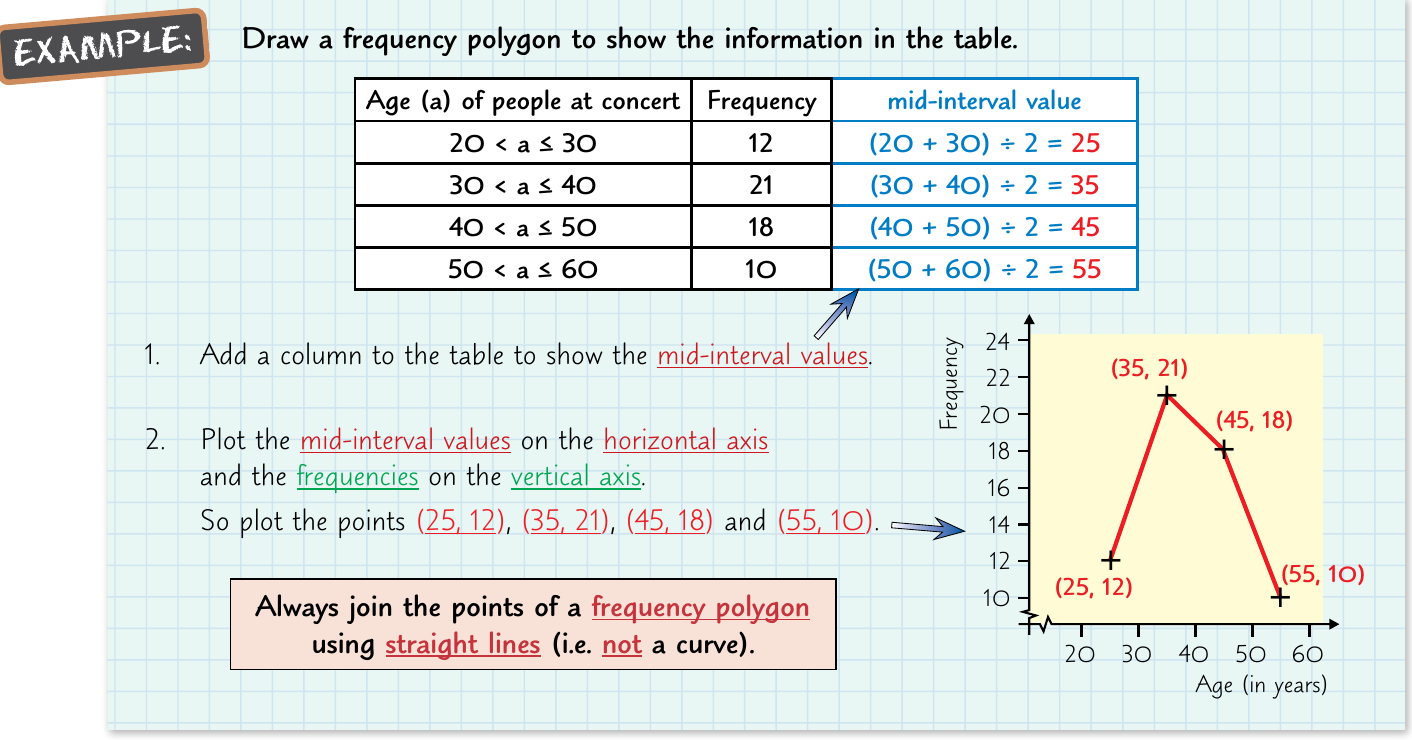
When you have your mid-interval values calculated, you plot these values on the horizontal axis (x-axis) and the corresponding frequencies on the vertical axis (y-axis). Each point represents the frequency for that particular mid-interval value.
The crucial rule to remember is that you must always connect the points using straight lines - never use curves. This is what makes it a polygon rather than a smooth curve.
The straight lines help you clearly see the shape of the frequency distribution and make it easier to identify patterns and trends in your data.
Key steps for drawing frequency polygons
Step-by-Step Method:
- Create a new column in your frequency table for mid-interval values
- Calculate each mid-interval value using the formula:
- Plot the mid-interval values on the horizontal axis
- Plot the frequencies on the vertical axis
- Mark each point where the mid-interval value meets its frequency
- Connect all points using straight lines only
Two-way tables
Two-way tables, also known as contingency tables, are incredibly useful for displaying two different types of information within the same table. They allow you to examine relationships between two categorical variables simultaneously.
Understanding two-way tables
These tables show how two different characteristics or variables relate to each other. For example, you might want to examine both gender and handedness, or transportation method and gender. The table is organised so that one variable forms the rows and the other forms the columns.
Two-way tables are essential for identifying patterns and relationships that might not be obvious when looking at single variables in isolation.
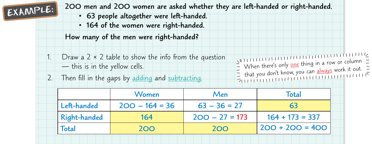
Solving missing values in two-way tables
When you encounter a two-way table with missing values, you can use simple addition and subtraction to find the unknown numbers. This works because each row and column must add up to its total, and all the individual cells must sum to the grand total.
The key principle is that when there's only one unknown value in a row or column, you can easily calculate it by subtracting the known values from the total. This method works systematically - you solve the easy ones first, then use those answers to solve the more complex missing values.
Worked Example: Finding Missing Values
If a row has a total of 50, and you know two values are 15 and 20: Missing value =
Use this newly found value to help solve other missing entries in the table.
Step-by-step approach
Systematic Method for Solving Two-Way Tables:
- Look for rows or columns where only one value is missing
- Subtract the known values from the row or column total
- Use the newly found values to solve other missing entries
- Continue this process until the table is complete
- Always check your work by ensuring all rows and columns add up correctly
| walk | Car | Bus | Total | |
|---|---|---|---|---|
| Male | 15 | 21 | ||
| Female | 22 | 51 | ||
| Total | 33 | 100 |
Practical applications
Both frequency polygons and two-way tables are valuable tools for analysing real-world data. Frequency polygons help you visualise the distribution of continuous data, making it easier to identify patterns, peaks, and trends. Two-way tables are particularly useful for examining relationships between different groups or categories in survey data.
When working with these tools, always remember to label your axes clearly, include appropriate titles, and double-check your calculations. These graphs and tables are powerful ways to communicate statistical information clearly and effectively.
Remember!
Key Points to Remember:
- Frequency polygons use straight lines to connect points - never curves
- Mid-interval values are calculated using:
- Two-way tables show relationships between two different variables
- Missing values in two-way tables can be found using addition and subtraction
- Always check that your rows and columns add up to the correct totals