Organise and Graph Datasets (HSC SSCE Mathematics Advanced): Revision Notes
Organise and Graph Datasets
In statistics, we need effective ways to organise and display data so we can identify patterns and extract useful information. This note covers how to create frequency tables and construct different types of graphs including histograms and cumulative frequency polygons.
Understanding how to organize and visualize data is fundamental to statistical analysis. The techniques in this note will help you see patterns that aren't obvious in raw data and make meaningful comparisons between datasets.
Organise datasets in tables
When working with data from a discrete random variable (a variable that can only take specific, countable values), we can organise the information in a structured table. This table displays values alongside various frequency measures.
What is frequency?
Frequency tells us how many times a particular value appears in a dataset. For individual values, it's simply a count. When data is grouped into class intervals, the frequency represents how many observations fall within that interval.
For example, if you roll a die times and get the number on occasions, the frequency of is .
What is relative frequency?
Relative frequency expresses frequency as a proportion of the total dataset. It's calculated using the formula:
where is the frequency of a particular value or group, and is the total number of observations in the dataset.
Relative frequency is particularly useful when comparing datasets of different sizes, as it standardises the frequencies to proportions. For example, comparing survey results from 100 people versus 1000 people becomes much easier when using relative frequencies.
What is cumulative frequency?
Cumulative frequency is the running total of frequencies as you move through an ordered dataset. For each value or class, you add up all the frequencies up to and including that point.
The cumulative frequency at the end of the dataset will always equal the total number of observations ().
Similarly, cumulative relative frequency is the running total of relative frequencies, which will always reach (or ) at the end.
Worked Example 1: Pet Ownership Data
A survey records the number of pets owned by households. The data collected is:
Let's organise this data in a complete frequency table.
Strategy:
- Count how many times each value appears (frequency)
- Calculate the proportion for each value (relative frequency = frequency ÷ 20)
- Build running totals for cumulative frequencies
Working:
First, count the occurrences:
- appears times
- appears times
- appears times
- appears times
- appears time
Total: ✓
Now construct the complete table:
where:
- = the value (number of pets)
- = frequency
- = relative frequency
- = cumulative frequency
- = cumulative relative frequency
Check: The total frequency is and the cumulative relative frequency reaches , confirming our calculations are correct.
Always verify your frequency table calculations:
- The sum of all frequencies should equal (the total number of observations)
- The final cumulative frequency should equal
- The final cumulative relative frequency should equal (or )
Visualise datasets with histograms
A histogram is a visual representation of a frequency distribution using bars. The bars are placed adjacent to each other with no gaps (for continuous or consecutive discrete data), showing how the data is distributed.
Types of histograms
There are three main types of histograms:
1. Frequency histogram
- Bar heights represent the frequency of each value or class interval
- The y-axis shows frequency (count)
- Used to see which values occur most often
2. Relative frequency histogram
- Bar heights represent relative frequency (proportion)
- The y-axis shows relative frequency as decimals or percentages
- Useful for comparing datasets of different sizes
3. Cumulative frequency histogram
- Bar heights represent cumulative frequency (running total)
- The y-axis shows cumulative frequency
- Useful for finding the median and understanding the distribution pattern
For grouped data, the width of each bar represents the class interval. The bars should be adjacent with no gaps between them, emphasising the continuous nature of the distribution.
Finding the mode and median
The mode is the value or class interval with the highest frequency. On a frequency histogram, this is the tallest bar.
The median is the middle value when data is arranged in order. It divides the dataset into two equal parts. For a dataset with observations, the median is located at position .
Finding the median from a cumulative frequency histogram:
- Find on the y-axis
- Draw a horizontal line across to the histogram
- Read down to find the corresponding value on the x-axis
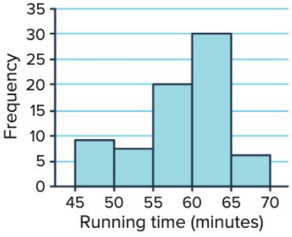
This histogram shows the distribution of running times for a km race with runners. The mode is in the - minute interval, as this is the tallest bar. To find the median, we would need to use a cumulative frequency histogram.
Worked Example 2: Creating a Frequency Histogram
A dataset records times (in minutes) for runners to complete a race:
Create a frequency histogram with class intervals of width minutes starting at . Identify the mode.
Strategy:
- Group the data into class intervals: -, -, -, -, -, -
- Count the frequency for each interval
- Draw bars with heights matching the frequencies
- Find the tallest bar to identify the mode
Working:
Class intervals and frequencies:
- -: values ()
- -: values ()
- -: values ()
- -: values ()
- -: values ()
- -: value ()
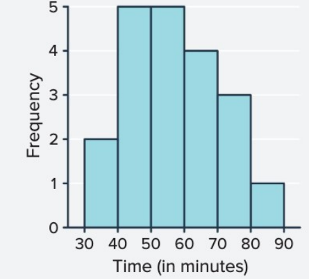
Mode: The highest frequency is , which occurs in both the - and - intervals. Therefore, the distribution is bimodal (has two modes).
Visualise datasets with cumulative frequency polygons
A cumulative frequency polygon, also called an ogive, is a line graph that displays cumulative frequencies. It's particularly useful for finding the median and analysing the accumulation of data.
How to construct a cumulative frequency polygon
To create a cumulative frequency polygon:
- Plot points at the upper boundary of each class interval (or at each value for ungrouped data)
- The y-coordinate of each point is the cumulative frequency up to that boundary
- Start the graph at , where is the lower boundary of the first class
- Connect the points with straight lines
- The graph ends when the cumulative frequency reaches (the total frequency)
The resulting shape typically shows an increasing curve that becomes steeper in regions where data is concentrated.
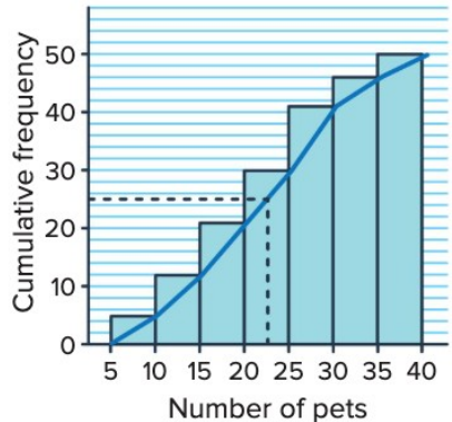
This cumulative frequency polygon shows pet ownership data. The median can be found by locating on the y-axis (in this case, ) and reading across to the curve, then down to the x-axis.
Finding the median from a cumulative frequency polygon
To find the median:
- Calculate where is the total frequency
- Locate this value on the y-axis (cumulative frequency axis)
- Draw a horizontal line from this point until it meets the polygon
- Draw a vertical line down to the x-axis
- Read the x-value where this vertical line meets the axis
This x-value is the median, representing the middle value of the ordered dataset.
Key Difference: The mode cannot be found directly from a cumulative frequency polygon. You need to refer back to the frequency table or frequency histogram, as the mode is the value with the highest individual frequency (not cumulative).
Worked Example 3: Books Read by Students
A dataset records the number of books read by students in a month:
Part a) Create a cumulative frequency polygon with class intervals of width books starting at .
Strategy:
- Group data into intervals: -, -, -, -
- Count frequencies and calculate cumulative frequencies
- Plot points at upper class boundaries
- Connect the points starting from
Working:
| Class Interval | Frequency | Cumulative Frequency |
|---|---|---|
| - | ||
| - | ||
| - | ||
| - |
Plot points at: , , , ,
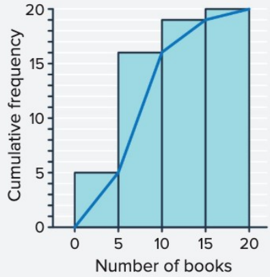
Part b) Find the mode.
Strategy: Look at the frequency table to identify which class interval has the highest frequency.
Answer: The mode is in the - interval, as this has the highest frequency of .
Part c) Find the median.
Strategy: Locate on the cumulative frequency axis, read across to the polygon, then down to find the corresponding number of books.
Working:
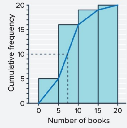
From the graph, when the cumulative frequency equals , the corresponding value on the x-axis is approximately books.
Answer: The median is approximately books. This means half the students read or fewer books, and half read or more books.
Key Points to Remember:
-
Frequency tables organise data with columns for values, frequency (), relative frequency (), cumulative frequency (), and cumulative relative frequency ().
-
Histograms use adjacent bars to display frequency distributions. The tallest bar indicates the mode (most common value or interval).
-
Cumulative frequency histograms show running totals and help estimate the median by locating on the y-axis.
-
Cumulative frequency polygons (ogives) connect points at upper class boundaries and are particularly useful for finding the median by reading from on the y-axis.
-
Always check your work: total frequencies should sum to , and cumulative relative frequencies should reach (or ).