Characteristics of Distributions, Dot Plots, and Stem Plots (VCE SSCE General Mathematics): Revision Notes
Characteristics of Distributions, Dot Plots, and Stem Plots
Introduction
When working with numerical data, we need effective ways to visualize and understand patterns in the information. This note explores the key characteristics of data distributions and introduces two important visualization tools: dot plots and stem plots. By the end of this note, you'll be able to identify distribution characteristics and construct appropriate plots for different types of data.
Understanding how to describe and visualize distributions is a fundamental skill in statistics. These tools help you communicate findings effectively and choose the most appropriate methods for analyzing your data.
Characteristics of a distribution
Distributions of numerical data can be described using three main features:
- Shape: whether the distribution is symmetric or skewed
- Centre: where the data values are typically located (also called location)
- Spread: how variable or dispersed the data values are
Understanding these characteristics helps you choose appropriate summary statistics and make informed conclusions about your data.
Shape of a distribution
The shape of a distribution tells us how the data values are arranged across the range.
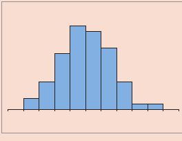
Symmetry
A distribution is symmetric when it creates a mirror image of itself if you fold it down the middle along a vertical axis. In other words, the left and right sides of the distribution look roughly the same.
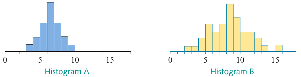
Histogram A shows a perfectly symmetric distribution, while Histogram B displays an approximately symmetric distribution.
In practice, you'll rarely find exactly symmetric distributions, so approximate symmetry is sufficient to classify a histogram as symmetric.
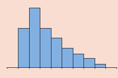
Positive and negative skew
Many distributions are not symmetric. Instead, they have a skew, meaning one tail of the distribution is longer than the other.
Positively skewed distributions have:
- A short tail on the left side
- A long tail extending to the right
- Many values concentrated towards the lower end of the distribution
Negatively skewed distributions have:
- A short tail on the right side
- A long tail extending to the left
- Many values concentrated towards the higher end of the distribution
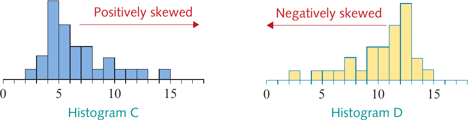
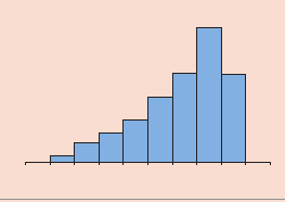
Histogram C demonstrates positive skewness, while Histogram D shows negative skewness. Notice how the arrows indicate the direction of the long tail.
Why this matters: Identifying whether a distribution is skewed or symmetric is important because it influences which summary statistics (like mean or median) are most appropriate to use.
Memory aid: Think of positive skew = pointing right (towards the positive direction) and negative skew = leaning left (towards the negative direction).
Centre
The centre (or location) of a distribution indicates where the data values are typically positioned along the number line.
Two distributions differ in centre when the data values in one distribution are generally larger than the values in the other distribution, even if both distributions have similar shapes.
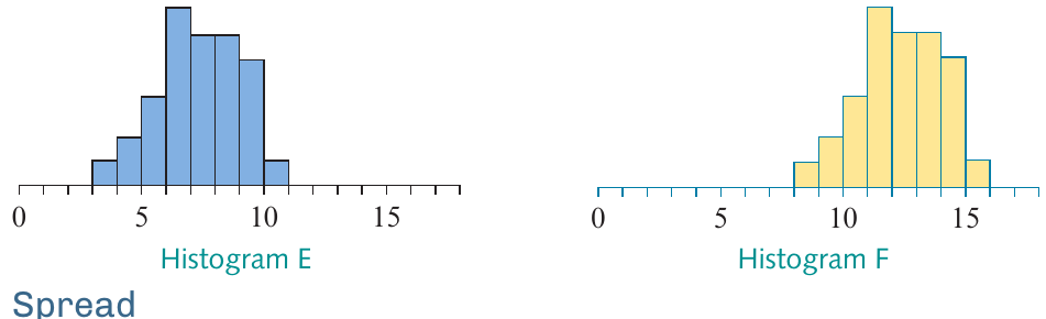
In this example, Histogram E and Histogram F have identical shapes and spreads, but Histogram F is shifted several units to the right. This indicates that these distributions differ in their centre or location.
Spread
The spread of a distribution describes how variable or dispersed the data values are.
Two distributions differ in spread when the data values in one distribution are more scattered or spread out than the values in the other distribution.
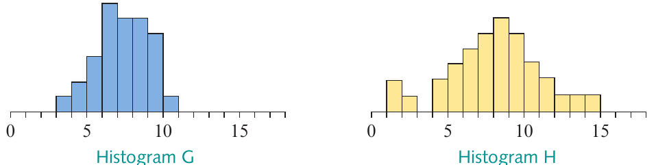
Histograms G and H are centred at approximately the same location, but Histogram H shows much greater spread. The values in Histogram H are more variable and cover a wider range.
Think of it this way: Two classes might have the same average test score (same centre), but one class could have scores ranging from 50% to 100% while the other has scores all between 70% and 90%. The first class has greater spread.
Dot plots
A dot plot provides a simple way to display numerical data, particularly for small datasets.
What is a dot plot?
A dot plot consists of:
- A number line scaled to include all data values
- Each data point marked by a dot above its corresponding value
- When multiple data points have the same value, dots are stacked vertically
Dot plots work best for displaying small datasets (typically ) where the data takes a limited number of distinct values, particularly with discrete data (values that are separate and distinct, like whole numbers).
Example 14: Constructing a dot plot
Worked Example: Constructing a Dot Plot
Question: The number of hours worked by each of students in their part-time jobs is as follows:
Construct a dot plot of these data.
Solution:
Step 1: Draw a number line scaled to include all data values (from to in this case). Label the line with the variable being displayed.
Step 2: Plot each data value by marking a dot above the corresponding value on the number line. When values repeat, stack the dots vertically.
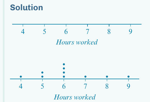
The completed dot plot shows three dots stacked at 6 (the most common value), two dots at 5, and single dots at 4, 7, 8, and 9.
Interpreting shape from dot plots
Just like with histograms, you can identify the shape of a distribution from a dot plot if there are enough data values:
- A longer tail in the positive direction indicates positive skewness
- A longer tail in the negative direction indicates negative skewness
- Roughly equal tails suggest approximate symmetry
The dot plot in Example 14 appears approximately symmetric, though with only data values, it's difficult to make definitive statements about shape.
Stem plots
A stem plot (also called a stem and leaf plot) provides another useful way to display small to medium-sized numerical datasets while preserving the actual data values.
What is a stem plot?
In a stem plot, each data value is split into two parts:
- Stem: usually the leading digit or digits (e.g., the tens digit)
- Leaf: usually the final digit (e.g., the units digit)
For example, the number is split into stem and leaf .
The stem values are listed vertically in ascending order, separated from the leaves by a vertical line. The leaf values are listed horizontally next to their corresponding stem.
Example 15: Constructing a stem plot
Worked Example: Constructing an Ordered Stem Plot
Question: The following is a set of marks obtained by a group of students on a test:
Display the data in the form of an ordered stem plot, and comment on the shape of the distribution.
Solution:
Step 1: Identify the appropriate stems. The data includes values in the units (0–9), tens (10–19), twenties (20–29), thirties (30–39), forties (40–49), fifties (50–59), and sixties (60–69). Therefore, use stems .
Write these in ascending order followed by a vertical line:
0 |
1 |
2 |
3 |
4 |
5 |
6 |
Step 2: Attach the leaves. Work through the data systematically:
- First value: → stem , leaf
- Second value: → stem , leaf
- Continue for all values
This produces the unordered stem plot:
0 | 2 5 7
1 | 5 9 8 7 9 9 9
2 | 4 5 4 8 8 7 5
3 | 0 3 7
4 | 2 5
5 | 2 5
6 | 0
Step 3: Create the ordered stem plot by arranging leaves in increasing order:
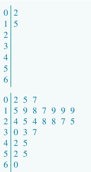
The final ordered stem plot includes:
- A title showing the variable name (Marks)
- A key explaining how to read the plot (e.g., marks)
- Leaves arranged in ascending order
Step 4: Comment on the shape. Looking at the stem plot (or imagining it turned on its side), the tail extends longer in the direction of increasing test scores. Therefore, this distribution is positively skewed.
Important notes about stem plots
Always include a key so readers know how to interpret the stems and leaves. For example: marks.
- The stem consists of the leading digit(s) and the leaf is the final digit
- Stem plots work best for small datasets (typically )
- They are usually constructed by hand rather than with technology
Choosing between plots
You now have three different visualization tools for numerical data: histograms, dot plots, and stem plots. All three allow you to assess the shape, centre, and spread of a distribution, but when should you use each one?
While there are no rigid rules, the following guidelines are commonly used:
| Plot | Used best when | How usually constructed |
|---|---|---|
| Dot plot | Small data sets (say ), discrete data | By hand or with technology |
| Stem plot | Small data sets (say ) | By hand |
| Histogram | Large data sets (say ) | With technology |
Memory aid for choosing plots: Think "30-50 rule" – use dot plots for , stem plots for , and histograms for (especially when using technology).
Exam tip: Choose your plot based on the size of your dataset and the resources available. For small datasets by hand, stem plots preserve more information than dot plots. For large datasets, histograms created with technology are most efficient.
Remember!
Key Points to Remember:
-
Numerical data distributions are characterized by three key features: shape (symmetric or skewed), centre (location), and spread (variability).
-
Distribution shapes include:
- Symmetric: forms a mirror image when folded down the middle
- Positively skewed: short tail on the left, long tail on the right
- Negatively skewed: short tail on the right, long tail on the left
-
Dot plots are best for small datasets () with discrete data. Each data point is marked as a dot above a number line, with dots stacked when values repeat.
-
Stem plots are ideal for small to medium datasets (). Each value is split into a stem (leading digits) and leaf (final digit). Always include a key!
-
Histograms are most appropriate for larger datasets () and are typically created using technology.
-
All three plot types allow you to visually identify the shape, centre, and spread of a data distribution, which helps you choose appropriate summary statistics and draw meaningful conclusions.