Box plots (AQA GCSE Statistics): Revision Notes
Box plots
What are box plots?
Box plots, also known as box and whisker plots, are a powerful way to display statistical information about a dataset. They show five key pieces of information from any distribution of data: the minimum value, the maximum value, the lower quartile, the upper quartile, and the median. This makes them incredibly useful for understanding how data is spread out and where the centre lies.
When you create a box plot, you're essentially summarising an entire dataset into these five critical values. This allows you to quickly see patterns, compare different groups, and identify the range and spread of your data at a glance.
Box plots are particularly valuable in statistics because they provide a visual summary that immediately shows both the central tendency and the spread of your data, making it easy to compare multiple datasets side by side.
Key components of a box plot
Understanding each part of a box plot is essential for both creating and interpreting them correctly.
The five components are:
- Minimum value: The smallest number in your dataset
- Lower quartile (Q₁): The value below which 25% of your data falls
- Median (Q₂): The middle value that divides your data exactly in half
- Upper quartile (Q₃): The value below which 75% of your data falls
- Maximum value: The largest number in your dataset
The way these components work together is quite logical. The lower quartile means that the lowest 25% of values are less than or equal to Q₁. Similarly, the highest 25% of values are greater than or equal to the upper quartile Q₃. The box itself represents the middle 50% of your data, which is why it's such a useful summary.
Think of quartiles as dividing your data into four equal parts - that's where the name "quartile" comes from. Each quartile represents exactly 25% of your dataset.
Constructing a box plot
Creating a box plot follows a systematic process that becomes straightforward once you understand the steps.
Step-by-step method:
- Order your data from smallest to largest - this is absolutely essential
- Find the range by identifying the minimum and maximum values
- Calculate the median position using the formula: , where n is the number of values
- Calculate the lower quartile position using:
- Calculate the upper quartile position using:
- Draw your scale on graph paper, making sure it covers your full data range
- Plot all five values and construct the box and whiskers
The mathematical formulas are crucial here. When you calculate for the median, you're finding which position in your ordered list contains the middle value. The same principle applies to finding Q₁ and Q₃ positions.
Box plots must always be drawn on graph paper with a clear scale. This isn't just for neatness - it's essential for accurate reading and comparison of the data.
Interpreting box plots
Reading box plots effectively allows you to extract meaningful information about your data distribution.
The box plot reveals several important characteristics. The length of the box shows you the interquartile range, which contains the middle 50% of your data. A longer box indicates more spread in the central values, while a shorter box suggests the middle values are clustered closely together.
The whiskers extending from the box show you how the extreme values relate to the central data. Long whiskers indicate that the minimum and maximum values are far from the quartiles, suggesting greater overall spread in the dataset.
The position of the median line within the box tells you about the shape of your distribution. If the median line is closer to Q₁, your data is skewed towards higher values. If it's closer to Q₃, the data is skewed towards lower values.
Key interpretation tips:
- Symmetric distribution: Median line is roughly in the centre of the box
- Right-skewed: Median closer to Q₁, longer right whisker
- Left-skewed: Median closer to Q₃, longer left whisker
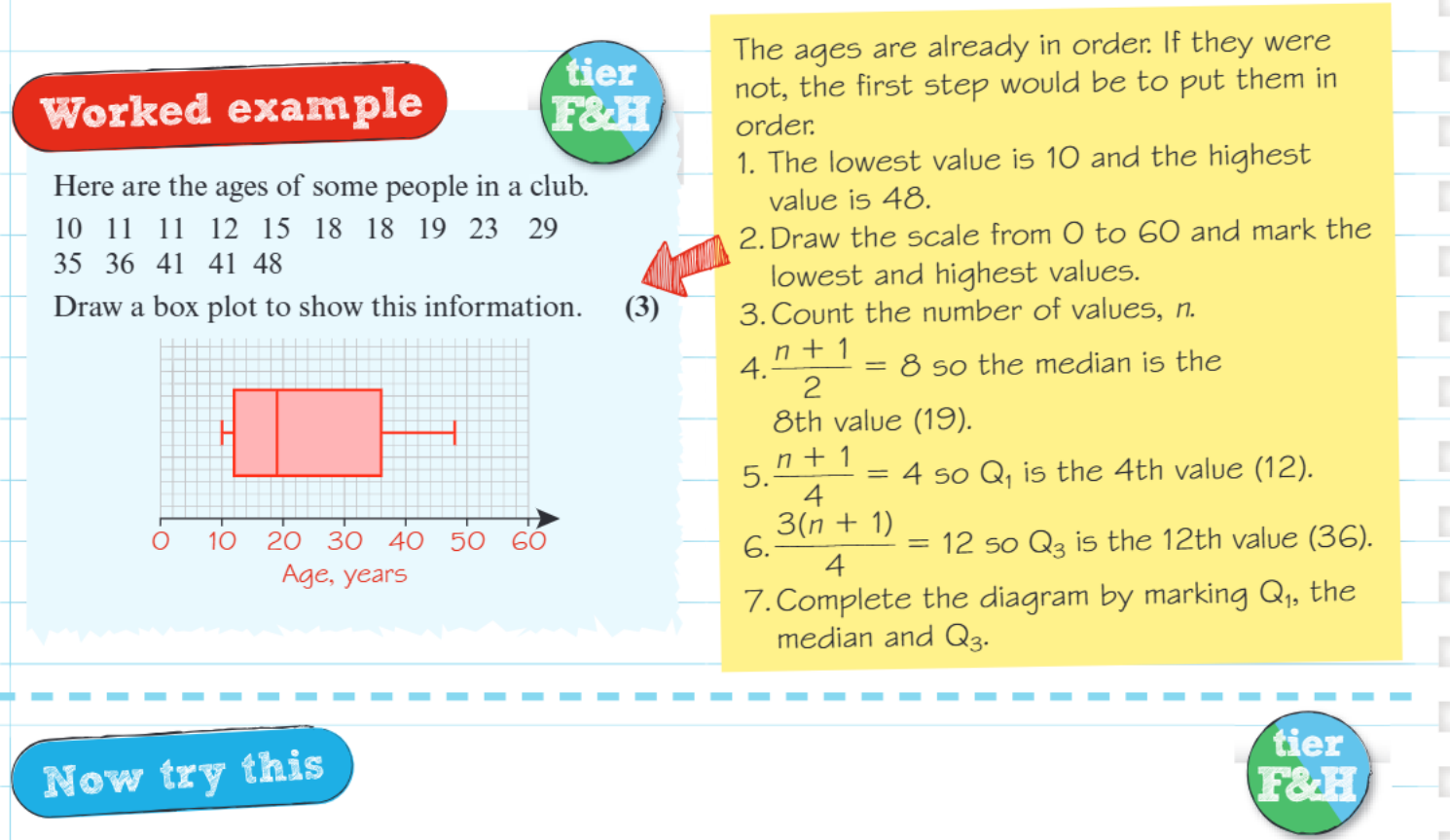
Worked example walkthrough
Worked Example: Constructing a Box Plot for Club Members' Ages
Let's examine how to construct a box plot using real data. Consider the ages of club members: 10, 11, 11, 12, 15, 18, 18, 19, 23, 29, 35, 36, 41, 41, 48.
The data is already arranged in order, which is our first requirement. We can see that we have 15 values (n = 15).
Step 1: Finding the key values
- Minimum value = 10 (the smallest number)
- Maximum value = 48 (the largest number)
- Median position = , so the median is the 8th value = 19
- Lower quartile position = , so Q₁ is the 4th value = 12
- Upper quartile position = , so Q₃ is the 12th value = 36
Step 2: Drawing the box plot
Once these values are identified, we draw a scale from 0 to 60 years and mark each of the five key points. The box extends from Q₁ (12) to Q₃ (36), with the median line at 19. The left whisker extends from the minimum (10) to Q₁, and the right whisker extends from Q₃ to the maximum (48).
Step 3: Interpretation
This completed box plot immediately shows us that the ages are fairly spread out, with the youngest and oldest members being quite different in age, but the central 50% of members are aged between 12 and 36 years.
Key Points to Remember:
- Box plots display five key values: minimum, Q₁, median, Q₃, and maximum
- Always arrange your data in order before calculating quartiles
- Use the formulas for median, for Q₁, and for Q₃
- Box plots must be drawn on graph paper with a clear, appropriate scale
- The box contains the middle 50% of your data, making it easy to see the central spread