Measures of dispersion for grouped data (AQA GCSE Statistics): Revision Notes
Range, quartiles and interquartile range
What is the range for grouped data?
When working with grouped data, we cannot know the exact values within each class interval, so we can only calculate estimates of statistical measures. The range gives us an idea of how spread out our data is from the smallest to the largest values.
Definition and calculation
For grouped data, the range is calculated using the extreme boundaries of our dataset:
For grouped data, this means:
- Largest possible value = upper bound of the highest class interval
- Smallest possible value = lower bound of the lowest class interval
Worked Example: Newspaper Readership
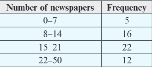
Looking at this frequency table showing newspaper readership data:
- Smallest possible value = 0 (lower bound of 0-7 class)
- Largest possible value = 50 (upper bound of 22-50 class)
- Range = 50 - 0 = 50
Worked Example: Student Weights
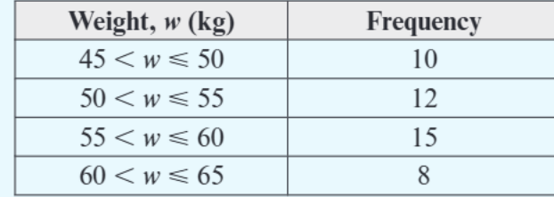
For this weight data:
- The notation "45 ≤ w ≤ 50" means weights from 45kg up to and including 50kg
- Smallest possible value = 45kg
- Largest possible value = 65kg
- Range = 65 - 45 = 20kg
Important exam tip: When data is rounded, think carefully about the minimum and maximum possible values. For example, if w > 45, the minimum possible weight is 45.5kg, not 45kg.
Understanding quartiles for grouped data
Quartiles divide your data into four equal parts. Think of them as the "quarter marks" of your dataset. They are particularly useful because they help us understand the distribution of our data and identify the spread of the middle portion.
The three quartiles
The quartile system provides three key reference points:
- Q₁ (first quartile): The value below which 25% of the data falls
- Q₂ (second quartile): The median - 50% of data falls below this value
- Q₃ (third quartile): The value below which 75% of the data falls
Finding quartile positions
For a dataset with total frequency n, we can determine where each quartile falls using these formulas:
Calculating quartiles using cumulative frequency
The most effective method for finding quartiles in grouped data involves using cumulative frequency tables and applying linear interpolation to estimate exact values within class intervals.
Worked Example: Distance Data with Cumulative Frequencies
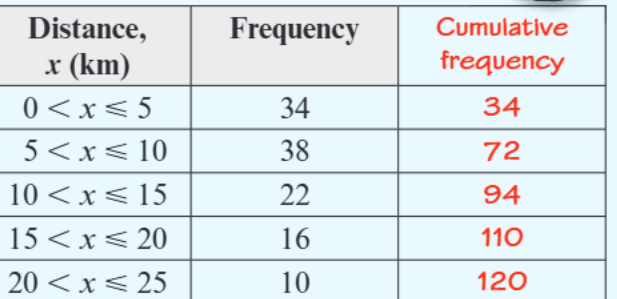
Using this distance data with cumulative frequencies:
Step 1: Find the total frequency Total frequency (n) = 120
Step 2: Calculate quartile positions
- Q₁ position = 120 ÷ 4 = 30th value
- Q₂ position = 120 ÷ 2 = 60th value
- Q₃ position = 3 × 120 ÷ 4 = 90th value
Step 3: Use cumulative frequency to locate quartile classes
- Q₁: 30th value is in the 5 < x ≤ 10 class (cumulative frequency goes from 34 to 72)
- Q₂: 60th value is in the 10 < x ≤ 15 class
- Q₃: 90th value is in the 10 < x ≤ 15 class
Step 4: Use linear interpolation to find exact values The linear interpolation formula helps us estimate the exact quartile value within a class interval.
For Q₁ in the 5 < x ≤ 10 class:
- We need the 30th value
- 34 values accumulated by end of this class
- Class starts at position 34 (from previous cumulative frequency)
- Q₁ = 0 + (30/34) × 5 = 4.41km (approximately 4.5km)
Similarly:
- Q₂ ≈ 9.5km
- Q₃ ≈ 14km
Calculating the interquartile range (IQR)
The interquartile range measures the spread of the middle 50% of your data. It's particularly valuable because it's less affected by extreme values than the range, making it a more reliable measure of spread for skewed distributions.
The formula is straightforward:
Using our distance example: IQR = 14 - 4.5 = 9.5km
This tells us that the middle 50% of distances span 9.5km.
Worked Example: Reading Times
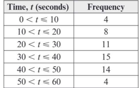
For this reading time data:
- Total frequency = 4 + 8 + 11 + 15 + 14 + 4 = 56
- Q₁ position = 56 ÷ 4 = 14th value
- Q₃ position = 3 × 56 ÷ 4 = 42nd value
You can find these using either:
- Cumulative frequency graph - plot cumulative frequency against time and read off quartile values
- Linear interpolation - calculate exact positions within class intervals
Key exam tips and common traps
Understanding the nuances of grouped data analysis is crucial for exam success. Here are the most important points to remember:
Watch out for notation
- "45 ≤ w < 50" means 45 is included, 50 is not
- "45 < w ≤ 50" means 45 is not included, 50 is included
- This affects your minimum and maximum possible values for range calculations
Linear interpolation tip When using linear interpolation, remember the formula structure:
Estimation vs exact values Always remember that with grouped data, you're calculating estimates, not exact values. Use phrases like "approximately" or "estimate" in your answers.
When reading from cumulative frequency graphs, draw horizontal lines from the quartile positions to the curve, then drop vertical lines to read the values on the horizontal axis. This systematic approach helps avoid reading errors.
Key Points to Remember:
- Range for grouped data = highest possible value - lowest possible value
- Quartiles split data into quarters: Q₁ (25%), Q₂ (50%), Q₃ (75%)
- IQR = Q₃ - Q₁ and shows the spread of the middle 50% of data
- Use cumulative frequency to locate which class interval contains each quartile
- Linear interpolation helps estimate exact quartile values within class intervals
- Always state your answers are estimates when working with grouped data