Cumulative Frequency (Edexcel GCSE Maths): Revision Notes
Cumulative frequency
What is cumulative frequency?
Cumulative frequency is a way of keeping track of how many data values you've counted up to any particular point. Think of it as a running total - you start with the first group and keep adding the frequencies as you move through each group. This gives you the total number of values that fall at or below each point in your data set.
The key concept is that cumulative frequency shows you the total frequency accumulated so far, rather than just the frequency of individual groups.
The word "cumulative" comes from "accumulate" - which means to gather or collect. So cumulative frequency literally means "accumulated frequency" or "collected frequency up to this point."
Creating a cumulative frequency table
To create a cumulative frequency table, you start with your regular frequency table and add a new column. Here's how you build it step by step:
- Start with your frequency table - this shows your data groups and how many values fall in each group
- Add a cumulative frequency column - this will show your running totals
- Fill in the running totals - for each row, add the current frequency to all the frequencies above it
| Height (h cm) | Frequency | Cumulative Frequency |
|---|---|---|
| 140 < h ≤ 150 | 4 | 4 |
| 150 < h ≤ 160 | 9 | 4 + 9 = 13 |
| 160 < h ≤ 170 | 20 | 13 + 20 = 33 |
| 170 < h ≤ 180 | 33 | 33 + 33 = 66 |
| 180 < h ≤ 190 | 36 | 66 + 36 = 102 |
| 190 < h ≤ 200 | 15 | 102 + 15 = 117 |
| 200 < h ≤ 210 | 3 | 117 + 3 = 120 |
The table demonstrates this process clearly. Notice how the cumulative frequency increases as you move down each row, showing the total count of all values up to that point.
Critical Rule: Each cumulative frequency value must be larger than the previous one. If you find a cumulative frequency that's smaller than the one above it, you've made an error in your calculations.
Drawing a cumulative frequency graph
Creating an accurate cumulative frequency graph requires careful plotting and specific techniques:
Setting up the graph
- Plot the highest value from each class interval on the horizontal axis
- Plot the cumulative frequency on the vertical axis
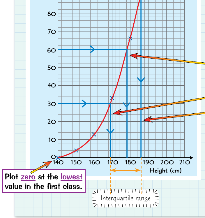
- Start at zero using the lowest value from your first class interval
Plotting the points
Each point represents the cumulative frequency up to the upper boundary of each class interval. For example, if you have height ranges like 140-150cm, 150-160cm, etc., you would plot points at 150, 160, 170, and so on.
Always use the upper boundary of each class interval when plotting. This is because the cumulative frequency represents all values up to and including that upper limit.
Drawing the curve
Once all points are plotted, connect them with a smooth curve rather than straight lines. This smooth curve is essential for accurate readings and represents the continuous nature of the data.
Never connect the points with straight lines! Always draw a smooth curve. Straight lines can lead to inaccurate readings and don't properly represent the continuous distribution of data.
Finding vital statistics from the graph
The cumulative frequency graph is particularly useful for finding important statistical measures without complex calculations.
Finding the median
The median represents the middle value of your data set. To find it:
Worked Example: Finding the Median
Step 1: Calculate the median position Median position =
Step 2: Find this value on the vertical axis and draw a horizontal line to the curve
Step 3: Drop down vertically from where the line meets the curve to read the median value on the horizontal axis
Finding the quartiles
Quartiles divide your data into four equal parts:
Lower quartile (Q1):
- Position =
- Follow the same process as finding the median, but use the quarter position
Upper quartile (Q3):
- Position =
- Again, use the same horizontal-to-curve-to-vertical reading process
Calculating the interquartile range
The interquartile range (IQR) shows the spread of the middle 50% of your data:
This gives you the range that contains the middle half of all your data values.
The interquartile range is particularly useful because it's not affected by extreme values (outliers) in your data set, making it a robust measure of spread.
Making estimates from cumulative frequency graphs
Cumulative frequency graphs are excellent tools for making estimates about your data. You can work in two directions:
Estimating frequencies
If you want to know how many values are less than or equal to a particular value:
- Find your target value on the horizontal axis
- Go up vertically to meet the curve
- Read across horizontally to find the cumulative frequency
- This tells you how many values fall at or below your target
Estimating values
If you want to find the value that corresponds to a particular cumulative frequency:
- Find your target frequency on the vertical axis
- Go across horizontally to meet the curve
- Read down vertically to find the corresponding value
This technique is particularly useful for finding percentiles or understanding the distribution of your data.
Worked Example: Finding a Percentile
To find the 80th percentile:
Step 1: Calculate the position Position =
Step 2: Find this value on the vertical axis
Step 3: Read horizontally to the curve, then vertically down to find the 80th percentile value
Practical tips for success
Essential Tips for Cumulative Frequency Success:
- Always check your running totals - each cumulative frequency should be larger than the previous one
- Plot points carefully - use the upper boundary of each class interval
- Draw smooth curves - avoid connecting points with straight lines
- Double-check your readings - make sure you're reading both axes correctly when finding statistics
- Label your axes clearly - this helps avoid confusion when reading values
Key Points to Remember:
- Cumulative frequency means keeping a running total as you add up frequencies from each group
- Always plot cumulative frequency graphs using the highest values from each class interval and connect with smooth curves
- The median is found at the halfway point () on your cumulative frequency graph
- Quartiles divide your data into quarters - find them at and of the total frequency
- The interquartile range shows the spread of the middle 50% of your data and equals upper quartile minus lower quartile