Frequency Tables (Edexcel GCSE Maths): Revision Notes
Box plots and data comparison
Understanding box plots
A box plot is a useful statistical diagram that gives you a clear summary of how data is spread out. Rather than showing every single data point, box plots focus on the most important statistical measures that tell you about the distribution of your data set.
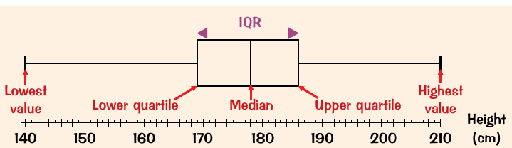
The main purpose of a box plot is to display the interquartile range as a rectangular box, which makes it easy to see where the middle 50% of your data lies. This visual representation helps you quickly understand both the central tendency and the spread of your data.
Key components of a box plot
Every box plot contains five essential statistical measures that work together to describe your data:
- Minimum value - the smallest data point in your set
- Lower quartile (Q1) - the value below which 25% of your data falls
- Median (Q2) - the middle value that divides your data in half
- Upper quartile (Q3) - the value below which 75% of your data falls
- Maximum value - the largest data point in your set
The rectangular box represents the interquartile range (IQR), which is the difference between the upper and lower quartiles. The whiskers (lines extending from the box) connect to the minimum and maximum values, showing the full range of your data.
How to construct a box plot
Creating a box plot follows a systematic three-step process that ensures accuracy and clarity:
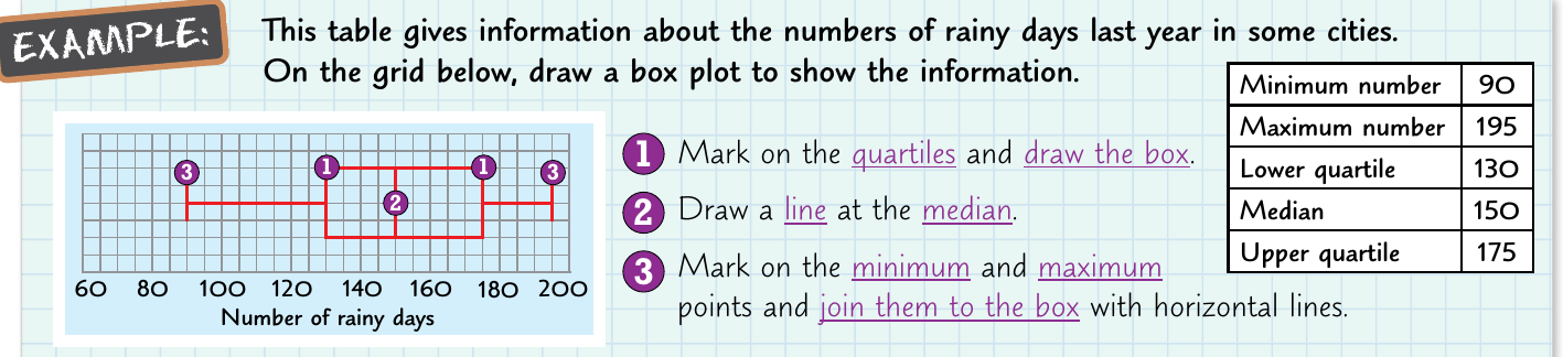
Step 1: Mark the positions of the lower quartile and upper quartile on your number line, then draw a rectangular box between these two points.
Step 2: Draw a vertical line inside the box at the median position. This line divides the box and shows the centre of your data distribution.
Step 3: Mark the minimum and maximum values on your number line, then connect these points to the edges of your box using horizontal lines (whiskers).
Remember that the box always represents the middle 50% of your data, regardless of how the individual values are distributed within that range.
Comparing data sets using statistics
When you need to compare two or more data sets, you should examine both their central tendencies and their spreads to get a complete picture of how they differ.
Comparing averages
To compare the central tendencies of different data sets, you can use any of the three main averages: mean, median, or mode. Look at which data set has the higher or lower average value, and consider what this tells you about the typical values in each set.
For example, if one group has a higher median than another, you can conclude that the first group generally has larger values than the second group.
Comparing spread
The spread of data tells you about consistency and variation within each data set. You can measure spread using either the range (difference between maximum and minimum) or the interquartile range (difference between upper and lower quartiles).
A larger spread indicates that the data values are less consistent with more variation, while a smaller spread suggests the values are more tightly clustered around the centre.
Worked example: analysing weight guesses
Worked Example: Comparing Weight Guesses
Let's examine a practical example where school children guessed the weight of a baby hippo at an animal park competition:
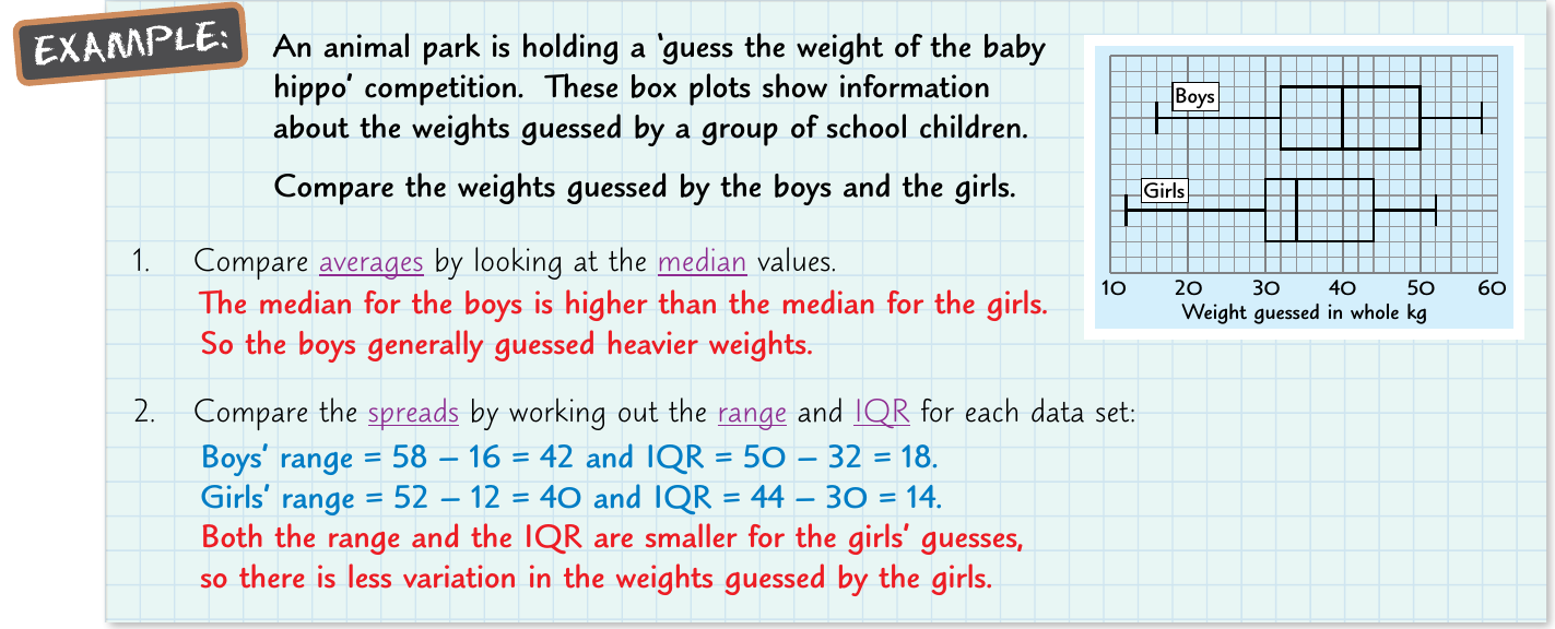
Step 1: Comparing averages Looking at the median values, the boys' guesses had a higher median than the girls' guesses. This suggests that boys generally estimated heavier weights for the baby hippo.
Step 2: Comparing spread To understand the consistency of the guesses, we calculate both measures:
Boys' calculations:
- Range = kg
- IQR = kg
Girls' calculations:
- Range = kg
- IQR = kg
Step 3: Interpretation Both the range and IQR are smaller for the girls' guesses, indicating that the girls were more consistent in their estimates with less variation between individual guesses.
This analysis shows that whilst boys tended to guess higher weights on average, the girls' guesses were more clustered together, suggesting greater agreement within that group.
Key Points to Remember:
- Box plots summarise data using five key measures: minimum, lower quartile, median, upper quartile, and maximum
- The rectangular box shows the interquartile range where the middle 50% of data lies
- When comparing data sets, examine both averages (for central tendency) and spread (for consistency)
- Smaller spreads indicate more consistent data with less variation
- Box plots are particularly useful for comparing multiple data sets side by side