Scatter Graphs (Edexcel GCSE Maths): Revision Notes
Scatter graphs
What are scatter graphs?
A scatter graph is a type of graph that helps you see how closely two different things are related to each other. When you plot data points on a scatter graph, you're looking for patterns that tell you whether there's a relationship between your two variables.
The technical term for this relationship is correlation. Think of correlation as the strength of the connection between two sets of data - it tells you whether changes in one variable tend to go along with changes in another variable.
What is correlation? Correlation describes the relationship between two variables. It tells you whether changes in one variable are associated with changes in another variable, and how strong that relationship is.
Understanding correlation and line of best fit
When you look at a scatter graph, you want to see if you can draw a line of best fit through most of your data points. If you can draw this line fairly close to most of your scattered points, then the two things you're measuring are correlated.
The line of best fit is a straight line that passes as close as possible to all the data points. You don't need every point to be exactly on the line - it just needs to go through the general pattern of the data.
Drawing a line of best fit The line of best fit doesn't have to pass through every point on your scatter graph. Instead, it should pass through the general pattern of the data, with roughly equal numbers of points above and below the line.
Types of correlation
Strong correlation
When your data points form a fairly straight line, you have strong correlation. This means the two variables are closely related to each other. The points don't need to be perfectly in line, but they should follow a clear pattern.
Weak correlation
Sometimes your points don't line up quite so neatly, but you can still see where you might draw a line of best fit. This is weak correlation. The relationship between the variables exists, but it's not as clear or predictable as with strong correlation.
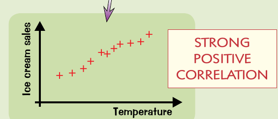
Positive correlation
If the points form a line sloping uphill from left to right, you have positive correlation. This means that as one variable increases, the other also increases. Alternatively, when one decreases, the other decreases too - they change in the same direction.
For example, as temperature increases, ice cream sales tend to increase too. Both variables go up together.
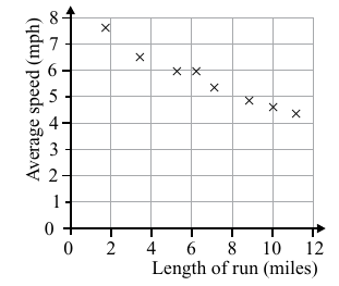
Negative correlation
When the points form a line sloping downhill from left to right, you have negative correlation. This means that as one variable increases, the other decreases. They change in opposite directions.
No correlation
If the points are randomly scattered and you can't draw a sensible line of best fit, then there's no correlation between the variables. This means the two things aren't related to each other in any predictable way.
Remember the correlation patterns:
- Uphill line = positive correlation (both variables increase together)
- Downhill line = negative correlation (one increases as the other decreases)
- Random scatter = no correlation (no predictable relationship)
Making predictions using scatter graphs
One of the most useful things about scatter graphs is that you can use them to make predictions. Once you've drawn a line of best fit, you can use it to estimate values.
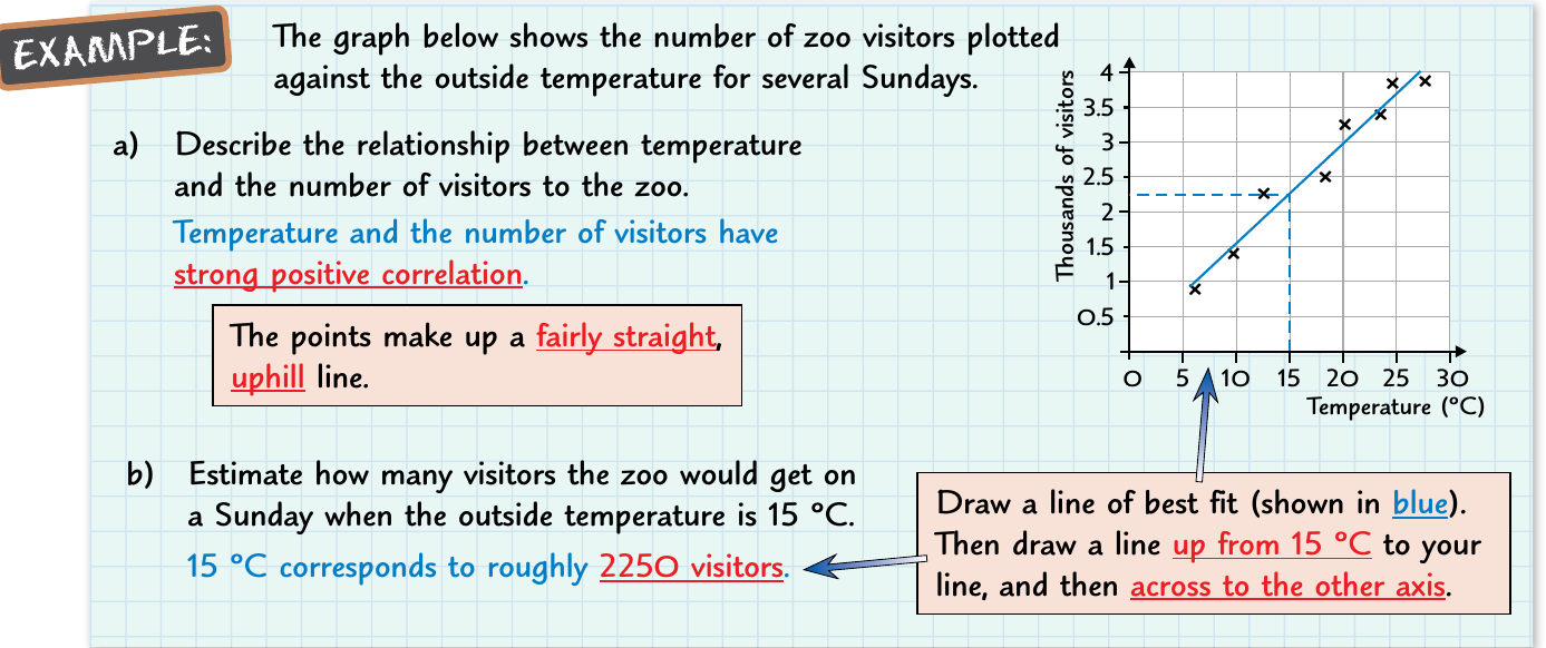
Making a prediction from a scatter graph:
Step 1: Draw a line of best fit through your data points
Step 2: Find the value you want to predict on one axis
Step 3: Draw a vertical line from that point to your line of best fit
Step 4: Draw a horizontal line from where it meets your line of best fit to the other axis
Step 5: Read off the predicted value
This works best when you're predicting values within the range of your existing data (called interpolation). Be more careful when predicting outside this range (called extrapolation).
Interpolation vs Extrapolation
- Interpolation: Making predictions within the range of your data - more reliable
- Extrapolation: Making predictions outside the range of your data - less reliable and should be done with caution
How to describe correlation
When describing the correlation in a scatter graph, you should mention:
- Strength: Is it strong or weak?
- Direction: Is it positive or negative?
- Type: What does the pattern look like?
For example: "The scatter graph shows a strong positive correlation between temperature and number of zoo visitors. The points form a fairly straight uphill line."
Describing correlation effectively Always include both the strength (strong/weak) and direction (positive/negative) when describing correlation. This gives a complete picture of the relationship between your variables.
Remember!
Key Points to Remember:
- Scatter graphs show the relationship between two variables through correlation
- Strong correlation means points form a fairly straight line; weak correlation means the pattern is less clear
- Positive correlation = uphill line (both variables increase together)
- Negative correlation = downhill line (one increases as the other decreases)
- No correlation = randomly scattered points with no clear pattern
- Use the line of best fit to make predictions by drawing vertical and horizontal lines
- Interpolation (within data range) is more reliable than extrapolation (outside data range)