Boxplots (VCE SSCE General Mathematics): Revision Notes
Boxplots
Introduction to boxplots
In addition to histograms, dot plots, and stem-and-leaf plots, we have another powerful tool for displaying numerical data: the boxplot. Boxplots are particularly valuable because they can summarise large datasets in a compact, visual form. This makes them ideal for quickly understanding the distribution of data and comparing different datasets.
Boxplots are especially useful when you need to compare multiple datasets side-by-side or when working with very large datasets where other visualization methods would be too cluttered.
The five-number summary
Before we can create a boxplot, we need to understand the five-number summary. This summary contains five key values that describe a dataset:
- Minimum: the smallest value in the dataset
- First quartile (): the value below which 25% of the data falls
- Median ( or ): the middle value that divides the dataset in half
- Third quartile (): the value below which 75% of the data falls
- Maximum: the largest value in the dataset
When we know these five values, we have a good understanding of both the centre of the data and how it spreads out. The five-number summary forms the foundation for constructing a boxplot.
Think of the five-number summary as telling the "story" of your data in just five numbers. These values reveal where the middle of your data is (median), where the middle 50% sits (between and ), and what the extremes are (minimum and maximum).
Components of a boxplot
A boxplot (also called a box-and-whisker plot) is a graphical representation of the five-number summary. Let's look at the key components:
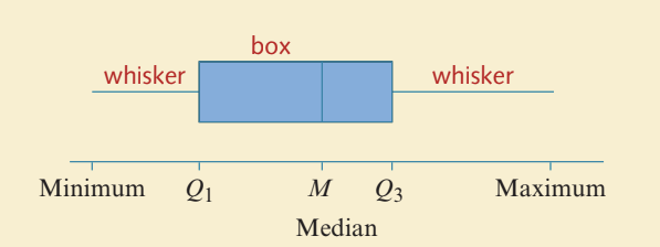
The main features of a boxplot are:
- The box: A rectangle that represents the middle 50% of the data. It extends from to .
- The median line: A vertical line inside the box showing where the median () is located.
- The whiskers: Lines extending from each end of the box to the minimum and maximum values (or to the smallest and largest values that aren't outliers, as we'll see later).
Constructing a simple boxplot
Let's work through an example to see how to construct a boxplot step by step.
Worked Example: Monthly Rainfall in Melbourne
The table below shows monthly rainfall figures (in millimetres) for a year in Melbourne:
| Month | J | F | M | A | M | J | J | A | S | O | N | D |
|---|---|---|---|---|---|---|---|---|---|---|---|---|
| Rainfall (mm) | 48 | 57 | 52 | 57 | 58 | 49 | 49 | 50 | 59 | 67 | 60 | 59 |
We're given the five-number summary:
- Min = 48
- = 49.5
- = 57
- = 59
- Max = 67
Step 1: Draw a labelled and scaled number line that covers the full range of values (from 45 to 70).
Step 2: Draw a box starting at and ending at .
Step 3: Mark the median value with a vertical line at inside the box.
Step 4: Draw the whiskers by extending lines from the centre of each end of the box to the minimum (48) and maximum (67) values.
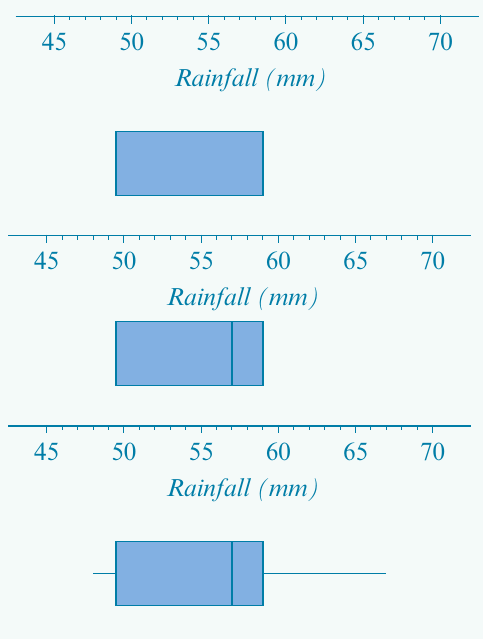
The completed boxplot gives us a clear visual summary of the rainfall distribution throughout the year.
Exam Tip: Always ensure your number line scale spans the full range from minimum to maximum. It's helpful to mark each value of the five-number summary with a dot before drawing the boxplot.
Understanding outliers in boxplots
Sometimes a boxplot might have one extremely long whisker. This could mean either:
- The data distribution is heavily skewed, with many values in the tail, or
- The long whisker is hiding one or more outliers (unusual values that don't fit the general pattern).
To distinguish between these situations, we need a precise definition of what counts as an outlier.
When you see an unusually long whisker, it's a signal to investigate further. Don't assume it's just a skewed distribution - there might be outliers that need special attention!
Defining outliers
An outlier is a data point that lies unusually far from the rest of the data. Specifically:
Definition of an Outlier:
An outlier is any value that lies more than 1.5 interquartile ranges below the first quartile or more than 1.5 interquartile ranges above the third quartile.
Remember that the interquartile range (IQR) is calculated as:
This 1.5 × IQR rule gives us a mathematical way to identify outliers objectively.
Upper and lower fences
To identify outliers, we use imaginary boundaries called fences:
- Lower fence:
- Upper fence:
Any data value that falls outside these fences is classified as an outlier.
Critical Boundary Rule: If a data point lies exactly on a fence, it is NOT considered an outlier. The value must fall strictly outside the fence to be classified as an outlier.
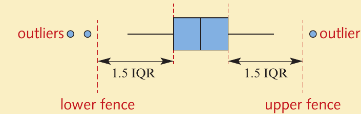
When we draw a boxplot with outliers:
- Outliers are shown as individual dots or circles
- The whiskers extend only to the smallest and largest values that are NOT outliers
- The box still represents the middle 50% of the data, just as before
Constructing a boxplot with outliers
Let's work through a complete example that involves identifying and displaying outliers.
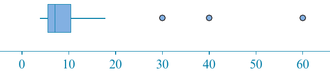
Worked Example: Hours Spent on a School Project
The data below shows the number of hours each of 33 students spent on a school project:
| 2 | 3 | 4 | 9 | 9 | 13 | 19 | 24 | 27 | 35 | 36 |
| 37 | 40 | 48 | 56 | 59 | 71 | 76 | 86 | 90 | 92 | 97 |
| 102 | 102 | 108 | 111 | 146 | 147 | 147 | 166 | 181 | 226 | 264 |
Step 1: Find the five-number summary
From the ordered list:
- Minimum = 2 hours
- Maximum = 264 hours
- Median (17th value) = 71 hours
For the quartiles (with 33 values):
- = average of 8th and 9th values = hours
- = average of 25th and 26th values = hours
Step 2: Calculate the IQR
Step 3: Determine the fences
Step 4: Identify outliers
Looking at our data, only one value falls outside the fences: 264 hours (which is greater than 235.5).
The largest value that is NOT an outlier is 226 hours (which is less than 235.5).
Step 5: Draw the boxplot
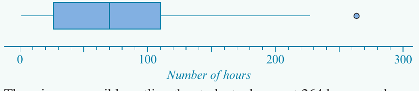
The boxplot shows:
- The box extending from to
- A median line at 71
- The lower whisker extending to the minimum (2)
- The upper whisker extending to 226 (the largest non-outlier value)
- A dot at 264 representing the outlier
Conclusion: There is one possible outlier - the student who spent 264 hours on the project.
Interpreting boxplots: estimating percentages
Boxplots aren't just for displaying data - they're also useful for estimating what percentage of values fall within certain ranges. This is because the quartiles divide the data into specific percentage groups.
The 25-50-25 Rule:
Think of the boxplot as dividing your data into four equal parts:
- 25% below
- 25% between and the median
- 25% between the median and
- 25% above
Key percentages to remember
- 25% of values lie below
- 50% of values lie below the median
- 75% of values lie below
- The box contains the middle 50% of all values
- 25% of values lie above
Worked Example: Estimating Percentages
Consider the boxplot shown below:
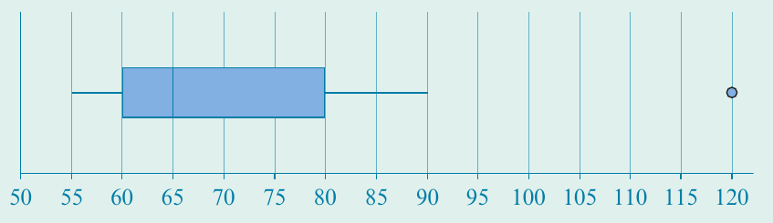
Let's estimate various percentages:
a) Percentage less than 60
Since 60 is the first quartile (), 25% of the data values are less than 60.
b) Percentage less than 65
Since 65 is the median (), 50% of the data values are less than 65.
c) Percentage more than 80
Since 80 is the third quartile (), 75% of values are less than 80. Therefore, 25% of values are greater than 80.
d) Percentage between 60 and 80
75% of values are less than 80, and 25% are less than 60. Therefore, 50% of values fall between 60 and 80.
e) Percentage between 60 and 120
100% of values are less than 120 (the maximum), and 25% are less than 60. Therefore, 75% of values fall between 60 and 120.
Tip: Identify the five-number summary first, then use the quartiles to estimate the requested percentages. Remember that each quartile represents a specific percentage of the data.
Using technology to create boxplots
Creating boxplots by hand, especially those displaying outliers, can be time-consuming. Fortunately, CAS calculators can generate boxplots automatically.
General process for CAS calculators
Most graphing calculators follow a similar process:
- Enter your data into a list or spreadsheet column
- Access the statistics/graphing function
- Select boxplot as the graph type
- Enable the "show outliers" option if available
- Display the graph and use the trace function to read key values
The calculator will automatically:
- Calculate the five-number summary
- Determine the fences
- Identify any outliers
- Draw the boxplot with outliers shown as separate points
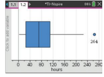
You can trace along the boxplot to read the values of the minimum, , median, , maximum, and any outliers.
Exam Tip: While calculators are helpful for checking your work, make sure you understand the manual construction process. Exams may require you to construct boxplots by hand or explain the steps involved.
Remember!
Key Points to Remember:
-
A boxplot is a visual representation of the five-number summary: minimum, , median, , and maximum.
-
The box contains the middle 50% of data, extending from to , with the median marked by a vertical line inside.
-
Outliers are values that lie more than away from the nearest quartile. Calculate fences using:
- Lower fence =
- Upper fence =
-
When outliers exist, they are shown as individual dots, and whiskers extend only to the most extreme non-outlier values.
-
Boxplots allow you to estimate percentages: 25% of data lies below , 50% below the median, and 75% below .