Classifying and Displaying Categorical Data (VCE SSCE General Mathematics): Revision Notes
Classifying and Displaying Categorical Data
Introduction to variables and data
When we collect information through surveys or experiments, we are gathering data about different variables. A variable is any characteristic that can change or vary from one person to another.
Consider a student survey that asks about:
- Gender (male or female)
- Preferred coffee size (small, medium, or large)
- Number of brothers
- Hand span in centimetres
Each of these questions represents a different variable because the answers will vary from student to student. The actual values we collect are called data.
These variables, and the data they produce, can be sorted into two main types: categorical or numerical.
Understanding categorical data
Categorical data sorts people or items into groups or categories. When you collect categorical data, you are essentially placing each person into one of several possible groups.
However, not all categorical data works the same way. There are two subtypes:
Nominal data
Nominal data uses values that are simply names or labels. These labels identify which category something belongs to, but they don't tell us anything more than that.
Example: Gender recorded as 'M' or 'F'
The letters M and F identify whether someone is male or female, but they don't imply any ordering or ranking. We can't say that one is "more" or "less" than the other in any meaningful way. The values are just names.
Other examples of nominal data:
- Favourite colour (red, blue, green, yellow)
- Type of pet (dog, cat, bird, other)
- Country of birth
Memory Aid: Nominal = Names
Think of "nominal" as coming from the word "name." Nominal data simply names or labels categories without any ranking or ordering.
Ordinal data
Ordinal data does two things: it names categories AND allows us to order or rank them.
Example: Coffee size recorded as 'small', 'medium', or 'large'
These values not only tell us the size category, but we can also arrange them in order from smallest to largest. There is a natural ranking to the categories.
Other examples of ordinal data:
- Level of agreement (strongly disagree, disagree, neutral, agree, strongly agree)
- Education level (primary, secondary, tertiary)
- Satisfaction rating (very unsatisfied, unsatisfied, neutral, satisfied, very satisfied)
Memory Aid: Ordinal = Order
The word "ordinal" relates to "order." Ordinal data has categories that can be arranged in a meaningful sequence or ranking.
The key difference is that ordinal data has a meaningful order, while nominal data does not.
Understanding numerical data
Numerical data consists of values that represent quantities. These are numbers that you can perform arithmetic operations on, such as adding, subtracting, or finding an average. Like categorical data, numerical data has two subtypes:
Discrete data
Discrete data can only take specific, separate values. These values are typically whole numbers that come from counting.
Example: Number of brothers (, , , , ...)
You can have , , or brothers, but you cannot have brothers. The values are distinct and separate from each other.
Other examples of discrete data:
- Number of students in a class
- Number of cars in a car park
- Number of goals scored in a match
Continuous data
Continuous data can take any value within a range. These values typically come from measurement and are limited only by the precision of your measuring instrument.
Example: Hand span measured in centimetres
If a student records their hand span as cm, their actual hand span could be anywhere between cm and cm, depending on how they measured and rounded. The variable could theoretically take any value within a certain range.
Other examples of continuous data:
- Height in centimetres
- Weight in kilograms
- Time in seconds
- Temperature in degrees
Memory Aid: Discrete vs Continuous
- Discrete = Distinct countable values (think "separate" or "distinct")
- Continuous = Can be anywhere in a range (think "continuous line")
Alternative: "CATS count, DOGS measure" - CATegorical data you COUNT in frequency tables, Continuous data often comes from MEASUREment
A note on interval and ratio scales
There is another way to classify numerical data, though for most statistical purposes this distinction is not critical:
Interval scales have equal differences between successive values, but zero does not mean the complete absence of what is being measured.
Example: Temperature in degrees Celsius. The difference between and is the same as between and . However, does not mean a complete absence of heat. Also, we cannot say that is twice as hot as .
Ratio scales have all the properties of interval scales, plus zero means complete absence, and we can make meaningful ratio statements.
Example: Number of brothers or hand span in centimetres. Zero brothers means no brothers at all. Someone with brothers has exactly twice as many brothers as someone with brothers.
For statistical analysis in this course, we treat both interval and ratio data the same way, so you don't need to distinguish between them.
Types of variables summary
Variables that produce categorical data are called categorical variables. These can be further classified as:
- Nominal variables (e.g., gender, hair colour)
- Ordinal variables (e.g., size preferences, satisfaction levels)
Variables that produce numerical data are called numerical variables. These can be further classified as:
- Discrete variables (e.g., number of siblings, number of students)
- Continuous variables (e.g., height, weight, time)
The following diagram shows how different variable types relate to each other:
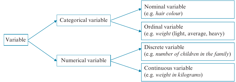
Key Classification Framework:
All variables fall into two main categories:
- Categorical variables → Nominal (names only) or Ordinal (names + order)
- Numerical variables → Discrete (countable, specific values) or Continuous (measurable, any value in range)
Classifying variables: worked examples
Let's practice identifying different types of variables with some examples.
Example 1: Categorical or numerical?
Question: Classify the following variables as categorical or numerical.
a) Students choose their favourite pet from 'dog', 'cat', 'bird', or 'other'.
b) The time, in seconds, taken to solve a puzzle is recorded.
Solution:
a) Categorical - The values are categories of pets. Students are being sorted into groups based on their preference.
b) Numerical - The data consists of numbers representing the amount of time taken. We can perform calculations like finding the average time.
Example 2: Nominal or ordinal?
Question: Classify the following categorical variables as nominal or ordinal.
a) A group of people record their level of happiness as 'very happy', 'happy', 'not too happy', or 'very unhappy'.
b) Students select their favourite country to visit.
Solution:
a) Ordinal - The categories represent different levels of happiness, and there is a clear order from very unhappy to very happy. We can rank the responses.
b) Nominal - The data values are simply names of countries. There is no natural ordering to countries.
Example 3: Discrete or continuous?
Question: Classify the following numerical variables as discrete or continuous.
a) The number of children in the family is recorded for all students in a school.
b) The birth weight of babies, measured in grams, is recorded at a hospital.
Solution:
a) Discrete - The number of children can only be whole numbers (, , , , etc.). This data comes from counting.
b) Continuous - Weight can take any value within a range. A baby could weigh grams or grams, depending on the accuracy of the scale. This data comes from measurement.
Example 4: Classifying mixed variables
Question: Classify the following variables as nominal, ordinal, discrete, or continuous.
a) The number of students in each of classes is counted.
b) The time taken for mice to each complete a maze is recorded in seconds.
c) Diners at a restaurant were asked to rate their meal: = Very satisfied, = Satisfied, = Indifferent, = Dissatisfied, = Very dissatisfied.
d) Students choose a colour from a list: = Blue, = Green, = Red, = Yellow.
e) Students' heights were classified as 'less than cm', ' cm - cm', or 'more than cm'.
Solution:
a) Discrete - The number of students can only be whole numbers.
b) Continuous - Time can take any value, limited only by the precision of measurement.
c) Ordinal - Although numbers are used, they represent categories of satisfaction that can be ordered from very dissatisfied to very satisfied.
d) Nominal - The numbers are just codes for colour names. The numbers don't represent quantities, and there's no meaningful order.
e) Ordinal - Heights are grouped into three ordered categories (short, medium, tall).
Watch out for numbers that represent categories!
Just because something is recorded as a number doesn't automatically make it numerical data. In part (d) above, the numbers , , , are simply codes for colour names - they don't represent quantities. This is a common exam trap!
Frequency tables
Once we have collected categorical data, we need to organize it in a way that makes it easy to understand and analyze. Frequency tables are the most common way to do this.
What is a frequency table?
A frequency table lists the possible values of a variable along with how often each value occurs in the data set.
Frequency can be recorded in two ways:
Frequency: The actual count of how many times each value appears.
Percentage frequency: The percentage of times each value appears, calculated using:
A frequency distribution is simply a complete listing of all values and their frequencies.
Rounding percentages
When calculating percentage frequencies, the total may come to or instead of exactly . This is normal and occurs because we round each individual percentage. Don't worry if your percentages don't sum to exactly - this is expected!
Example 5: Constructing a frequency table
Question: Thirty children chose a sandwich, a salad, or a pie for lunch:
sandwich, salad, salad, pie, sandwich, sandwich, salad, salad, pie, pie, pie, salad, pie, sandwich, salad, pie, salad, pie, sandwich, sandwich, pie, salad, salad, pie, pie, pie, salad, pie, sandwich, pie
Construct a table showing both frequency and percentage frequency.
Solution:
Step 1: Set up a table with the variable name (Lunch choice) and its three possible values (Sandwich, Salad, Pie).
Step 2: Count how many children chose each option:
- Sandwich: children
- Salad: children
- Pie: children
Step 3: Add the frequencies to find the total:
Step 4: Calculate percentage frequencies:
- Sandwich:
- Salad:
- Pie:
Step 5: Complete the table:
Notice that the percentages total rather than due to rounding.
Bar charts
While frequency tables summarize data effectively, visual displays often make patterns easier to spot. For categorical data, the appropriate visual display is a bar chart.
Features of bar charts
A bar chart has these key features:
- The vertical axis shows frequency or percentage frequency
- The horizontal axis shows the categories of the variable
- The height of each bar represents the frequency (or percentage) for that category
- Gaps between bars indicate that each value is a separate category
- There is one bar for each category
Example 6: Constructing bar charts
Question: Use the frequency table for Lunch choice from Example 5 to construct:
a) A bar chart
b) A percentage bar chart
Solution:
Part a: Frequency bar chart
Step 1: Label the horizontal axis "Lunch choice" and mark it with the three categories (Pie, Salad, Sandwich).
Step 2: Label the vertical axis "Frequency" and create a scale from to (slightly above the maximum frequency of ). Mark the scale in intervals of .
Step 3: Draw a bar for each category. Make each bar narrower than the space allocated to show the categories are separate. The height of each bar matches the frequency:
- Pie: height of
- Salad: height of
- Sandwich: height of
Part b: Percentage bar chart
Step 1: Follow the same process as Part a, but label the vertical axis "Percentage" instead.
Step 2: Create a scale from to (slightly above the maximum percentage of ). Mark the scale in intervals of .
Step 3: Draw bars with heights matching the percentage frequencies:
- Pie: height of
- Salad: height of
- Sandwich: height of
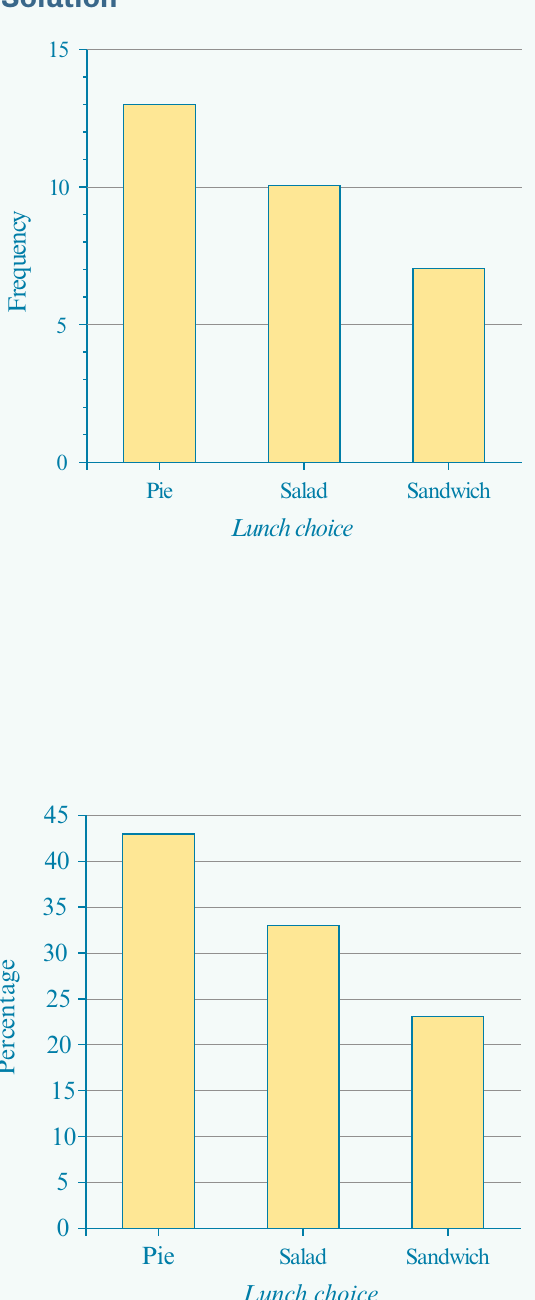
Arranging categories in bar charts
For nominal variables, it's common (though not required) to arrange categories in order of decreasing frequency. This makes it easier to identify patterns and compare categories. This is why the example shows Pie first (highest frequency), then Salad, then Sandwich.
The mode or modal category
One important feature that bar charts help us identify quickly is the mode or modal category.
The mode is the category that occurs most frequently - the most common or popular value. In a bar chart, this is the category with the tallest bar.
In Example 5, the modal category is 'pie' because it was chosen by more children () than any other lunch option.
When is the mode useful?
The mode is most useful when:
- A single category clearly occurs more often than others
- You want to identify the most popular or common choice
- You're conducting popularity polls or market research
Examples of questions answered by the mode:
- "Which TV station is most frequently watched between 6 p.m. and 8 p.m.?"
- "When is a supermarket busiest?"
- "What is the most common shoe size sold?"
The mode tells us what is typical or most common in categorical data, helping us understand what most people choose or prefer.
Remember! Key Points
-
Data can be categorical or numerical. Categorical data sorts things into groups; numerical data consists of quantities you can calculate with.
-
Categorical data is either nominal or ordinal. Nominal data uses names or labels with no order (e.g., colors, countries). Ordinal data has categories that can be ranked (e.g., small/medium/large, satisfaction levels).
-
Numerical data is either discrete or continuous. Discrete data comes from counting and takes specific values (e.g., number of siblings). Continuous data comes from measuring and can take any value in a range (e.g., height, time).
-
Frequency tables organize categorical data by showing how often each category occurs, either as counts or percentages. Use the formula:
-
Bar charts visualize categorical data with gaps between bars to show separate categories. The height of each bar shows the frequency or percentage, and the tallest bar identifies the mode (most common category).