Displaying and Describing Numerical Data - Further Exploration (VCE SSCE General Mathematics): Revision Notes
Displaying and Describing Numerical Data - Further Exploration
Introduction
Numerical data can be organized and displayed using frequency tables and histograms, just like categorical data. However, because numerical data has natural ordering and can take many different values, we need specific techniques to handle it effectively. This note explores how to create frequency tables and histograms for numerical data, and how to describe the key features of data distributions.
This exploration covers three main areas:
- Creating frequency tables for different types of numerical data
- Constructing and interpreting histograms
- Describing distributions using shape, centre, spread, and outliers (SSCO)
Frequency tables for numerical data
Discrete numerical data with a small number of values
When working with a discrete numerical variable that only takes a small number of different values (such as the number of bedrooms in a house), you can construct a frequency table in the same way as for categorical data.
How to construct a frequency table:
- Identify the minimum and maximum values in your dataset
- Create a table listing all values between the minimum and maximum
- Count how many times each value appears in the dataset
- Record these counts in the frequency column
- Convert frequencies to percentages using: percentage =
- Total both the frequency and percentage columns
Worked Example: Number of bedrooms
For the following data on 24 properties:
2 3 4 3 3 4 3 4 4 1 3 2 1 2 2 2 4 5 3 4 4 5 3 4
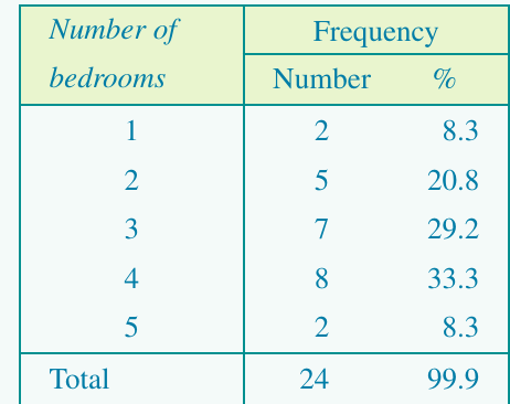
The table shows that 4-bedroom properties are most common (33.3%), followed by 3-bedroom properties (29.2%).
Grouped frequency distributions
When a variable can take many different values (like ages from 0 to 100) or when the variable is continuous (like response times measured to 2 decimal places), we need to group the data into intervals.
Principles for grouping intervals:
- Every data value must fall within an interval
- Intervals should not overlap
- There should be no gaps between intervals
Guidelines for choosing intervals:
- Aim for approximately 5 to 15 groups
- Choose interval widths that are easy to interpret (like 10 units, 100 units, or 1000 units)
- By convention, state the beginning of each interval as the exact value. For example, use intervals like 0–49, 50–99, 100–149 rather than 1–50, 51–100, 101–150
Worked Example: Average hours worked per week
The data below shows average hours worked per week in 23 countries:
35.0, 48.0, 45.0, 43.0, 38.2, 50.0, 39.8, 40.7, 40.0, 50.0, 35.4, 38.8, 40.2, 45.0, 45.0, 40.0, 43.0, 48.8, 43.3, 53.1, 35.6, 44.1, 34.8
To construct a grouped frequency table with five intervals:
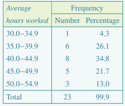
The most common working hours range is 40.0–44.9 hours (8 countries, 34.8%).
Histograms
A histogram is a graphical display of a frequency table for numerical data. While it looks similar to a bar chart, there are important differences: the bars follow a natural order, and the bar widths depend on the actual data values.
Constructing a histogram from a frequency table
Key features of a histogram:
- Frequency (count or percentage) is shown on the vertical axis
- The values of the variable are plotted on the horizontal axis
- Each bar corresponds to a data interval
- The height of each bar shows the frequency (or percentage frequency)
Steps to construct a histogram:
- Label the horizontal axis with the variable name and mark the scale using the start of each interval
- Label the vertical axis as 'Frequency' and scale it to accommodate the maximum frequency
- For each interval, draw a bar with height equal to the frequency
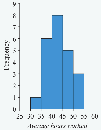
This histogram displays the grouped frequency table from the previous example.
Constructing histograms from raw data using a CAS calculator
Creating a histogram from raw data by hand is time-consuming because you must first construct a frequency table. A CAS calculator can do this quickly and automatically.
Using the TI-Nspire CAS:
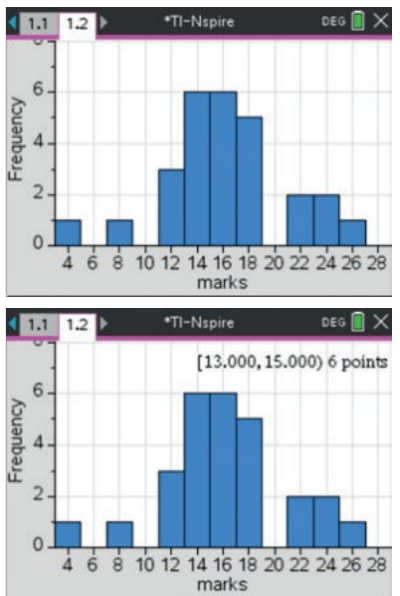
Key steps:
- Enter your data into a list in the Lists & Spreadsheet application
- Use the Data & Statistics application to create graphs
- Select the variable for the horizontal axis
- Change the plot type to Histogram
- Adjust the bin width and starting point as needed using the Bin Settings menu
- You can convert the frequency axis to a percentage axis using Scale > Percent
Exam tip: Knowing how to use your CAS calculator to create histograms will save you valuable time in exams and ensure accuracy.
Describing distributions from histograms
When you look at a histogram, you should describe four key features: shape, centre, spread, and outliers. Remember these as "SSCO".
Shape
Shape describes how the data is distributed across the range of values.
Symmetric distributions
A distribution is symmetric if the histogram tails off evenly on either side of the peak. The left side is a mirror image of the right side.
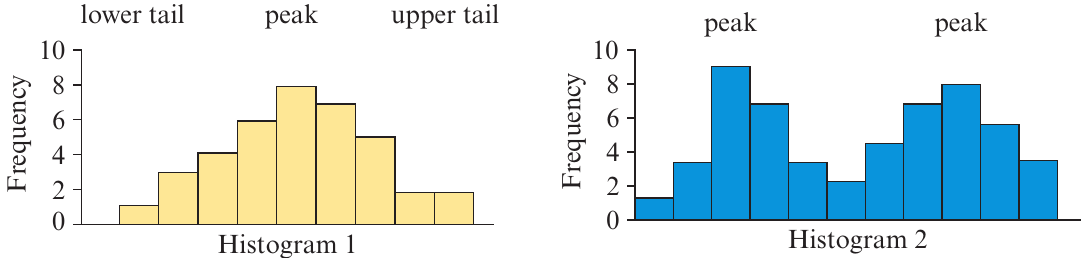
A single-peaked symmetric distribution (Histogram 1) is common when measuring variables like intelligence test scores, weights of oranges, or any data where values vary evenly around a central value.
A bimodal distribution (Histogram 2) has two distinct peaks. This often indicates data from two different populations. For example, if you measured discus throw distances for both male and female Olympic athletes, you would expect a bimodal distribution with one peak for males and another for females.
Skewed distributions
Sometimes a histogram has a long tail extending primarily in one direction.
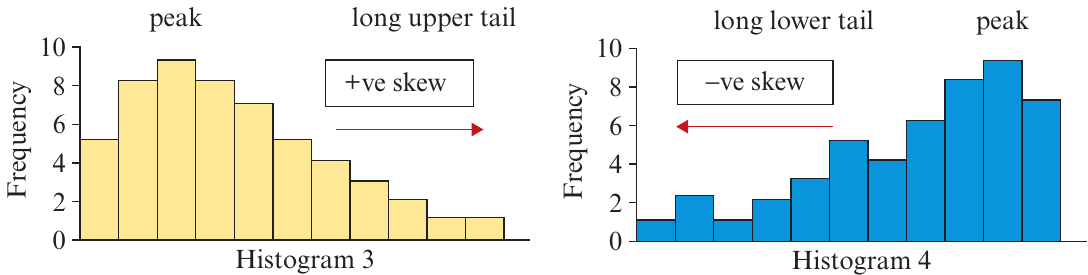
Positively skewed (Histogram 3): The tail extends to the right (towards higher values). Examples include:
- Salaries in a large organization (most earn similar amounts, a few earn much more)
- House prices (most houses in a similar range, some very expensive ones)
Negatively skewed (Histogram 4): The tail extends to the left (towards lower values). Examples include:
- Age at death (most people die in old age, fewer in middle age, even fewer in childhood)
Memory aid: The direction of skew is indicated by the direction of the longer tail. Positive skew points right (positive direction), negative skew points left (negative direction).
Centre
The centre of a distribution indicates where the middle of the data lies. It's the point where roughly half the observations fall above and half fall below.
For symmetric distributions, the centre is easy to locate by eye—it's roughly halfway between the extremes.
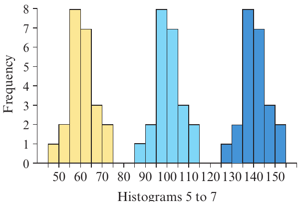
Looking at Histograms 5 to 7, we can estimate:
- Histogram 5 (yellow) is centred at about 60
- Histogram 6 (light blue) is centred at about 100
- Histogram 7 (dark blue) is centred at about 140
These three histograms have identical shapes but different centres.
For skewed distributions, the centre is harder to estimate visually. It's not halfway between the extremes because the data bunches up at one end. Instead, imagine the histogram as a cardboard cut-out—the centre is where a vertical line would divide it into two equal areas.
Spread
Spread describes how widely dispersed the data values are.
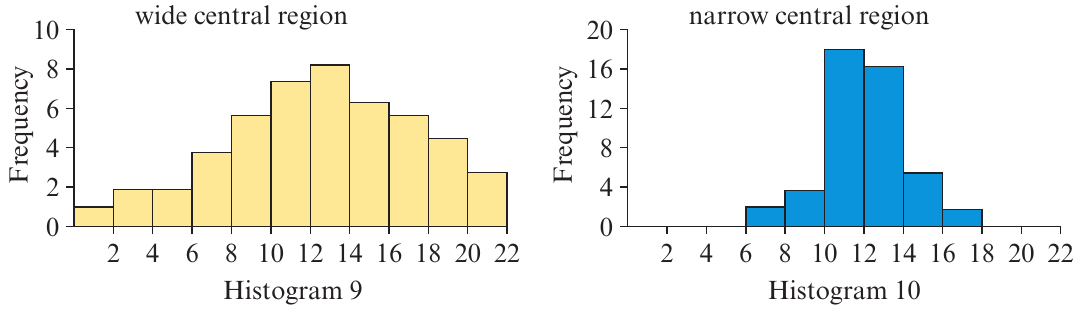
Wide central region (Histogram 9): The data values are more widely spread out and not tightly clustered around the centre.
Narrow central region (Histogram 10): The data values are tightly clustered around the centre with less variation.
Understanding spread helps you assess variability in the data. For example, if test scores have a narrow spread, most students performed similarly. If they have a wide spread, there's more variation in performance.
Outliers
Outliers are data values that stand out from the main body of data. They are atypically high or low compared to the rest of the values.
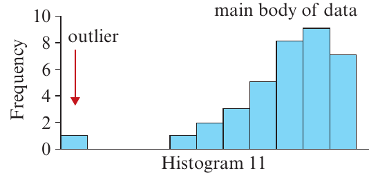
In Histogram 11, there is one data value that is much lower than the rest of the data. This is an outlier.
Important: Outliers should always be checked. They may represent:
- Genuinely unusual values (which are interesting to investigate)
- Errors in data collection or recording (which need to be corrected)
Exam tip: When describing a histogram, always comment on whether outliers are present and where they are located.
Worked Example: Gestation period
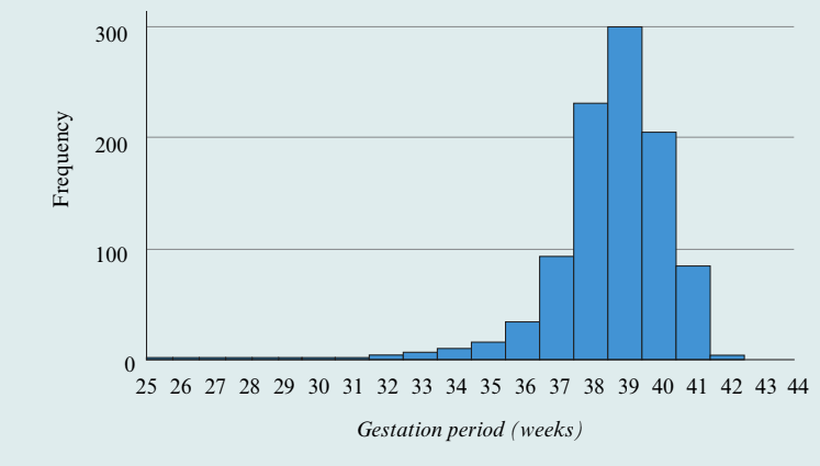
Let's describe this histogram showing gestation periods for 1000 babies:
Shape: The distribution is clearly negatively skewed, with a long lower tail extending to the left.
Centre: The centre of the distribution is around 38–39 weeks. This is where the histogram would balance if it were a cardboard cut-out.
Spread: The data values range from 25 to 44 weeks, but most values are close to the centre, falling between 36 and 41 weeks. This indicates a relatively narrow spread around the centre.
Outliers: Values less than 34 weeks appear to be unusually small compared to the rest of the data. However, we cannot determine exactly which values are outliers just by looking at the histogram—we need more precise statistical measures for that.
Key Points to Remember:
- Frequency tables organize numerical data by showing how often each value (or interval) occurs
- Grouped frequency tables are used when data takes many values or is continuous—typically use 5–15 intervals
- Histograms provide a visual display of frequency distributions with frequency on the vertical axis and data values on the horizontal axis
- Always describe histograms using the four key features: Shape (symmetric, skewed, bimodal), Centre (where the middle lies), Spread (narrow or wide), and Outliers (unusual values)
- Positive skew = long tail to the right; Negative skew = long tail to the left