Displaying and Describing the Distributions of Categorical Variables (VCE SSCE General Mathematics): Revision Notes
Displaying and Describing the Distributions of Categorical Variables
Introduction
When working with categorical data, we need effective ways to organize and present the information so we can identify patterns and draw meaningful conclusions. This note covers the main tools for displaying and describing categorical variables: frequency tables, bar charts, and segmented bar charts.
Raw categorical data can be overwhelming and difficult to interpret. The techniques covered in this note help transform messy data into clear, interpretable information that reveals patterns and supports decision-making.
The frequency table
What is a frequency table?
When you have lots of raw data, it's difficult to spot patterns or trends just by looking at the values. For example, consider this data showing study mode for 60 students (C = on-campus, O = online):

A frequency table organizes data by listing each category value and showing how often it appears in the dataset. This makes patterns much easier to identify.
Two ways to show frequency
Frequency can be recorded in two ways:
- Number (count): The actual number of times each value appears in the data
- Percentage (percentage frequency): The proportion of times each value appears, expressed as a percentage
The formula for percentage frequency is:
Constructing a frequency table
Let's work through an example to see how to build a frequency table.
Worked Example: Ice-cream Flavour Preferences
A group of 11 preschool children chose between chocolate (C) and vanilla (V) ice-cream:
C V V C C V C C C V V
To construct a frequency table with both counts and percentages:
Step 1: Set up a table with columns for the category, number (count), and percentage.
Step 2: Count how many times each category appears. For chocolate, count the C's (6 times). For vanilla, count the V's (5 times).
Step 3: Add up the counts to get the total (6 + 5 = 11).
Step 4: Calculate the percentage for each category using the formula.
- Chocolate:
- Vanilla:
Step 5: Add up the percentages to verify they total 100% (or very close to 100% if rounding).
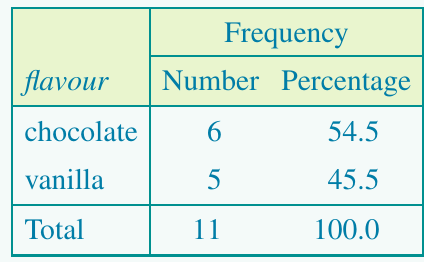
Always check that your counts add up to the total number of observations, and that your percentages add up to 100% (or close to it - sometimes you might get 99.9% or 100.1% due to rounding).
The bar chart
What is a bar chart?
Once categorical data has been organized into a frequency table, we typically create a visual display to help identify key features. A bar chart (also called a bar graph) is the standard way to display categorical data visually.
Visual displays like bar charts make it much easier to spot patterns, compare categories, and communicate findings to others. They transform numbers in a table into an intuitive visual representation.
Key features of bar charts
A properly constructed bar chart has these important features:
- The vertical axis shows frequency (either count or percentage)
- The horizontal axis shows the categories of the variable being displayed
- The height of each bar represents the frequency for that category
- Gaps appear between bars to show that each value is a separate, distinct category
- There is one bar for each category
Constructing a bar chart
Let's see how to create a bar chart from a frequency table.
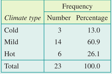
Worked Example: Climate Types
The climate type of 23 countries was classified as 'cold', 'mild', or 'hot':
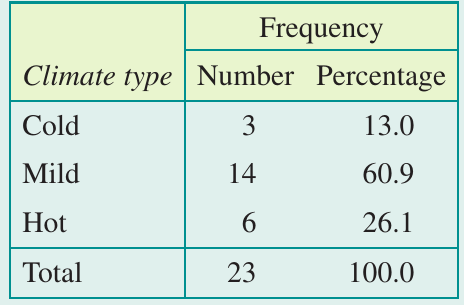
Part a: What level of measurement is the variable climate type?
The data allows us to group countries by climate type and arrange these groups in a natural order (from cold to hot). This makes it an ordinal variable.
Part b: Construct a frequency bar chart.
Step 1: Label the horizontal axis with the variable name (Climate type) and mark it with the category labels (Cold, Mild, Hot).
Step 2: Label the vertical axis "Frequency" and create a scale that accommodates the maximum frequency (14 in this case).
Step 3: For each climate type, draw a bar with gaps between them. The height of each bar equals the frequency from the "Number" column.
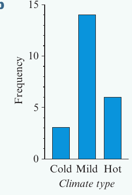
Notice the gaps between the bars - these are essential because they show that the categories are separate and distinct from each other.
The segmented bar chart
What is a segmented bar chart?
A segmented bar chart (also called a stacked bar chart) is a variation of the standard bar chart. Instead of having separate bars for each category, the bars are stacked on top of each other to create a single bar divided into segments.
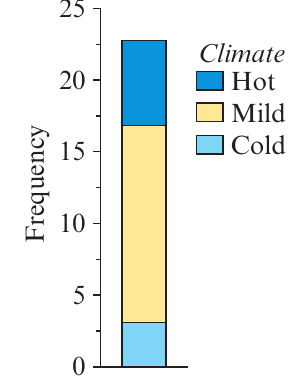
Segmented bar charts are particularly useful when you want to show the composition of a whole and compare the relative sizes of different categories in a compact, space-efficient format.
Key features of segmented bar charts
- Bars are stacked vertically to form a single column
- The length of each segment shows the frequency for that category
- The total height of the bar equals the total frequency
- A legend identifies which segment represents which category
- Segmented bar charts are particularly useful for comparing two or more categorical variables in a compact way
Percentage segmented bar charts
In a percentage segmented bar chart, the length of each segment is determined by the percentage frequency rather than the count. When using percentages, the total height of the bar is always 100%.
Worked Example: Climate Types as a Percentage Segmented Bar Chart
Using the same climate data from before:
Step 1: The horizontal axis has no label in a segmented bar chart.
Step 2: Label the vertical axis "Percentage" and scale it from 0 to 100.
Step 3: Draw a single bar with height 100. Divide it into three segments by inserting dividing lines:
- First line at 13% (for Cold)
- Second line at 73.9% (13% + 60.9% for Cold + Mild)
- Top at 100%
Step 4: Use different colours or shading for each segment.
Step 5: Add a legend to identify which segment represents each climate type.
The result shows the relative proportions clearly, with the Mild segment taking up most of the bar.
The mode
What is the mode?
The mode (or modal category) is the most frequently occurring value or category in a dataset.
In a frequency table, the mode is the category with the highest frequency (count or percentage).
In a bar chart, the mode is the category with the tallest bar or longest segment.
Identifying the mode
Looking at our climate example:
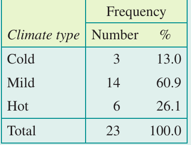
The modal category is clearly 'Mild' because it has the highest frequency (14 countries, or 60.9%).
When is the mode useful?
The mode is particularly important in 'popularity' polls and surveys. For example:
- Which TV station is most watched between 6:00 p.m. and 8:00 p.m.?
- When is a supermarket at peak demand: morning, afternoon, or night?
- What is the most popular colour choice for a new product?
The mode is only really useful when one category clearly stands out from the others. If all categories have similar frequencies, identifying a mode isn't particularly informative.
Answering statistical questions for categorical variables
What is a statistical question?
A statistical question is any question that requires data to answer it. These questions can't be answered with a simple yes/no or a single fact - they need data analysis.
Common types of statistical questions for categorical variables
When analyzing a single categorical variable, we typically ask questions like:
Question type 1: Is there a dominant category that contains most of the individuals, or are individuals spread fairly evenly across all categories?
Example: Are shoppers in a department store predominantly male or female, or are there roughly equal numbers of each?
Question type 2: How many (or what percentage) of individuals fall into each category?
Example: What percentage of national park visitors are day-trippers, and what percentage stay overnight?
Writing reports to answer statistical questions
The standard way to answer statistical questions is by writing a short written report. Here are guidelines to help you write effective reports:
Guidelines for Report Writing:
- Provide context: Briefly summarize how the data were collected and state the number of individuals in the study
- Mention the mode: If there's a clear modal category, make sure to identify it
- Include numbers: Use frequencies or percentages in your report (percentages are usually preferred)
- Be selective: If there are many categories, you don't need to mention every single one, but always mention the modal category
Example of a statistical report
Worked Example: Climate Type Distribution
Using the climate data we've been working with, let's write a report answering the question: "How is climate type distributed across these 23 countries?"
Report:
The climate types of 23 countries were classified as being 'cold', 'mild', or 'hot'. The majority of the countries, 60.9%, were found to have a mild climate. Of the remaining countries, 26.1% were found to have a hot climate, while 13.0% were found to have a cold climate.
Notice how this report:
- States the context (23 countries, climate classification)
- Identifies the modal category (mild)
- Uses percentages throughout
- Mentions all three categories (because there are only three)
- Uses clear, professional language
Important notes about percentages
Sometimes when you add up percentages that have been rounded to one decimal place, you might get a total of 99.9% or 100.1% instead of exactly 100%. This is normal and is called rounding error.
Rounding Error is Normal
When percentages are rounded to one decimal place, small discrepancies may appear. For example:
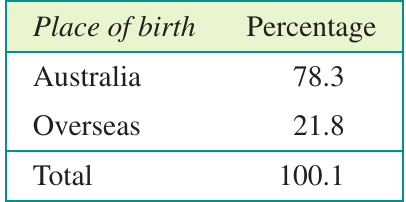
This table shows 78.3% + 21.8% = 100.1%. This small discrepancy is due to rounding and is perfectly acceptable in statistical reporting.
Key Points to Remember:
-
Frequency tables organize categorical data by showing counts and/or percentages for each category. Always check that totals are correct!
-
Bar charts display categorical data visually with separate bars for each category. The gaps between bars show that categories are distinct.
-
Segmented bar charts stack categories into a single column, making them ideal for compact displays and comparisons. Percentage segmented bar charts always reach 100%.
-
The mode is the most common category - look for the tallest bar or highest frequency. It's most useful when one category clearly dominates.
-
Statistical reports should provide context, identify the mode, use percentages, and present findings in clear, professional language.