Dot Plots and Stem Plots (VCE SSCE General Mathematics): Revision Notes
Dot Plots and Stem Plots
Introduction to simple data displays
When working with numerical data, you often need a quick and effective way to visualize patterns and distributions. Dot plots and stem plots are two straightforward techniques designed for displaying small data sets by hand, without needing a calculator or computer. These methods are particularly useful when you have a reasonably small amount of numerical data that you want to organize and examine visually.
Both techniques help you to see the shape of your data distribution, identify common values, and spot any unusual observations. They work best when you have between 10 and 50 data values to display.
While these techniques can handle larger data sets, they are most effective with 10 to 50 data values. For larger data sets, consider using computer-generated displays like histograms or box plots.
The dot plot
Understanding dot plots
A dot plot is made up of a horizontal number line with dots placed above it to represent individual data values. When multiple data points share the same value, the dots stack vertically on top of each other. This creates a simple visual picture of your data that makes it easy to see which values occur most frequently.
Key Definition:
A dot plot consists of a number line with each data point marked by a dot.
Dot plots work especially well for discrete numerical data (data that can only take specific values, like the number of children in a family or goals scored in a match). They provide a very quick way to order and display a small data set.
Constructing a dot plot
Creating a dot plot involves just two main steps:
Step 1: Draw a horizontal number line that is scaled to include all your data values. Make sure your scale covers the range from the smallest to the largest value in your data set. Label the line clearly with the variable name.
Step 2: For each data value, mark a dot directly above the corresponding position on the number line. If a value appears multiple times, stack the dots vertically.
Construction Tip:
Work through your data systematically, checking off each value as you add it to the plot. This helps ensure you don't miss any data points or count any twice.
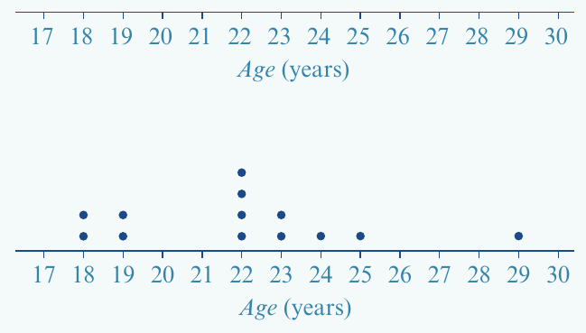
Worked example: Cricket team ages
Worked Example: Constructing a Dot Plot
Question: The ages (in years) of members of a cricket team are:
Construct a dot plot.
Solution:
Following the steps outlined above, we first create a number line spanning from to years to include all ages. We then systematically work through the data, placing a dot for each team member above their age.
The stem plot
Understanding stem plots
A stem-and-leaf plot (often shortened to stem plot) offers another straightforward approach for displaying numerical data. Unlike dot plots, stem plots work well for both discrete and continuous data. They are particularly useful when you have small to medium-sized data sets (typically up to about values). Like dot plots, stem plots are designed as a pen-and-paper technique.
Key Definition:
In a stem plot, each data value is separated into two parts: its leading digits, which make up the 'stem' of the number, and its last digit, which is called the 'leaf'.
The key feature of a stem plot is how it organizes numbers. Each data value is divided into two components:
- The stem: the leading digit(s) of the number
- The leaf: the final digit of the number
How to read a stem plot
Understanding how numbers are represented in a stem plot is essential. Let's look at how this works:
In this format, the number is shown with stem and leaf , while appears as stem and leaf . The vertical line separates the stems from the leaves.
Reading Stem Plots:
To reconstruct a value from a stem plot, simply combine the stem with each leaf. For example, if stem has leaves , the actual values are , , and .
A complete stem plot always includes a key that explains how to interpret the numbers. Here's an example of a complete stem plot:
The key at the top () tells us how to read the values. For instance, in the stem row, the leaves represent the values .
Notice that the leaves are arranged in ascending order along each row, making it easy to identify the minimum, maximum, and most common values in each group.
Constructing a stem plot
Building a stem plot requires a systematic approach with three key steps:
Construction Steps:
Step 1: Identify the range of stems needed by looking at the leading digits in your data. Write these stems in a vertical column in ascending order, followed by a vertical line.
Step 2: Work through your data set systematically. For each value, identify its stem and leaf, then write the leaf digit next to the appropriate stem. At this stage, write the leaves in the order you encounter them in the data.
Step 3: Rewrite the stem plot with all leaves arranged in ascending order on each stem. Add a clear label for the variable and include a key showing how to interpret the values.
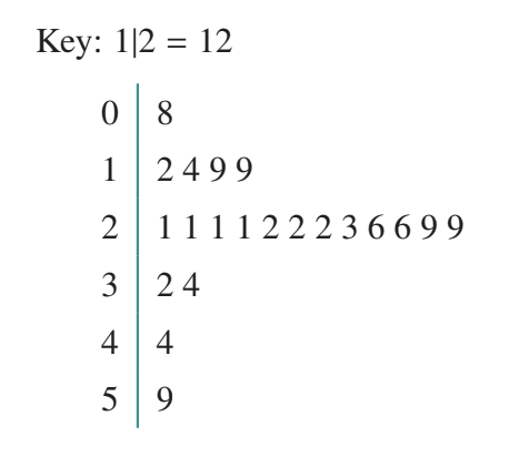
Worked example: University participation rates
Worked Example: Constructing a Stem Plot
Question: University participation rates (%) in countries are:
| 26 | 3 | 12 | 20 | 36 | 1 | 25 | 26 | 13 | 9 | 26 | 27 |
| 15 | 21 | 7 | 8 | 22 | 3 | 37 | 17 | 55 | 30 | 1 |
Display the data in the form of a stem plot.
Solution:
Following Step 1, we examine the data and see values ranging from to . This means we need stems and . We write these in ascending order with a vertical line.
For Step 2, we work through the data systematically. The first value is : stem , leaf . The second value is : stem , leaf . Continuing this process for all values gives us an initial stem plot.
For Step 3, we reorganize the leaves in ascending order on each stem and add the variable name and key:
| rate (%) | Key: 1|2 = 12 |
|---|---|
| 0 | 1 1 3 3 7 8 9 |
| 1 | 2 3 5 7 |
| 2 | 0 1 2 5 6 6 6 7 |
| 3 | 0 6 7 |
| 4 | |
| 5 | 5 |
Notice that stem has no leaves, indicating no countries had participation rates in the 40s. The stem row has the most leaves, showing that participation rates in the 20s are most common.
Stem plots with split stems
When and how to split stems
Sometimes using the basic stem plot method produces a cramped display that doesn't give a clear picture of the data distribution. This typically happens when all your data values share the same one or two leading digits, resulting in most or all leaves appearing on just one or two stems.
When to Split Stems:
Use split stems when your basic stem plot looks too cramped, especially when:
- Most or all data values cluster on one or two stems
- You have only a few different stem values
- The distribution pattern is hard to see in the basic plot
Splitting stems into halves or fifths creates a clearer, more spread-out display.
When this occurs, you can improve the display by splitting the stems. This means using each stem value multiple times, with each repetition handling a different subset of possible leaf values.
Two Methods for Splitting Stems:
Splitting into halves:
- First stem: leaves
- Second stem: leaves
Splitting into fifths:
- First stem: leaves
- Second stem: leaves
- Third stem: leaves
- Fourth stem: leaves
- Fifth stem: leaves
Choose whichever method gives the clearest display for your particular data set.
Worked example: VCE statistics test
Consider the marks obtained by VCE students on a statistics test:
If we create a basic stem plot, we get:
| Key: 1|6 = 16 |
|---|
| 0 | 2 7 9 |
| 1 | 0 1 2 2 3 4 5 5 6 6 6 7 7 8 |
This is clearly cramped, with out of values on a single stem. We can improve this by splitting the stems:
Stem split into halves:
| Key: 1|6 = 16 |
|---|
| 0 | 2 |
| 0 | 7 9 |
| 1 | 0 1 2 2 3 4 |
| 1 | 5 5 6 6 6 7 7 8 |
Stem split into fifths:
| Key: 1|6 = 16 |
|---|
| 0 | |
| 0 | 2 |
| 0 | |
| 0 | 7 |
| 0 | 9 |
| 1 | 0 1 |
| 1 | 2 2 3 |
| 1 | 4 5 5 |
| 1 | 6 6 6 7 7 |
| 1 | 8 |
Both versions provide a clearer picture of the distribution than the original cramped plot. The choice between halves and fifths depends on your data - use whichever gives the clearest display.
Splitting stems is most useful when you have only a few different values for the stem, causing most of your data to cluster on just one or two rows.
Key Points to Remember:
-
Dot plots use a number line with stacked dots to display data values. They work best for discrete numerical data and small data sets.
-
Stem plots divide each number into a stem (leading digits) and a leaf (final digit), organizing data in a tabular format that works for both discrete and continuous data.
-
Always include a key in your stem plot to show how values should be read (e.g., ).
-
Remember to arrange leaves in ascending order on each stem to make patterns easier to spot.
-
Use split stems when your basic stem plot looks too cramped, dividing stems into halves or fifths for a clearer display.