Interpreting and Describing Frequency Tables and Bar Charts (VCE SSCE General Mathematics): Revision Notes
Interpreting and Describing Frequency Tables and Bar Charts
Understanding the purpose
When you conduct a statistical investigation, creating a frequency table or bar chart is not the end goal. These tools are just ways to help you discover patterns and insights in your data that you didn't know before. The real aim is to understand what your data tells you and then communicate these findings to others in a clear, systematic report.
The ultimate goal of creating frequency tables and bar charts is not just to organize data, but to interpret the patterns and communicate your findings effectively to others.
This note will help you develop the skills to interpret frequency tables and bar charts, and write effective reports about categorical variables.
What is a categorical variable?
A categorical variable is one where the data falls into distinct groups or categories. For example, lunch choices (sandwich, salad, pie), or opinions about a statement (agree, disagree, don't know).
Unlike numerical data, categorical data represents qualities or characteristics rather than quantities. You cannot perform arithmetic operations (like finding an average) on categorical data.
Guidelines for describing categorical data
When writing a report about categorical data, follow these important guidelines:
Context and sample size
Always begin by briefly explaining what data was collected and from whom. Include the total number of people (or items) in your study. This helps readers understand the scale and scope of your investigation.
Identifying the mode
The modal category is the one with the highest frequency. If there is a clear mode, make sure to mention it in your report. State which category was most popular or most common.
Using numbers effectively
Include relevant counts (actual numbers) or percentages in your report. Both are acceptable - choose whichever is most appropriate for your data.
- Counts work well for smaller datasets
- Percentages are better for larger samples or when comparing different sized groups
Managing multiple categories
If you have more than three categories, you don't need to mention every single one. Focus on the most important patterns: highest, lowest, and any notable features. This keeps your report concise and readable.
Worked example: describing a frequency table
Let's look at how to interpret and describe data from a frequency table.
Worked Example: Lunch Choices
A group of children were offered a choice of sandwich, salad or pie for lunch. Their responses were collected and summarised in the frequency table below.
| Lunch choice | Frequency |
|---|---|
| Sandwich | 7 |
| Salad | 10 |
| Pie | 13 |
| Total | 30 |
Writing the report:
A group of children were offered a choice of sandwich, salad or pie for lunch.
The most popular lunch choice was pie, chosen by of the children. Ten children chose salad. The least popular option was sandwich, chosen by only of the children.
What makes this a good report?
- States the context (lunch choices for 30 children)
- Identifies the modal category (pie was most popular)
- Includes the actual frequencies as supporting evidence
- Mentions all three categories since there are only three
- Uses clear, comparative language (most popular, least popular)
Practice example: activity choices
Here's an example for you to think about. A group of kindergarten children were asked to choose an activity from painting, story time and playdough. Their choices are shown below.
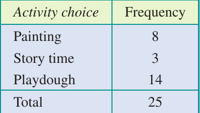
How to approach this:
- Start by stating the context and sample size ( kindergarten children)
- Identify the modal category (which activity was chosen most?)
- Mention the category with the lowest frequency
- Include the actual frequencies to support your statements
- Write as if you're explaining the results to a friend
Hints:
- The most popular choice should be described as "the most popular"
- The lowest frequency should be described as "the least popular"
- Make your explanation clear and straightforward
Worked example: using frequency tables and bar charts together
Often you'll need to interpret both a frequency table and a bar chart showing the same data. The bar chart provides a visual representation that makes patterns easier to spot.
Worked Example: Beliefs About Astrology
A sample of people were asked whether they agreed with the statement "Astrology has scientific truth". They could choose from: definitely true, probably true, probably not true, definitely not true, or don't know.
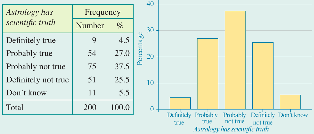
Writing the report:
A sample of two hundred people were asked to respond to the statement "Astrology has scientific truth".
The majority of respondents did not agree, with responding that they believed this statement was probably not true, and another declaring that the statement was definitely not true. Over one quarter () of the respondents thought that the statement was probably true, while only thought that the statement was definitely true.
What makes this effective?
- States the context and sample size ( people)
- Uses percentages (appropriate for this larger sample)
- Groups related categories together (combining "probably not true" and "definitely not true" to show majority disagreement)
- Includes specific percentages as evidence
- Uses comparative language ("majority", "over one quarter", "only")
- Presents findings in a logical order (from most common to least common response)
Practice example: happiness survey
A sample of people were asked "How much time have you felt happy in the past week?" They selected from: almost none of the time, some of the time, most of the time, or almost all of the time.
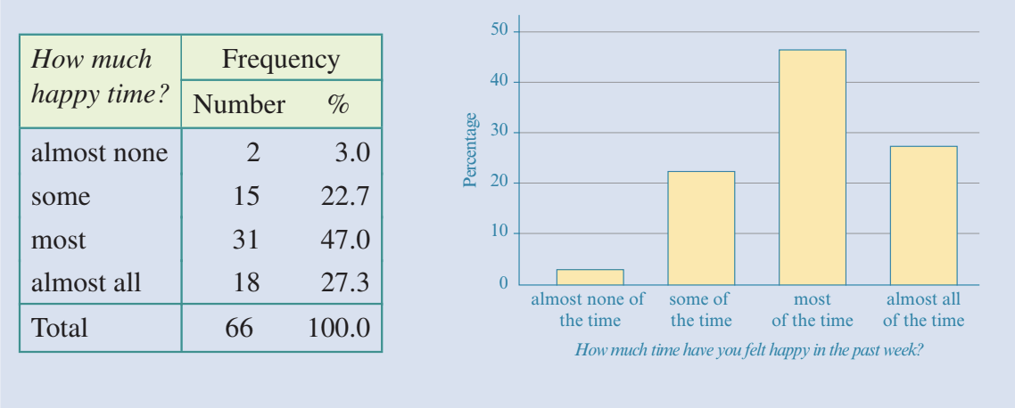
How to approach this:
- Compare the percentage frequencies from highest to lowest
- Use comparative terms like "more" and "less" - don't just list the percentages
- Write as if you're explaining the responses to another person
- Note that this is ordinal data (the categories have a natural order from least to most happy)
Key features of effective reports
When examining frequency tables and bar charts, keep these essential elements in mind:
Always include:
- The total number of data values or people surveyed
- The context of the investigation
- The modal category (highest frequency)
- The category with the lowest frequency
Use appropriate language:
- Comparative terms: most popular, least common, majority, minority
- Quantitative evidence: include specific counts or percentages
- Clear, simple explanations that someone unfamiliar with your data can understand
Keep it concise:
- Focus on the most important patterns
- Don't list every single category if there are many
- Combine related information where appropriate
Key Points to Remember:
- Always start with context and sample size
- Identify the modal category clearly
- Support statements with specific numbers or percentages
- Use comparative language to show relationships
- Keep writing clear, systematic, and concise
Bar charts: visual interpretation
Bar charts help you see patterns at a glance. The visual format makes complex data easier to understand and interpret.
Understanding Bar Charts:
- The height of each bar represents the frequency or percentage
- Taller bars indicate more common categories
- You can quickly compare categories by comparing bar heights
- The visual makes it easier to spot the mode and identify patterns
Exam tips
When writing reports:
- Always start with context and sample size
- Identify and state the modal category
- Support your statements with actual numbers (counts or percentages)
- Use comparative language to show relationships between categories
- Keep your writing clear and systematic
- Write in complete sentences, not bullet points
When choosing counts vs percentages:
- Use counts for smaller samples (under 100)
- Use percentages for larger samples or when comparing groups of different sizes
- Either is acceptable - choose what communicates most clearly
Common mistakes to avoid:
Watch out for these common errors:
- Forgetting to state the total number in the sample
- Not identifying the modal category
- Listing numbers without explaining what they mean
- Making your report too long by mentioning every single category
- Using informal language or unclear explanations
Remember!
Essential Takeaways:
- Frequency tables and bar charts are tools to help you understand and communicate patterns in categorical data
- Always include the context, sample size, and modal category in your reports
- Support your statements with specific frequencies or percentages
- Use clear, comparative language to explain patterns
- Keep your reports systematic and concise - focus on the most important features
- The goal is to communicate what you've learned from the data in a way that others can easily understand